Portfolio | Graphic Design / PR – Saint Sanity
CRAFTING A NEW BRAND THAT SPEAKS LOUD.
Branding | May 2024

Client Overview
Saint Sanity is an independent clothing brand specializing in streetwear and pieces with character, offering unique and elegant designs at accessible prices. The brand embodies a bold, classy, modern, and alternative persona, aiming to empower individuals to embrace their limitless potential and celebrate their unique identities.
Project Overview
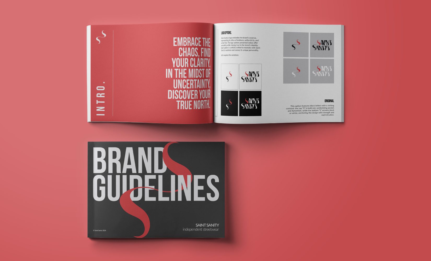
The branding project for Saint Sanity involves the creation of a visual identity that captures the brand’s bold personality and aligns with its core values. This includes the design of a distinctive logo, a cohesive colour palette and typography, and the development of strategic messaging and usage guidelines that ensure brand cohesiveness across all touchpoints. The goal was to create a brand identity that effectively communicates its values and resonates with its target audience.
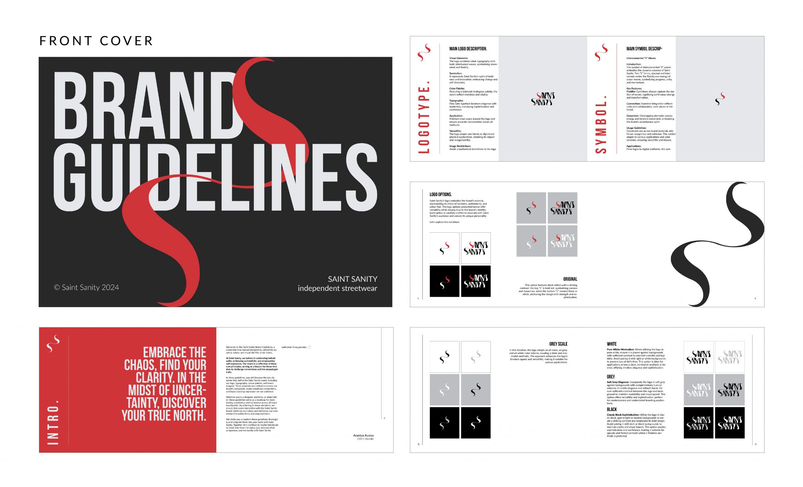
INTRO
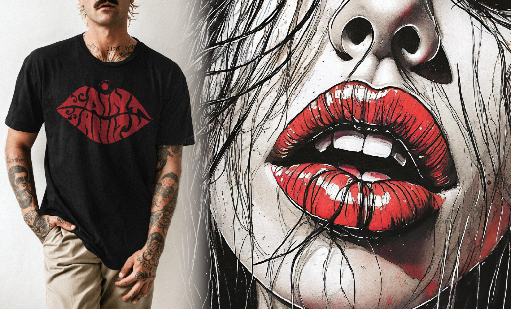
** The image of the lips (right) was created using Adobe Firefly.
Brand Personality and Tone
Saint Sanity’s identity is defined by boldness, elegance, creativity, and modernity. The brand speaks to those who dare to challenge norms and express their individuality with confidence. Rooted in the values of individuality, empowerment, community, creativity, and affordability, Saint Sanity fosters a non-judgmental community that celebrates diversity and self-expression.
KEY DELIVERABLES
Brand Identity: Created a new brand identity, including a logo, colour palette, typography, and brand guidelines.
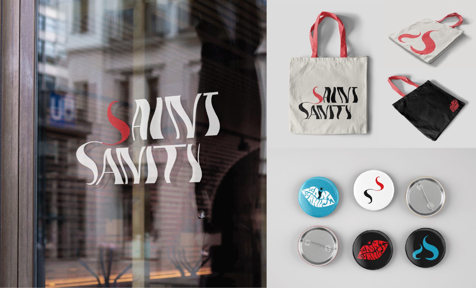
Visual Elements & Symbols: Creation of additional artwork, including “The Heart,” “The Flame,” “The Lips,” and “The Angel” symbols, each representing unique aspects of the brand’s identity.
Brand Messaging: Development of a brand narrative that encapsulates Saint Sanity’s bold, creative, and empowering ethos. Key messages to communicate across platforms.
PUBLIC RELATIONS
“EMBRACE THE CHAOS, FIND YOUR CLARITY. AMID THE UNCERTAINTY, DISCOVER YOUR TRUE NORTH”
BRAND MESSAGING
Saint Sanity is an independent clothing brand specializing in streetwear and statement pieces, offering unique and unconventional designs at accessible prices. The brand embodies a bold, classy, modern, and alternative persona, aiming to empower individuals to embrace their limitless potential and celebrate their unique identities.
Brand Personality and Tone
Saint Sanity’s identity is defined by boldness, creativity, and a fearless embrace of modernity. The brand speaks to those who dare to challenge norms and express their individuality with confidence. Rooted in the values of individuality, empowerment, community, creativity, and affordability, Saint Sanity fosters a non-judgmental community that celebrates diversity and self-expression.
Brand Story
Saint Sanity was born out of a desire to challenge the status quo. In a world where fashion often means following trends, we saw an opportunity to create something different—clothing that looks good with meaning. Every piece in our collection is designed to inspire you to be fearless, to take risks, and to embrace your essence. We’re not just a brand; we’re a way of life for those who refuse to be ordinary.
Audience
Saint Sanity appeals to a diverse audience, including:
- Fashion-forward individuals seeking unique streetwear and statement pieces.
- Urban youth who are drawn to bold, creative styles.
- Trendsetters looking to make an impact with the latest fashion trends.
- Creatives and artists who value self-expression and challenge societal norms.
- Socially conscious consumers who appreciate brands with empowering messages.
- Budget-conscious shoppers who desire stylish, high-quality fashion at an affordable price.
GRAPHIC DESIGN
LOGOTYPE
WAVES ADDITION TO FINO SANS
FINO SANS
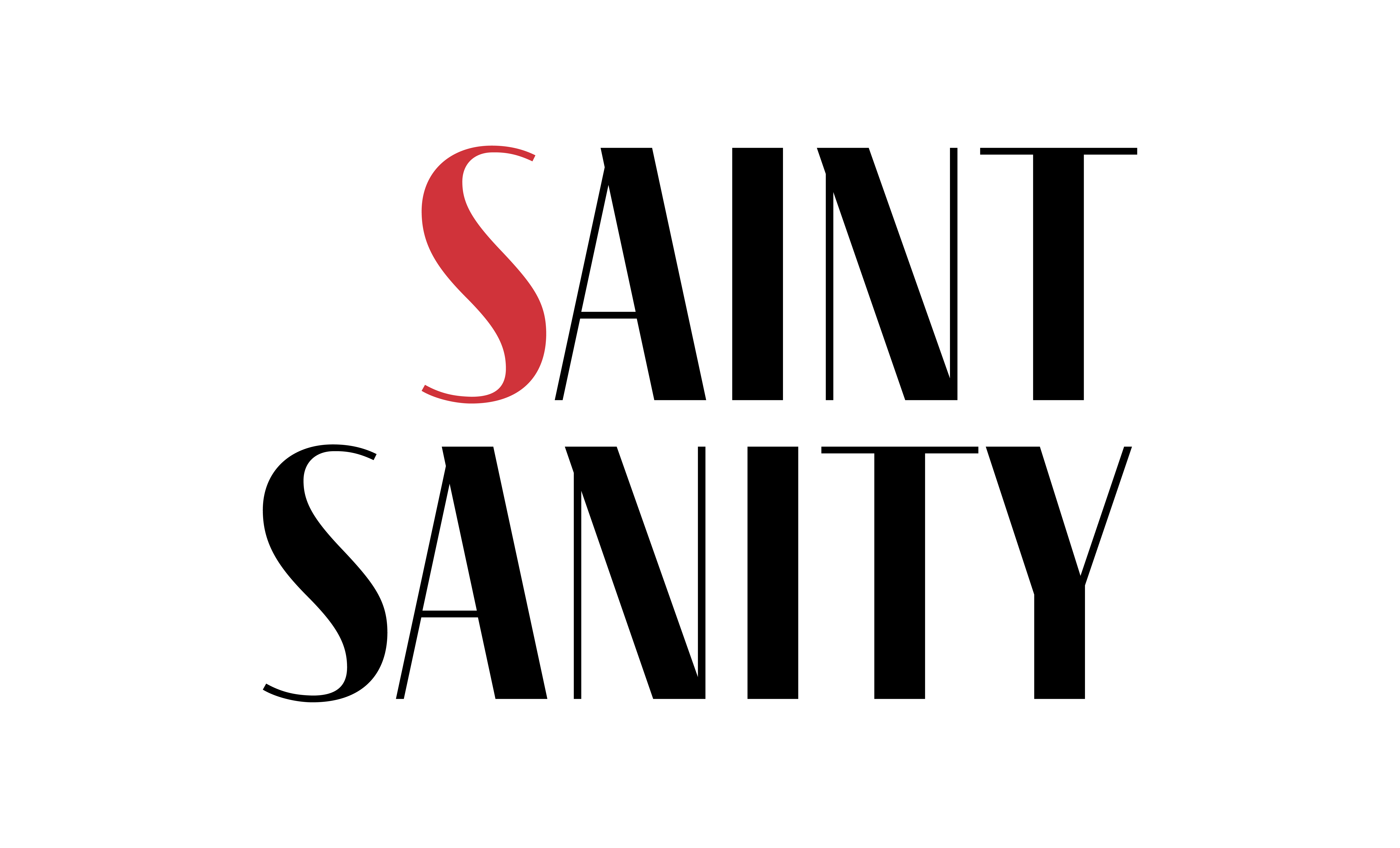
Fino Sans is a typeface designed by Maxim Schepin and released through Schriftlabor. Fino Sans is a modern sans-serif font with a clean and elegant design. It features a balanced combination of geometric shapes and humanist elements, making it versatile and suitable for various design applications such as branding, editorial design, web design, and more. Fino Sans comes in multiple weights and includes both regular and italic styles, allowing for flexibility in typography and layout.
Essence Alignment:
Modern Elegance: Fino Sans is a modern sans-serif font with clean lines and elegant proportions. Its sleek and sophisticated appearance reflects the brand’s classy and refined personality. This modern elegance resonates with Saint Sanity’s emphasis on sophistication and boldness.
Clean Aesthetic: The clean and minimalistic aesthetic of Fino Sans aligns with Saint Sanity’s desire to break free from clutter and embrace simplicity.
Contemporary Appeal: Fino Sans embodies a contemporary design sensibility that feels fresh and relevant. Its sleek and stylish appearance reflects Saint Sanity’s forward-thinking approach and innovative mindset.
Overall, the use of Fino Sans for the logotype of Saint Sanity can enhance the brand’s identity by communicating its values of modern elegance, versatility, clean aesthetic, and contemporary appeal.
WAVES
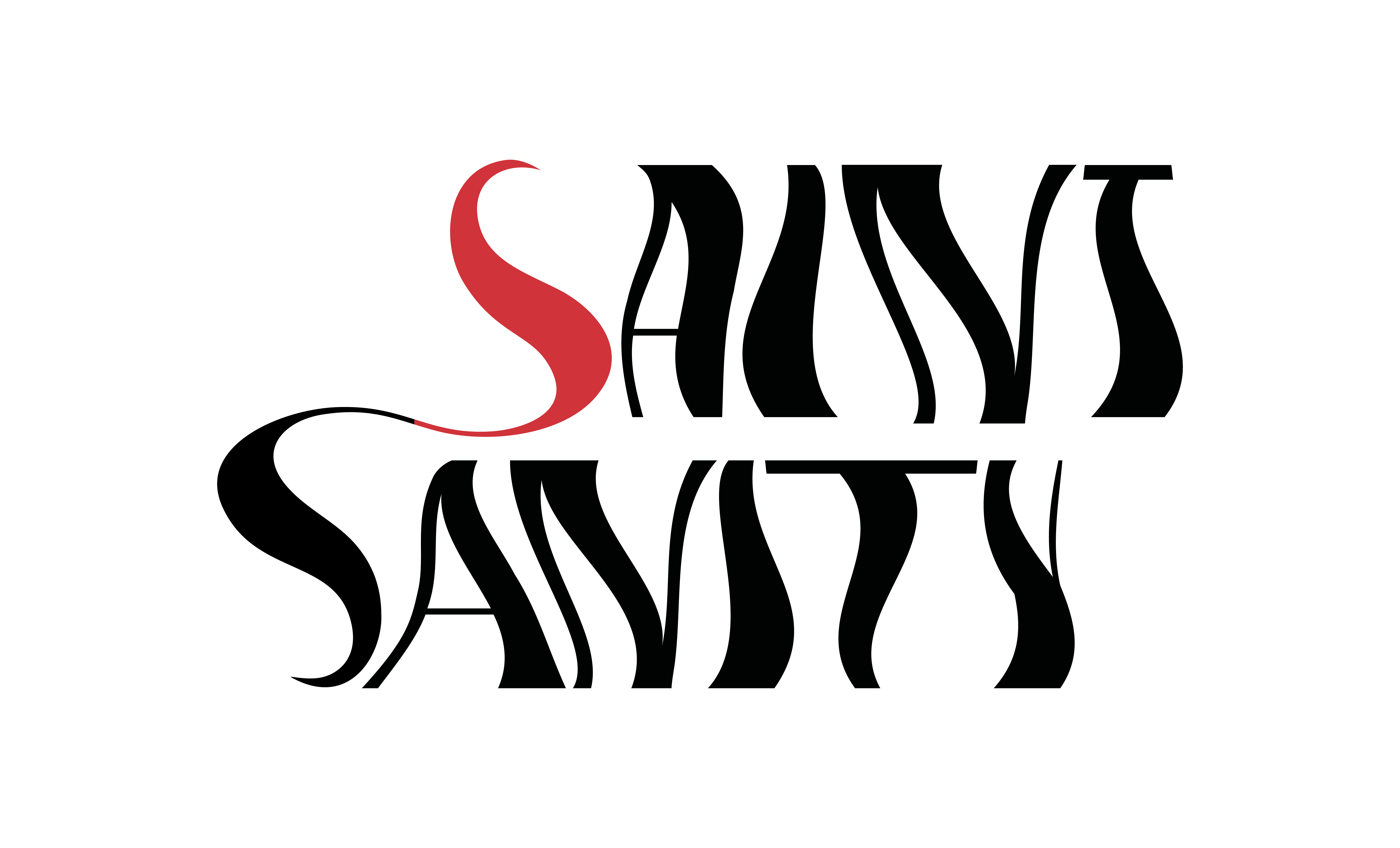
The bold and intertwined nature of the waves in this concept adds a striking visual element to the logotype, highlighting Saint Sanity’s bold and unconventional approach. It reflects the brand’s willingness to challenge norms and stand out, encouraging others to embrace their individuality and embrace their unique identity.
Adding an effect of intertwined bold waves to the Fino Sans typeface enhances the visual representation of Saint Sanity’s values, conveying messages of movement, freedom, boldness, and modernity.
Values Alignment:
Modern and Stylish Aesthetic: The addition of bold waves to the logotype enhances its modern and stylish aesthetic, aligning with Saint Sanity’s identity as a contemporary streetwear brand. It adds a dynamic and visually appealing element to the typography, reinforcing the brand’s commitment to innovative design and creativity.
Emotional Depth: Waves can also symbolize the depths of emotions, representing the ebb and flow of feelings such as joy, sadness, excitement, or contentment.
Spirituality and Transformation: In some cultures, waves are associated with spiritual symbolism and represent the journey of transformation or enlightenment. They symbolize the cyclical nature of life and the eternal rhythm of the universe.
SYMBOL
INTERCONNECTED “S” WAVES
Introduction:
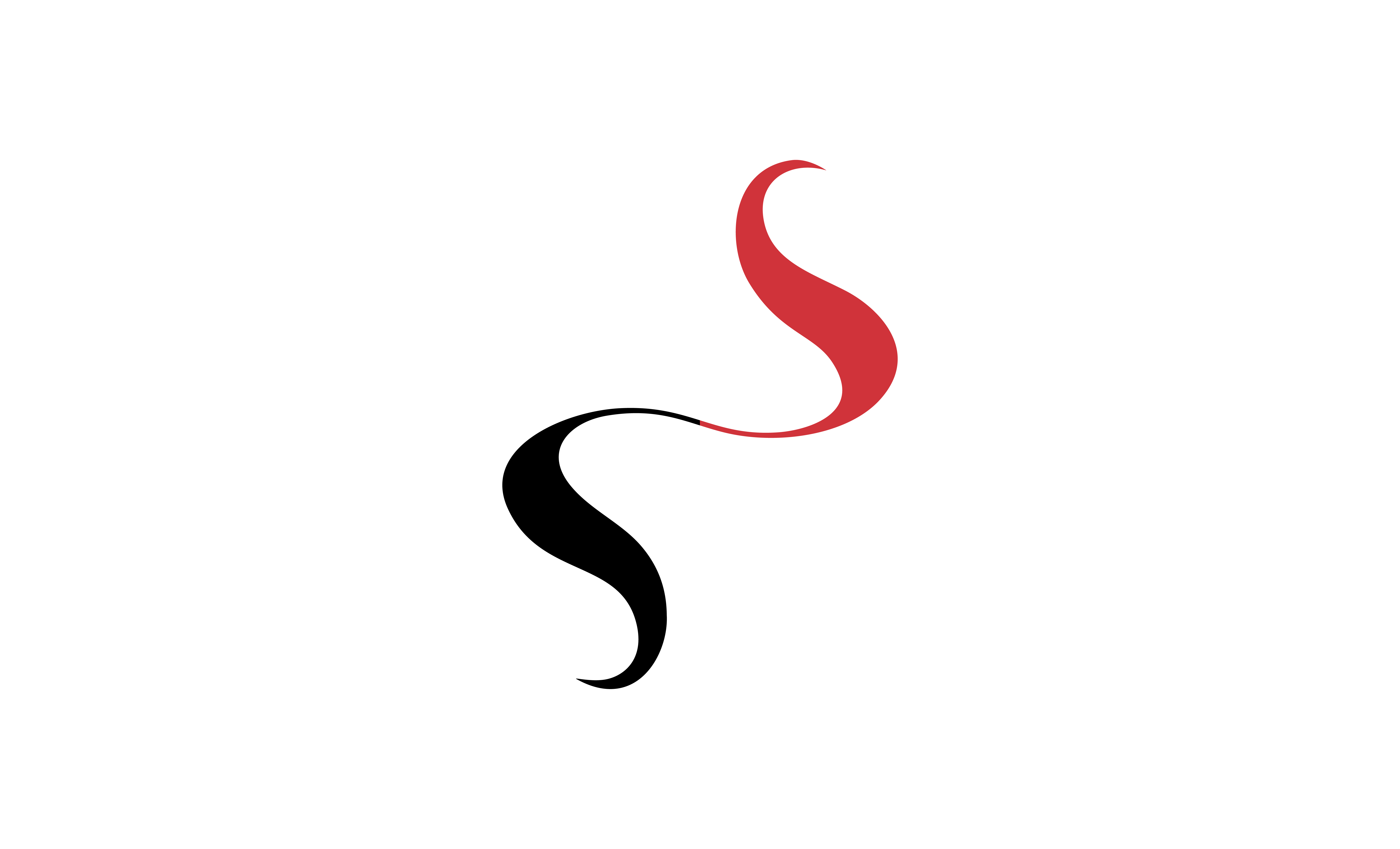
The symbol of interconnected “S” waves embodies the dynamic essence of Saint Sanity. Two “S” forms, stacked and intertwined, evoke the fluidity and energy of ocean waves, symbolizing progress, unity, and momentum.
Key Features:
Fluidity: Curvilinear shapes capture the motion of waves, signifying continuous change and transformation.
Connection: Seamless integration reflects unity and collaboration, the core values of the brand.
Dynamism: Overlapping elements convey energy and forward movement, embodying
USAGE GUIDELINES
Usage Guidelines:
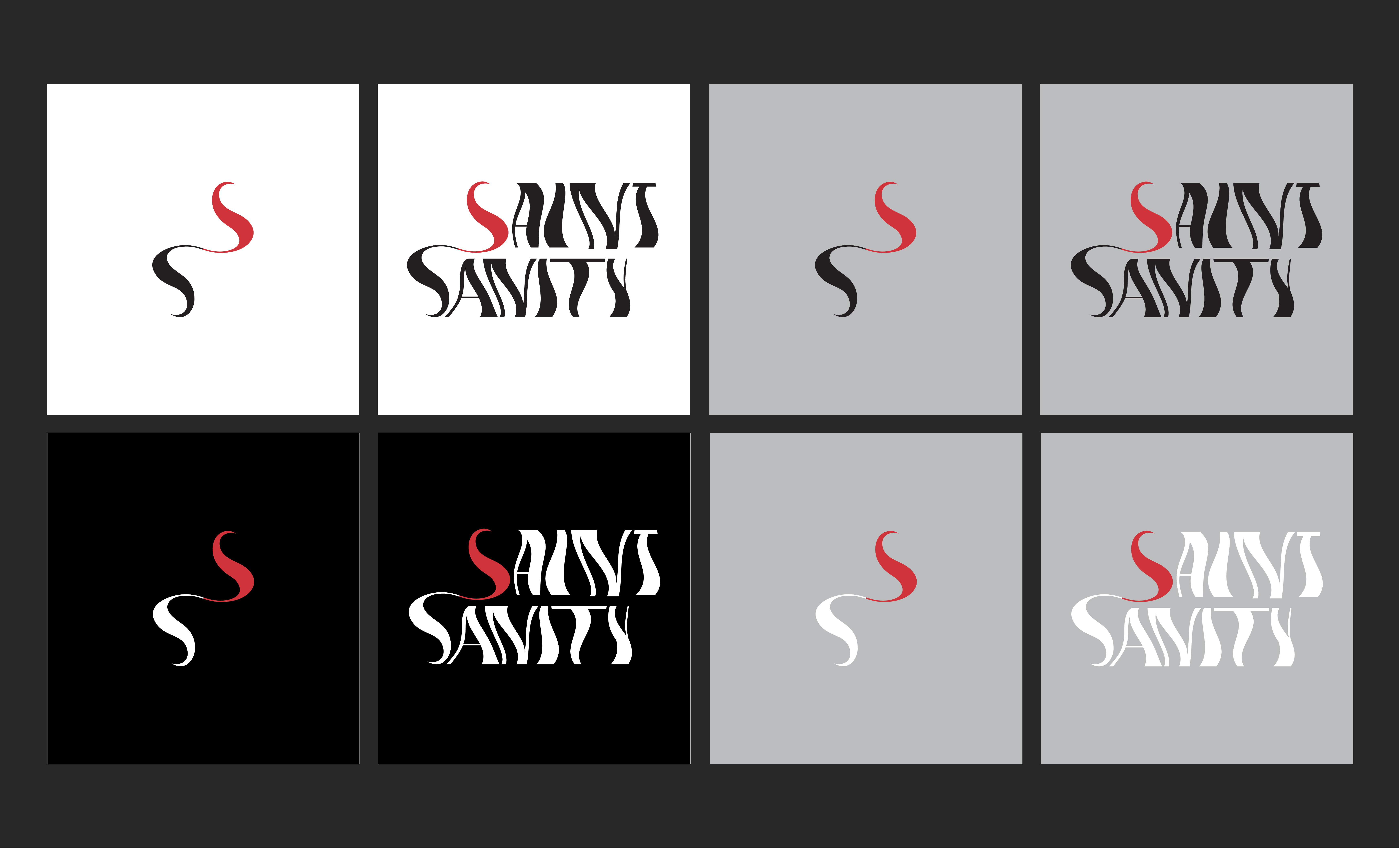
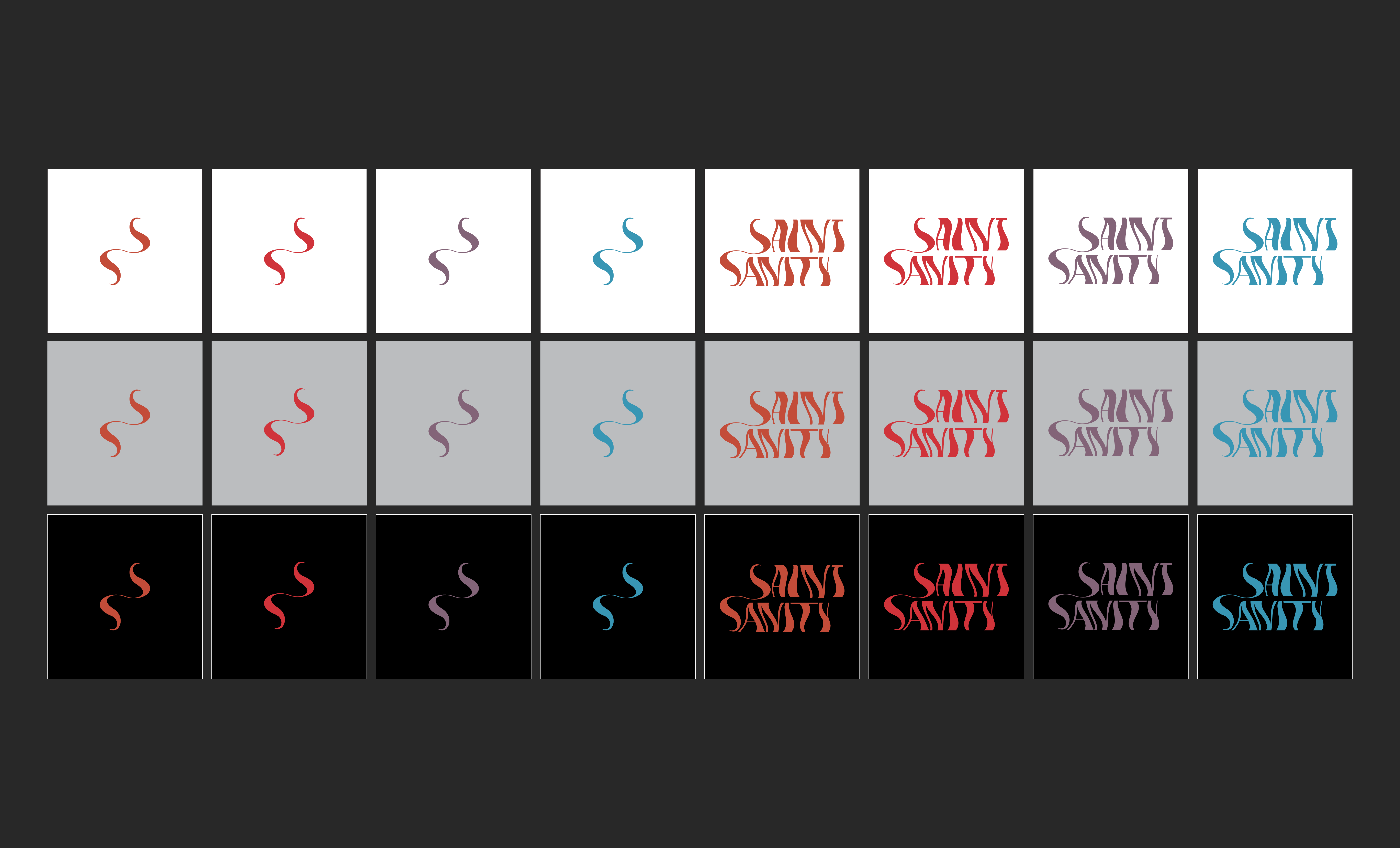
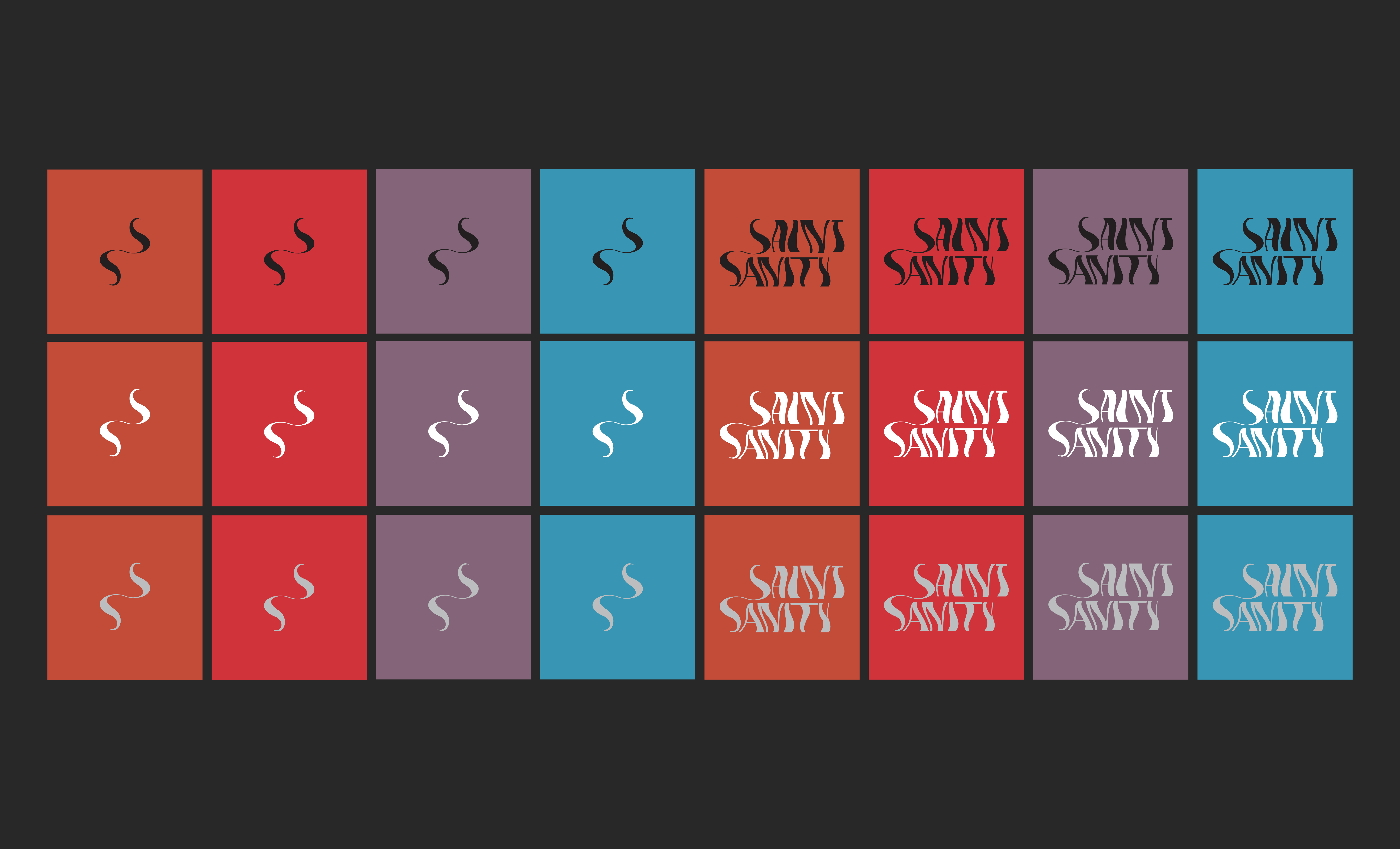
Consistent use across brand materials reinforces recognition and cohesion. The symbol adapts to various applications and colour schemes, ensuring versatility and impact.
Applications:
From logos to digital platforms, the symbol enhances brand presence and identity across diverse touchpoints, leaving a memorable impression on audiences.
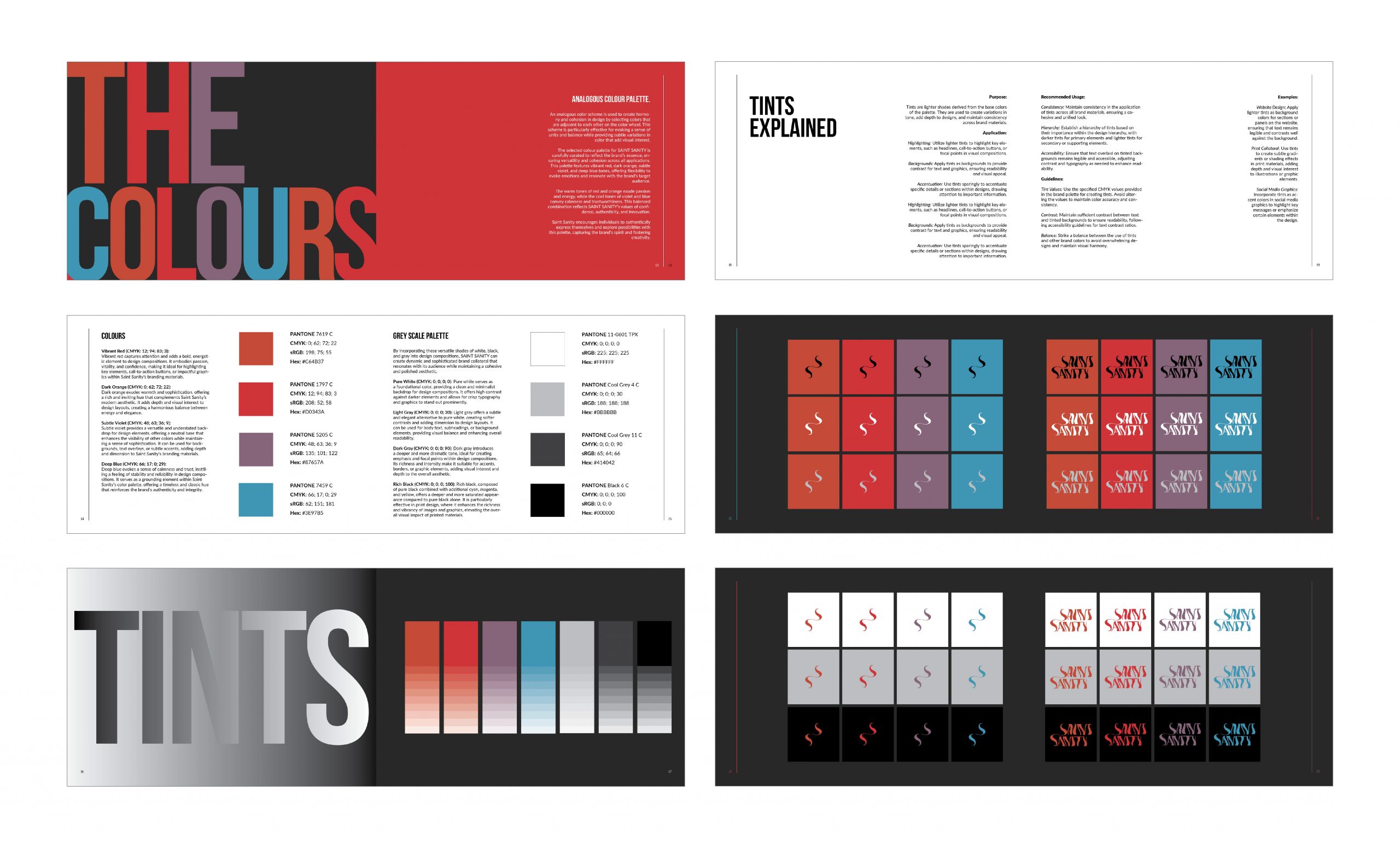
COLOURS
ANALOGOUS COLOUR PALETTE
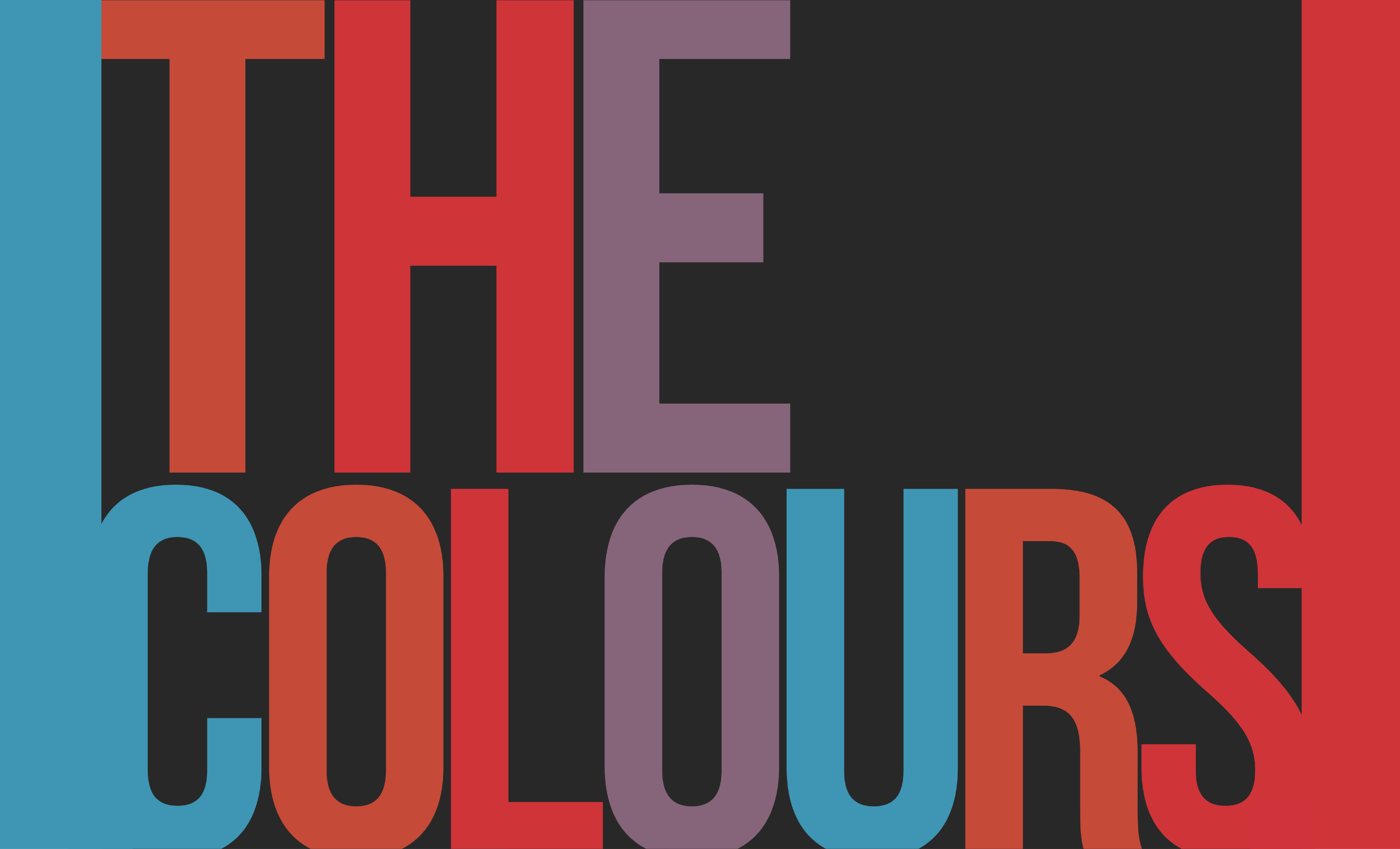
An analogous colour scheme is used to create harmony and cohesion in design by selecting colours that are adjacent to each other on the colour wheel.
This scheme is particularly effective for evoking a sense of unity and balance while providing subtle colour variations that add visual interest.
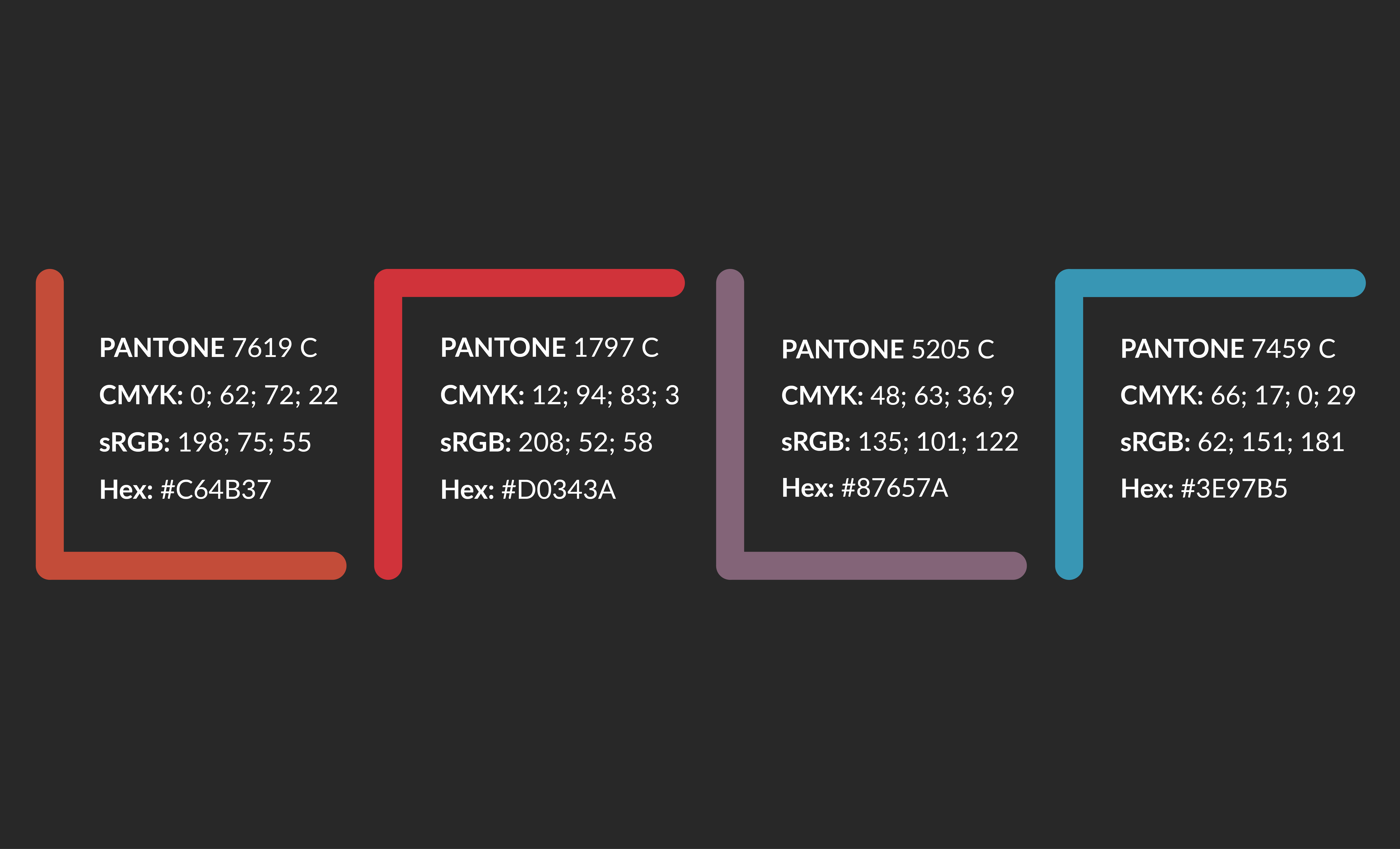
The selected colour palette for SAINT SANITY is carefully curated to reflect the brand’s essence, ensuring versatility and cohesion across all applications.
This palette features vibrant red, dark orange, subtle violet, and deep blue tones, offering flexibility to evoke emotions and resonate with the brand’s target audience.
The warm tones of red and orange exude passion and energy, while the cool tones of violet and blue convey calmness and trustworthiness. This balanced combination reflects SAINT SANITY’s values of confidence, authenticity, and innovation.
Saint Sanity encourages individuals to authentically express themselves and explore possibilities with this palette, capturing the brand’s spirit and fostering creativity.
WARM COLOURS
Vibrant Red (CMYK: 12; 94; 83; 3):
Vibrant red captures attention and adds a bold, energetic element to design compositions. It embodies passion, vitality, and confidence, making it ideal for highlighting key elements, call-to-action buttons, or impactful graphics within Saint Sanity’s branding materials, further amplifying the brand’s message of individuality and empowering self-expression.
Dark Orange (CMYK: 0; 62; 72; 22):
Dark orange exudes warmth and sophistication, offering a rich, inviting hue that perfectly complements Saint Sanity’s modern aesthetic. This versatile color adds depth and visual interest to design layouts, creating a harmonious balance between the brand’s energetic spirit and its message of self-assured individuality.
COOL COLOURS
Subtle Violet (CMYK: 48; 63; 36; 9):
Subtle violet provides a versatile and understated backdrop for design elements, offering a neutral base that enhances the visibility of other colours while maintaining a sense of sophistication. It can be used for backgrounds, text overlays, or subtle accents, adding depth and dimension to Saint Sanity’s branding materials.
Deep Blue (CMYK: 66; 17; 0; 29):
Deep blue evokes a sense of calmness and trust, instilling a feeling of stability and reliability in design compositions. It serves as a grounding element within Saint Sanity’s colour palette, offering a timeless and classic hue that reinforces the brand’s authenticity and integrity.
GREY SCALE
SHADES
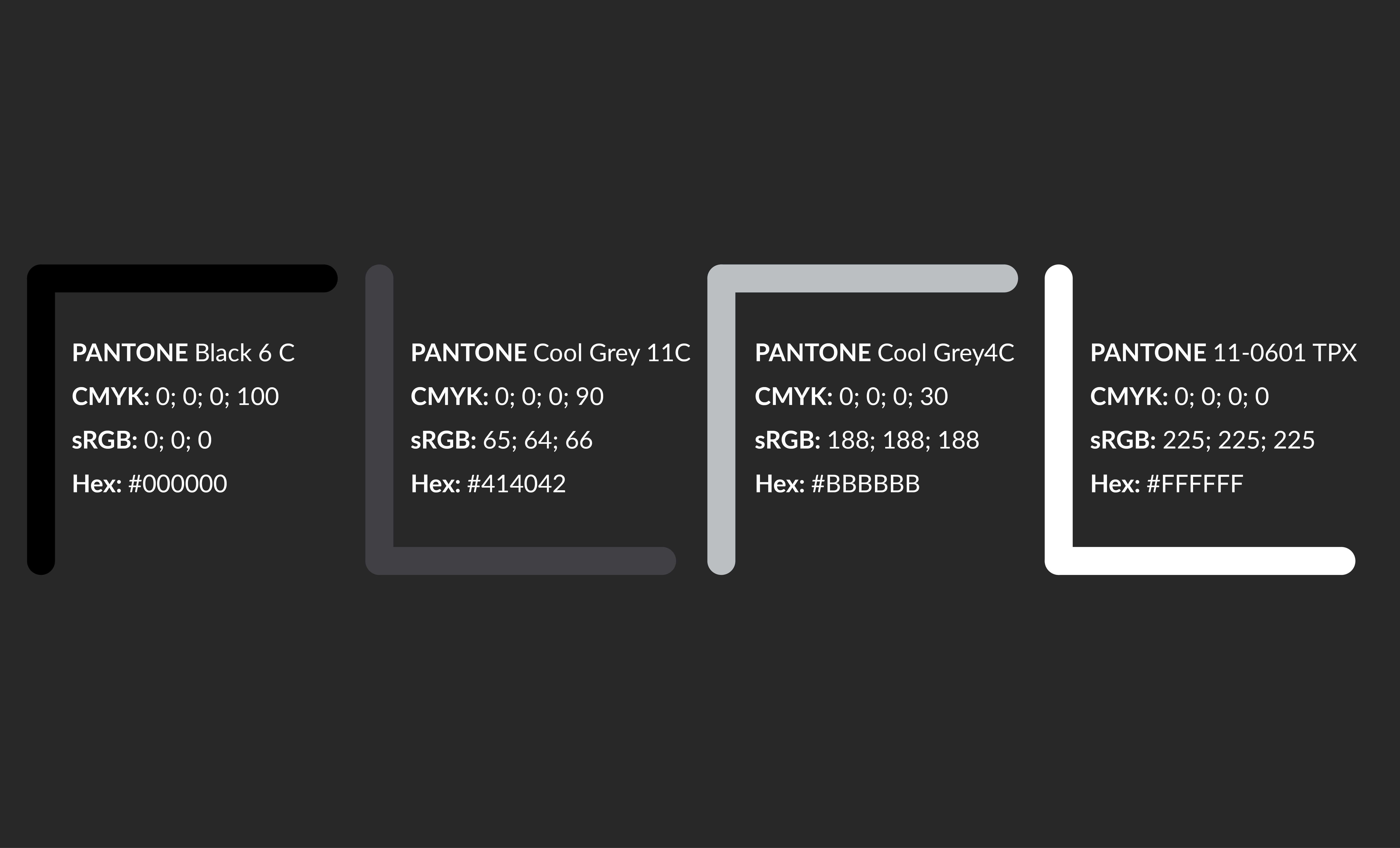
Dark Gray (CMYK: 0; 0; 0; 90):
Dark gray introduces a deeper and more dramatic tone, ideal for creating emphasis and focal points within design compositions.
Its richness and intensity make it suitable for accents, borders, or graphic elements, adding visual interest and depth to the overall aesthetic.
Rich Black (CMYK: 0; 0; 0; 100):
Rich black, composed of pure black combined with additional cyan, magenta, and yellow, offers a deeper and more saturated appearance compared to pure black alone. It is particularly effective in print design, where it enhances the richness and vibrancy of images and graphics, elevating the overall visual impact of printed materials.
TINTS

TINTS
Pure White (CMYK: 0; 0; 0; 0):
Pure white is a foundational colour for Saint Sanity’s designs, creating a clean and minimalist canvas. This high-contrast backdrop allows for crisp typography and graphics to stand out prominently. It provides a neutral base that complements the brand’s bold statements and empowers the unconventional designs to shine, further emphasizing Saint Sanity’s message of individuality and self-expression.
Light Gray (CMYK: 0; 0; 0; 30):
Light gray offers a subtle and elegant alternative to pure white, creating softer contrasts and adding dimension to design layouts. It can be used for body text, subheadings, or background elements, providing visual balance and enhancing overall readability.
TINTS EXPLAINED
The PURPOSE:
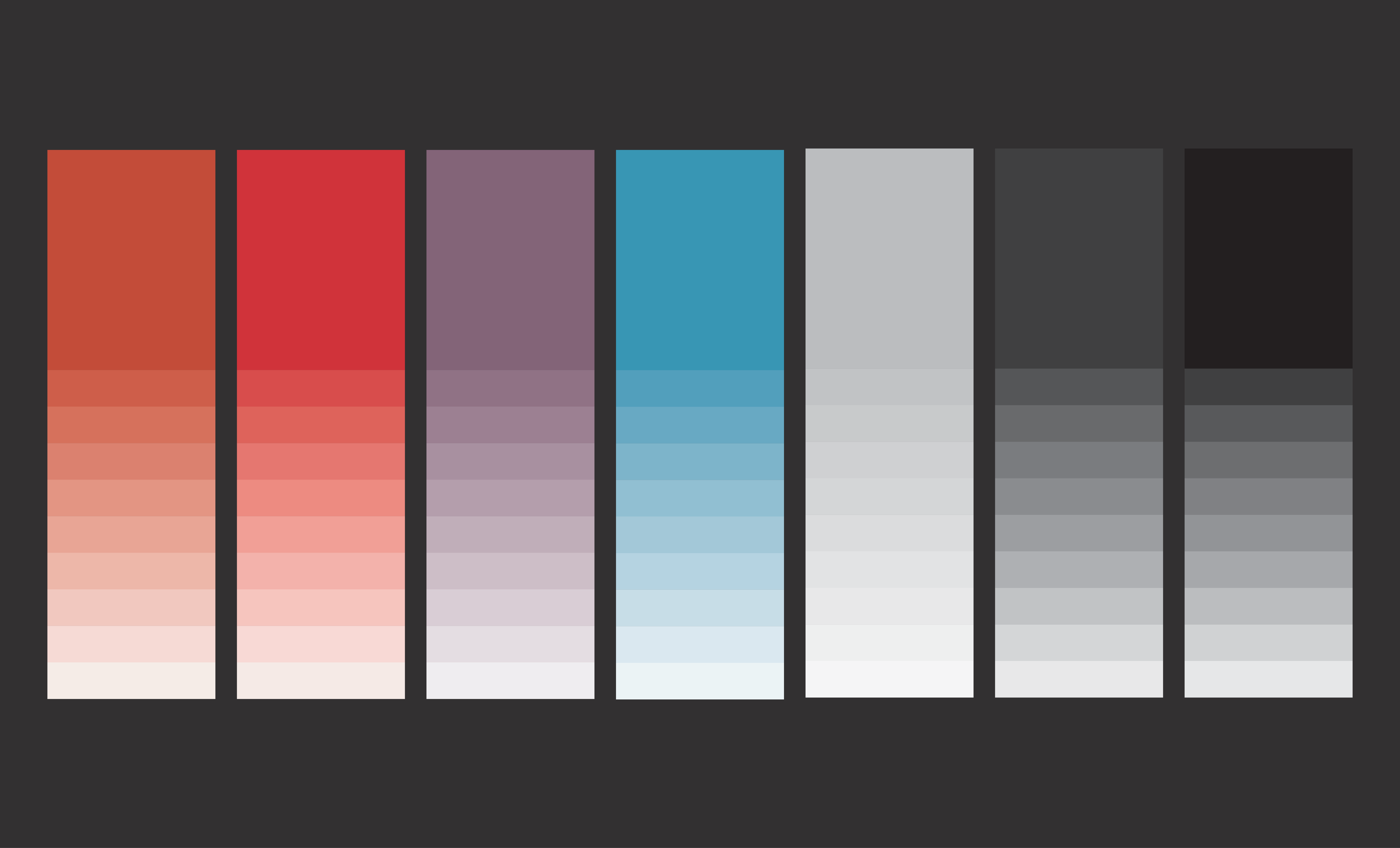
Tints are lighter shades derived from the base colours of the palette. They are used to create variations in tone, add depth to designs, and maintain consistency across brand materials.
The APPLICATION:
Highlighting: Utilize lighter tints to highlight key elements, such as headlines, call-to-action buttons, or focal points in visual compositions.
Backgrounds: Apply tints as backgrounds to provide contrast for text and graphics, ensuring readability and visual appeal. Adding a subtle tint behind your text or graphics, can improve their legibility and make your design more aesthetically pleasing.
Accentuation: Use tints sparingly to accentuate specific details or sections within designs, drawing attention to important information.
Recommended USE:
Consistency: Maintain consistency in the application of tints across all brand materials, ensuring a cohesive and unified look.
Hierarchy: Establish a hierarchy of tints based on their importance within the design hierarchy, with darker tints for primary elements and lighter tints for secondary or supporting elements.
Accessibility: Ensure that text overlaid on tinted backgrounds remains legible and accessible, adjusting contrast and typography to enhance readability.
TINTS GUIDELINES
Tint Values: Use the specified CMYK values provided in the brand palette for creating tints. Avoid altering the values to maintain colour accuracy and consistency.
Contrast: Maintain sufficient contrast between text and tinted backgrounds to ensure readability, following accessibility guidelines for text contrast ratios.
Balance: Strike a balance between tints and other brand colours to avoid overwhelming designs and maintain visual harmony.
LOGO OPTIONS
ORIGINAL
USING COLOUR
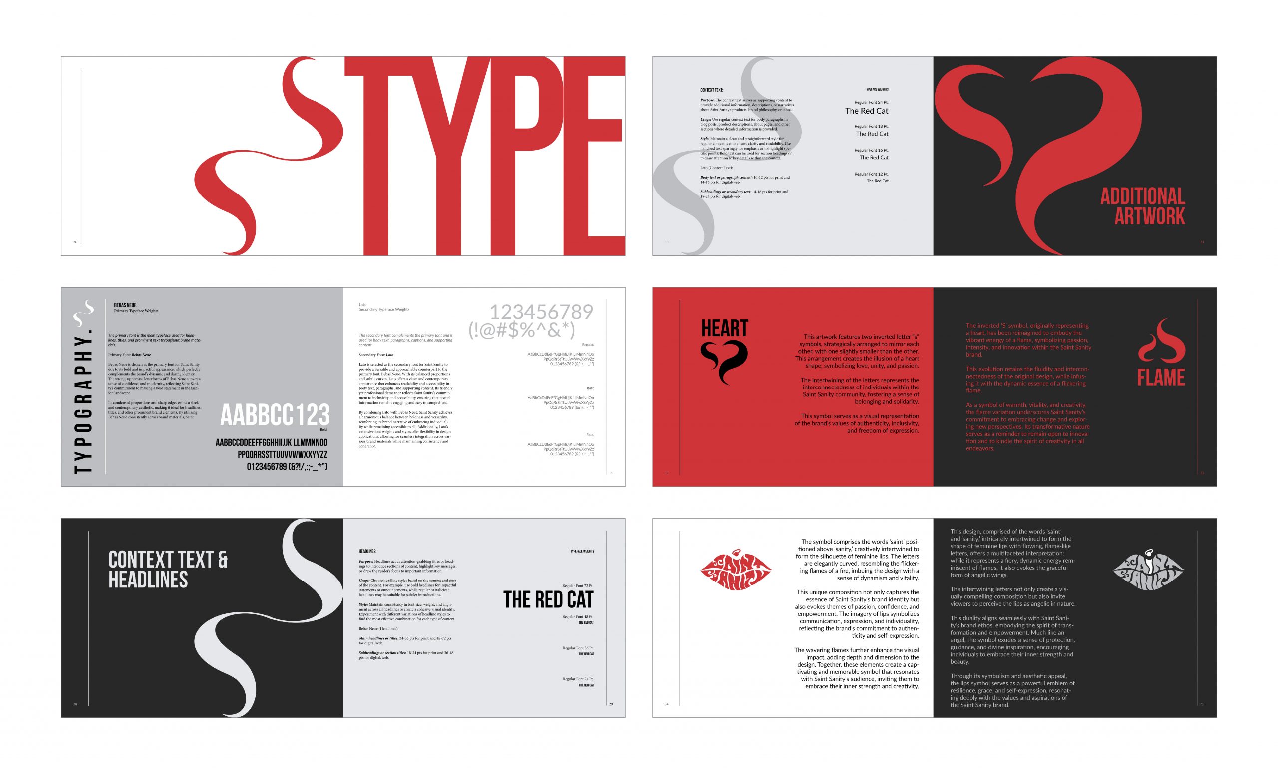
The TYPOGRAPHY
BEBAS NEUE
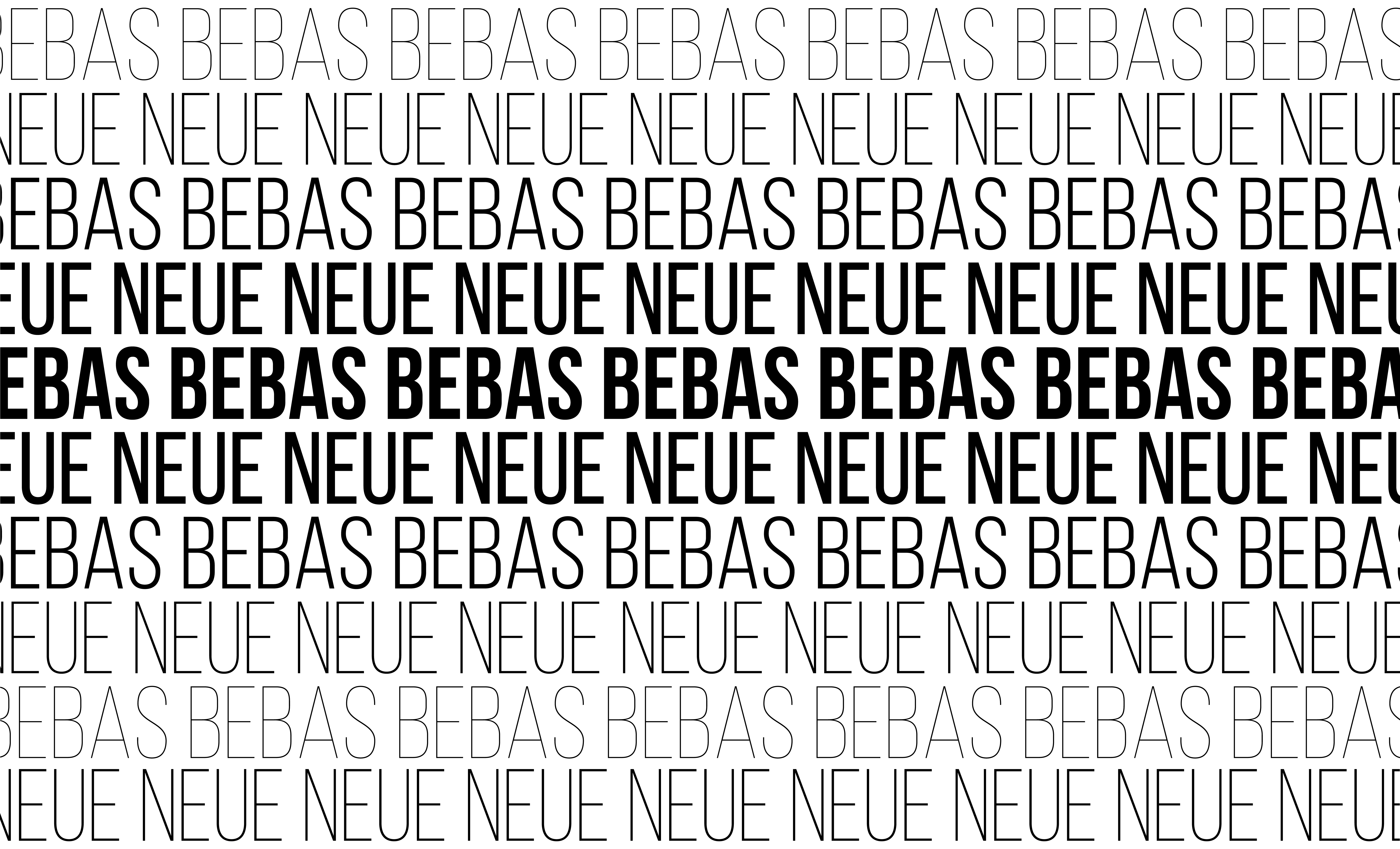
PRIMARY TYPEFACE WEIGHTS
The primary font, the workhorse of your brand’s visual language, takes center stage for headlines, titles, and prominent text throughout Saint Sanity’s materials.
Primary Font: Bebas Neue
Bebas Neue is chosen as the primary font for Saint Sanity due to its bold and impactful appearance, which perfectly complements the brand’s dynamic and daring identity. The strong, uppercase letterforms of Bebas Neue convey a sense of confidence and modernity, reflecting Saint Sanity’s commitment to making a bold statement in the fashion landscape.
Its condensed proportions and sharp edges evoke a sleek and contemporary aesthetic, making it ideal for headlines, titles, and other prominent brand elements. By utilizing Bebas Neue consistently across brand materials, Saint Sanity establishes a visually striking identity that resonates with its target audience and reinforces its position as a trendsetter in the industry.
LATO
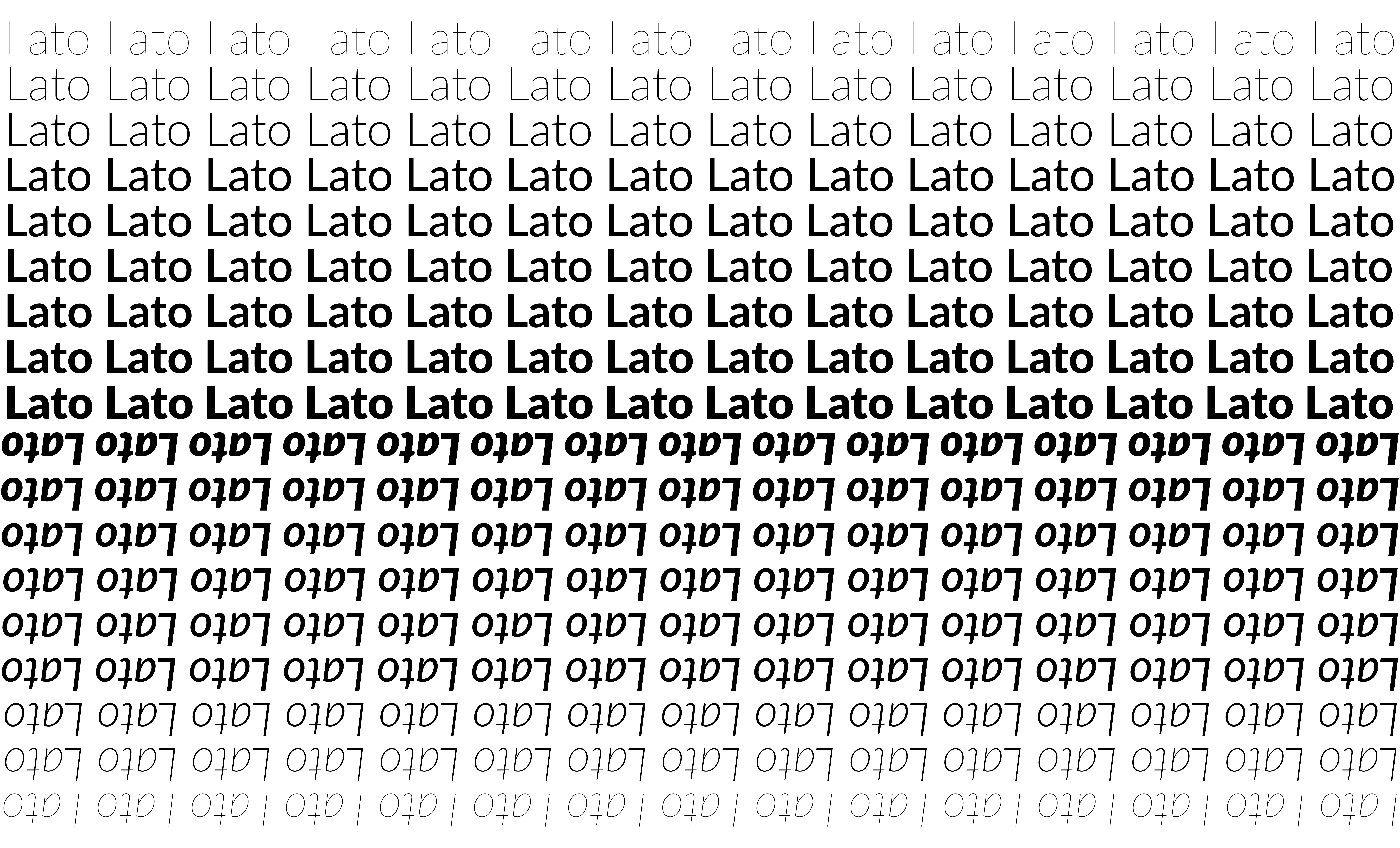
Secondary Typeface Weights
The secondary font complements the primary font and is used for body text, paragraphs, captions, and supporting content.
Secondary Font: Lato
Lato is selected as the secondary font for Saint Sanity to provide a versatile and approachable counterpart to the primary font, Bebas Neue. With its balanced proportions and subtle curves, Lato offers a clean and contemporary appearance that enhances readability and accessibility in body text, paragraphs, and supporting content. Its friendly, yet professional demeanor reflects Saint Sanity’s commitment to inclusivity and accessibility, ensuring that textual information remains engaging and easy to comprehend.
By combining Lato with Bebas Neue, Saint Sanity achieves a harmonious balance between boldness and versatility, reinforcing its brand narrative of embracing individuality while remaining accessible to all. Additionally, Lato’s extensive font weights and styles offer flexibility in design applications, allowing for seamless integration across various brand materials while maintaining consistency.
Additional ARTWORK
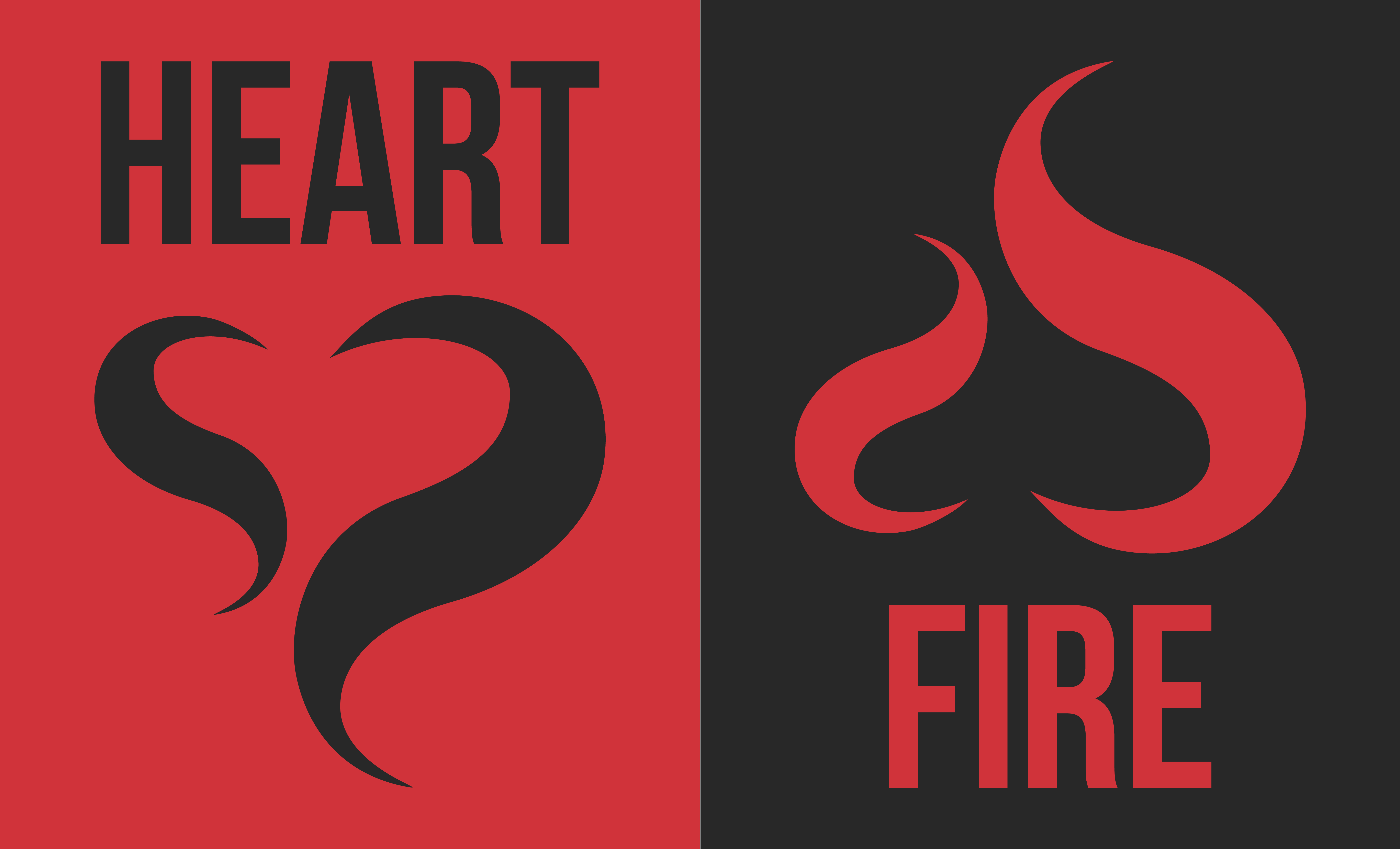
HEART
This artwork features two inverted letter “s” symbols, strategically arranged to mirror each other, with one slightly smaller than the other. This creates a heart shape, symbolizing love, unity, and passion.
The interlocking “s”s represent the interconnectedness of individuals within the Saint Sanity community, fostering a strong sense of belonging and solidarity.
FLAME
The inverted ‘S’ symbol, originally representing a heart, has been reimagined to embody the vibrant energy of a flame, symbolizing passion, intensity, and innovation within the Saint Sanity brand.
This evolution retains the fluidity and interconnectedness of the original design, weaving in the dynamic essence of a flickering flame to symbolize the ever-changing journey of self-discovery and the unwavering spirit of individuality.
As a symbol of warmth, vitality, and creativity, the flame variation underscores Saint Sanity’s commitment to embracing change and exploring new perspectives. Its transformative nature serves as a reminder to remain open to innovation and to kindle the spirit of creativity in all endeavours.
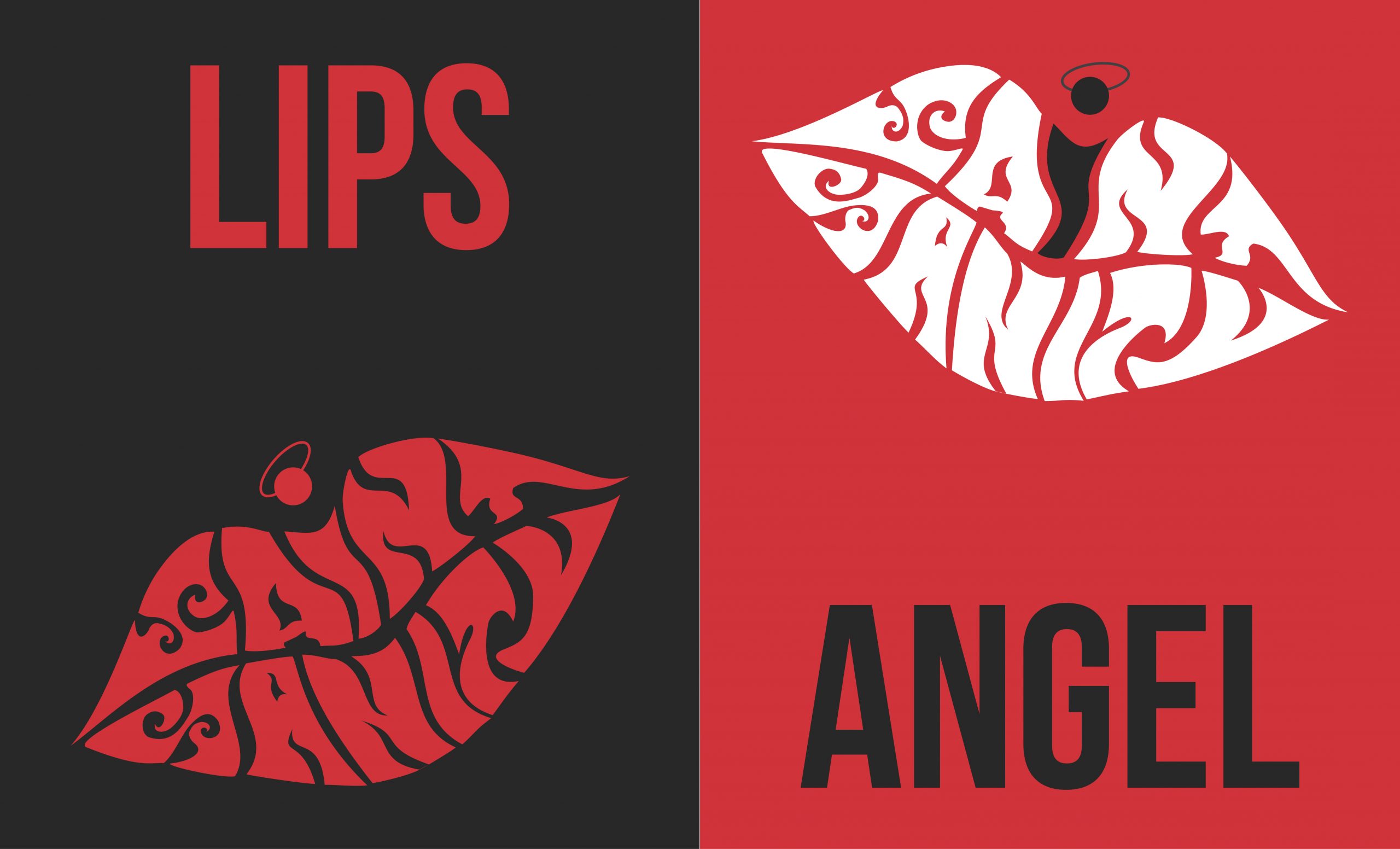
LIPS
The symbol, comprised of the words ‘saint’ and ‘sanity,’ intricately intertwined to form the shape of feminine lips with flowing, flame-like letters.
This design, while it represents a fiery, dynamic energy reminiscent of flames, it also evokes the graceful form of angelic wings. The wordplay, “saint” and “sanity,” hints at the balance between passion and control.
ANGEL
This duality aligns seamlessly with Saint Sanity’s brand ethos, embodying the spirit of transformation and empowerment, as it effortlessly transitions between the brand’s bold statements and its message of embracing your unique individuality.
Much like an angel, the symbol exudes a sense of protection, guidance, and divine inspiration, subtly encouraging individuals to tap into their inner strength and embrace their unique beauty, aligning perfectly with Saint Sanity’s mission of empowering self-expression.
Through its symbolism and aesthetic appeal, the lips symbol serves as a powerful emblem of resilience, grace, and self-expression, resonating deeply with the values and aspirations of the Saint Sanity brand.

