Portfolio | Web Design / E-Commerce / Graphic Design / PR – MONO
FOLLOW YOUR HEART!
Branding / Web Design | January 2024
A BRANDING & E-COMM PROJECT
BRAND PROFILE
MONO is a progressive fashion brand that merges art, technology, and individuality. Specializing in customizable apparel, MONO offers a platform for self-expression through bold, unique designs.
Brand Personality and Tone
MONO is bold, creative, and inspiring. The brand embodies a spirit of freedom, curiosity, and optimism. It encourages individuals to embrace their uniqueness.
Core Values :
- Individuality: Celebrating personal style and self-expression.
- Creativity: Fostering innovation and artistic exploration.
- Community: Building a supportive and respectful environment.
- Sustainability: A commitment to Mother Earth.
AUDIENCE
- Digital Natives: Tech-savvy individuals who appreciate the fusion of art and technology in fashion.
- Self-Expressive Individuals: People who use fashion as a form of self-expression and are drawn to unique, personalized styles.
- Conscious Consumers: Individuals who prioritize ethical fashion choices while seeking stylish options.
- Gen Z & Millennials: A demographic known for their interest in streetwear and social causes.
- Art and Design Enthusiasts: People who appreciate visually inspiring designs and are drawn to brands that push creative boundaries.
Key characteristics of the MONO customer:
- Values individuality and self-expression
- Interested in technology and innovation
- Appreciates art and design
- Conscious of social and environmental issues
- Seeks affordable yet stylish fashion option
The LOGOTYPE
LOGO ANALYSIS
The MONO logo is a minimalist wordmark. It features the word “MONO” in clean, sans-serif typography without spaces between letters evoking modernity that conveys a contemporary and clean aesthetic.
- Simplicity: The logo adheres to the principle of minimalism, focusing solely on the brand name.
- Readability: The typography is clear and easy to read, ensuring immediate recognition.
- Versatility: The logo’s simplicity allows for easy adaptation to various applications and sizes.
- Modernity: The sans-serif font conveys a contemporary and clean aesthetic.
SYMBOLISM
Concept: Unity in Diversity
- Shape: The circle, representing unity and wholeness, symbolizes structure and order.
- Color: A monochromatic color scheme (black and white) emphasizes simplicity and focus.
- Typography: Bold sans serif typography without spaces conveys modernity, unity, and an urban edge, suggesting a forward-thinking, and cohesive brand identity.
- Circle: Symbolizes unity, infinity, and wholeness, aligning with the concept of “one” or “single.”
- Rectangle: Represents stability, order, and structure, which can be associated with the order of things.
The HOME

From concept to cart!
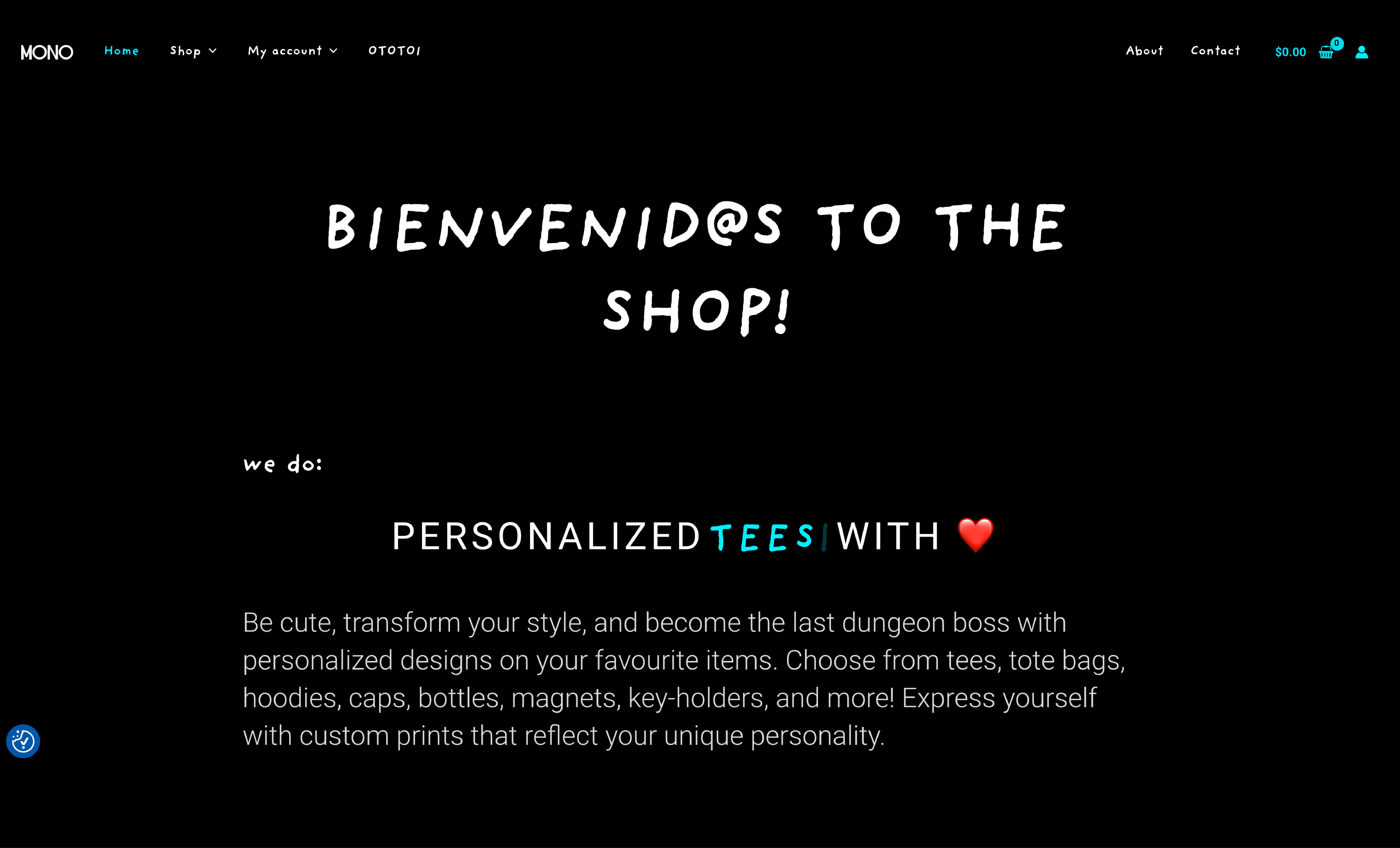
MONO is a unique fashion brand that merges art, technology, and social consciousness. It’s a platform for self-expression through personalized apparel. By combining vibrant Mexican art with minimalist Japanese aesthetics and a touch of Canadian pop culture, MONO creates one-of-a-kind designs that resonate with individuality.
The MONO website’s navigation is highly effective, employing clear and concise labels such as “Shop” and “About Us.” The logical placement of the main menu at the top of the page ensures easy accessibility for users.
The hero section is visually engaging, with bold typography and dynamic language that effectively communicates the brand’s personality. The inclusion of a brief product showcase within the hero area provides valuable context for potential customers, encouraging further exploration of the website. Lastly, The use of a call-to-action encourages engagement.
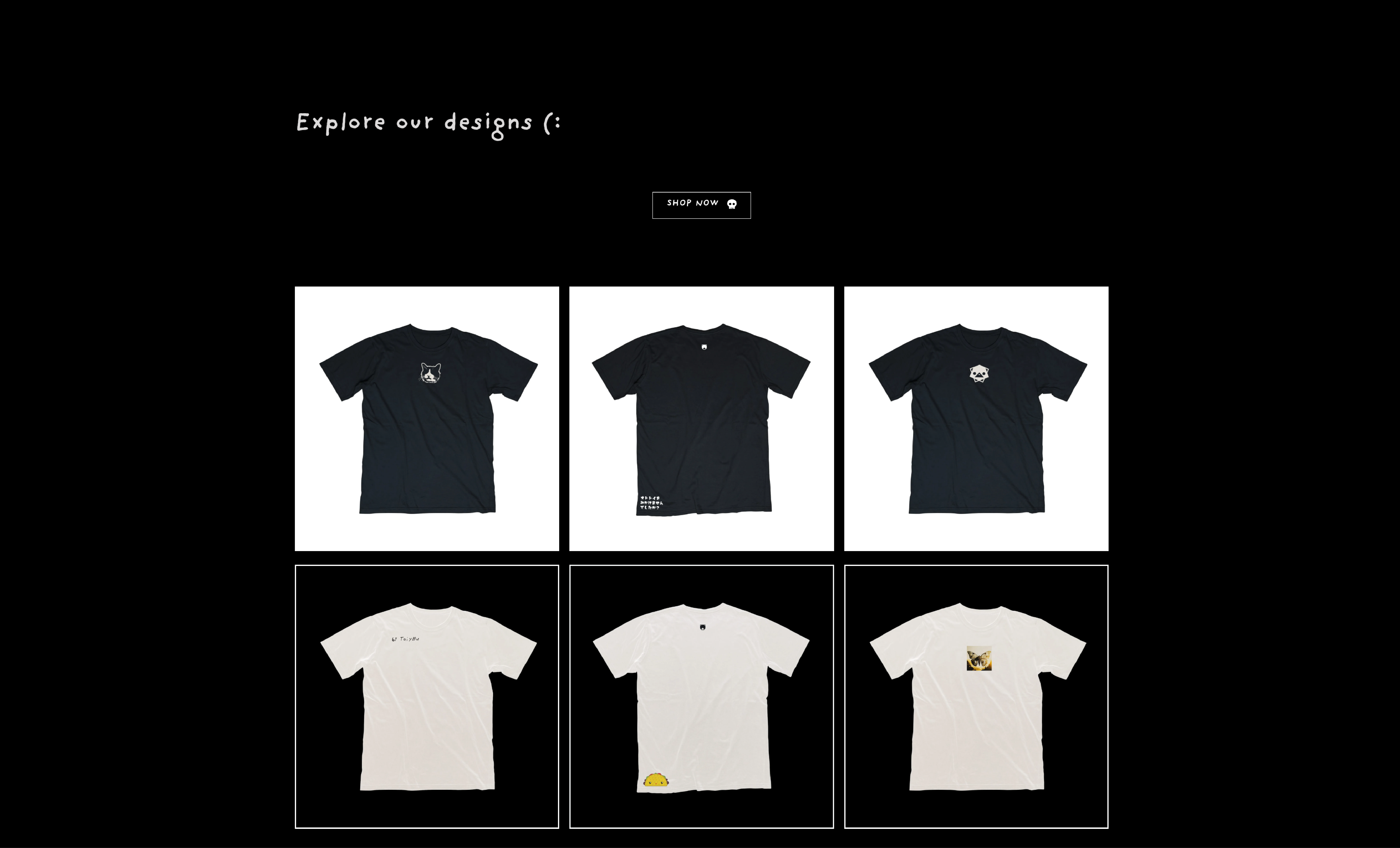
Product SHOWCASE

GRID
Immediately following the hero section and its call-to-action, a concise product showcase can effectively grab user interest. A curated selection of best-selling or new arrival items presented in a visually appealing grid format invites exploration.
This strategic placement reinforces the brand’s value proposition and encourages seamless transition from initial engagement to product discovery.
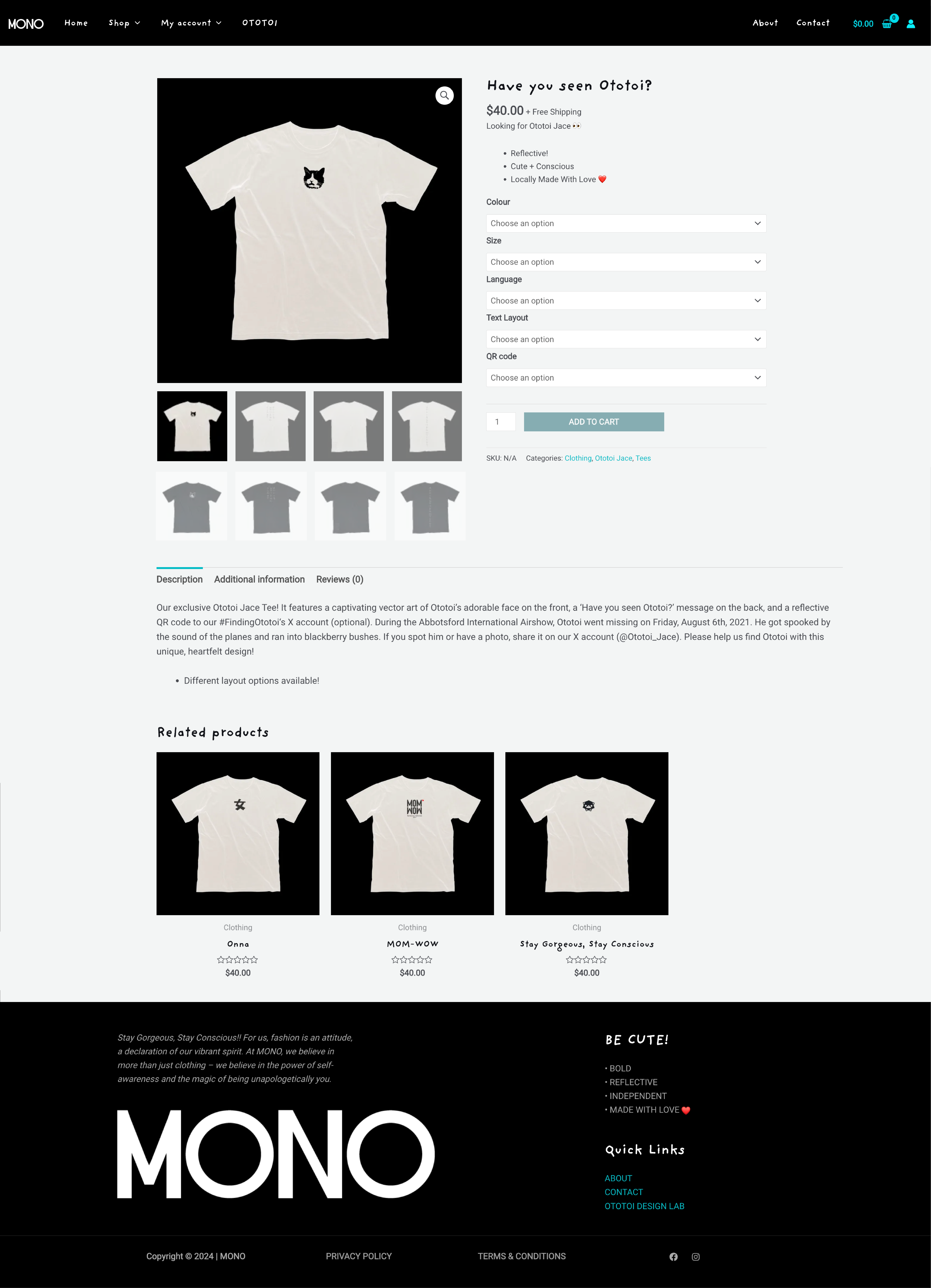
The PRODUCT

The product page serves as the cornerstone of online retail, providing a comprehensive showcase of each item.
Featuring high-quality, multiple option product imagery, detailed descriptions highlighting key features and benefits, and customer reviews, the product page empowers consumers to make informed purchasing decisions. Essential elements such as sizing charts, additional info, related products,, and clear calls to action further enhance the user experience, guiding customers through the purchasing journey.
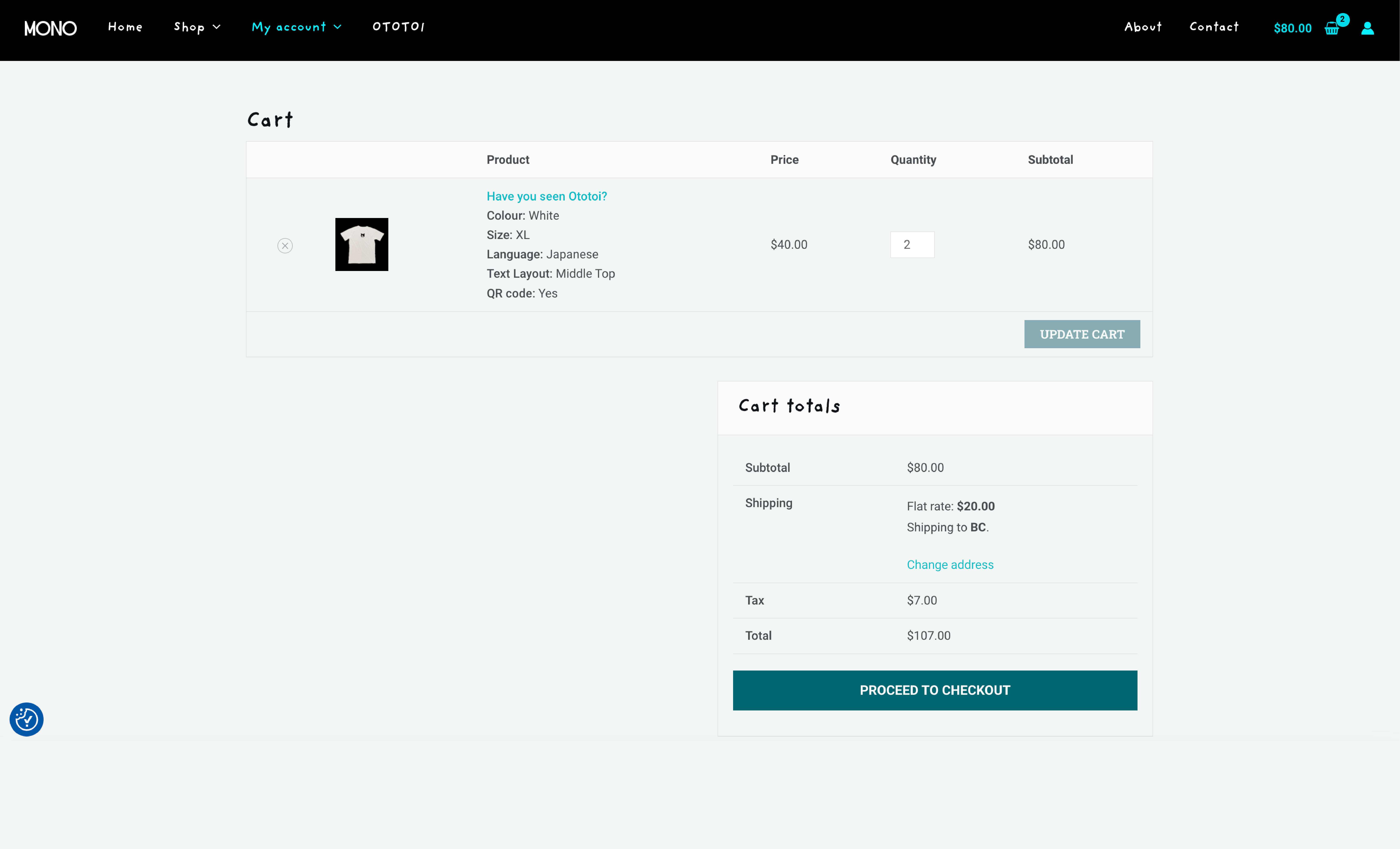
The CART

The cart page serves as a critical juncture in the customer journey. Displaying a clear and concise summary of selected items, including product images, quantities, and prices, it offers customers a final opportunity to review their purchase. Essential functionalities such as removing items, adjusting quantities, and applying discount codes should be readily accessible. A prominent checkout button, along with estimated shipping and tax information, guides customers towards completing their order.


