Portfolio | Graphic Design – Kumo (Concept)
SIMPLY CLOUD.
Branding / Menu Design | December 2022
INTRO
“KUMO” is a made–up restaurant combining nature + technology through the fusion of AI technology + traditional Japanese cuisine. KUMO offers personalized, immersive rooms powered by AI, with a holographic interactive 3D projection experience while providing fine dining.
THEME. Modern + Japanese
CLIENTELE. People (25 -105 years old) without limits, looking for perfection and thriving balance for a peaceful life.
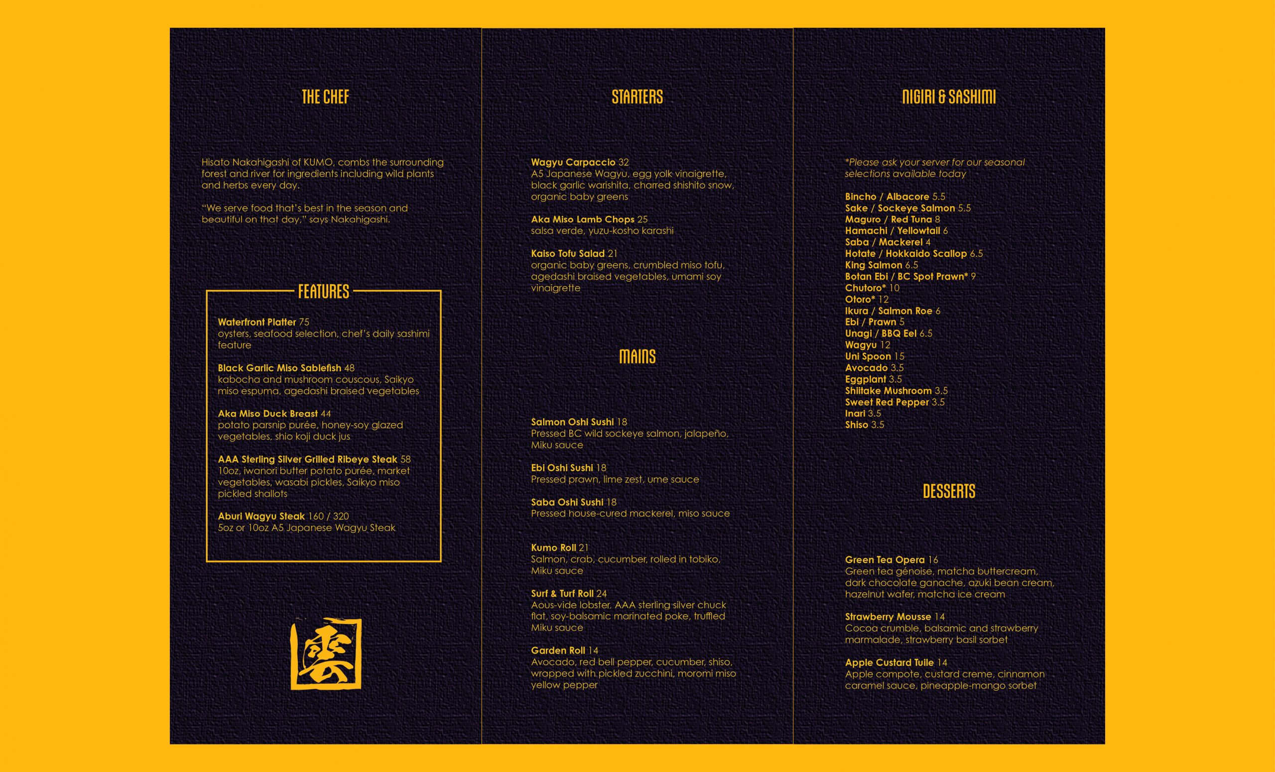
THE DESIGN is clean and minimalist, focusing on typography that is easy to read and navigate. Enabling the customers to quickly find what they are looking for and make their selections without confusion.
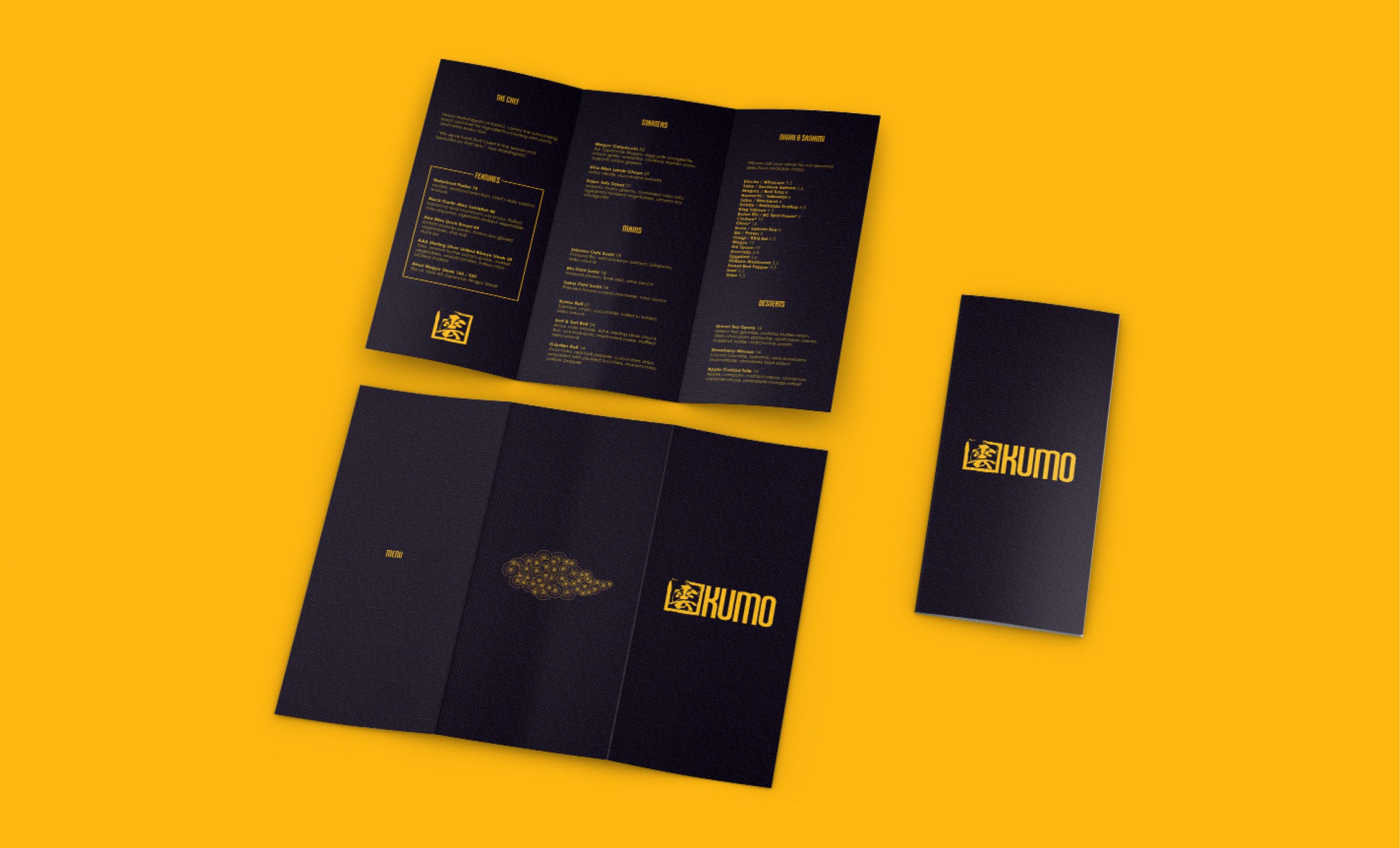
The modern design is intended to reflect the elegance and sophistication of traditional Japanese cuisine while adding a contemporary element. defined by simplicity, subtle sophistication, deliberate use of texture, and clean lines.
DELIVERABLES: Visual Identity | Main Menu | Beverage Menu | iPad Continuous Scrolling Menu
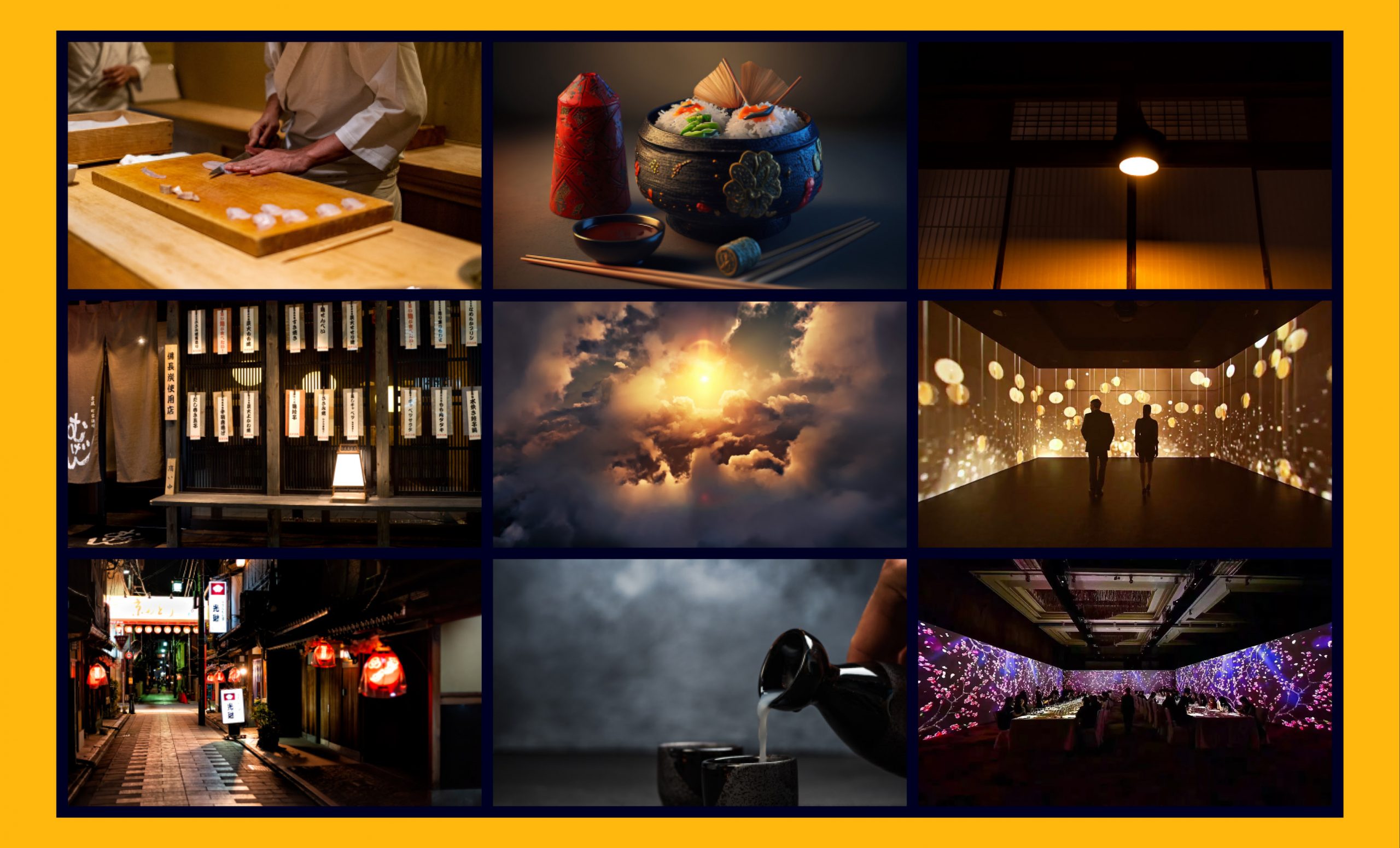
MOOD BOARD
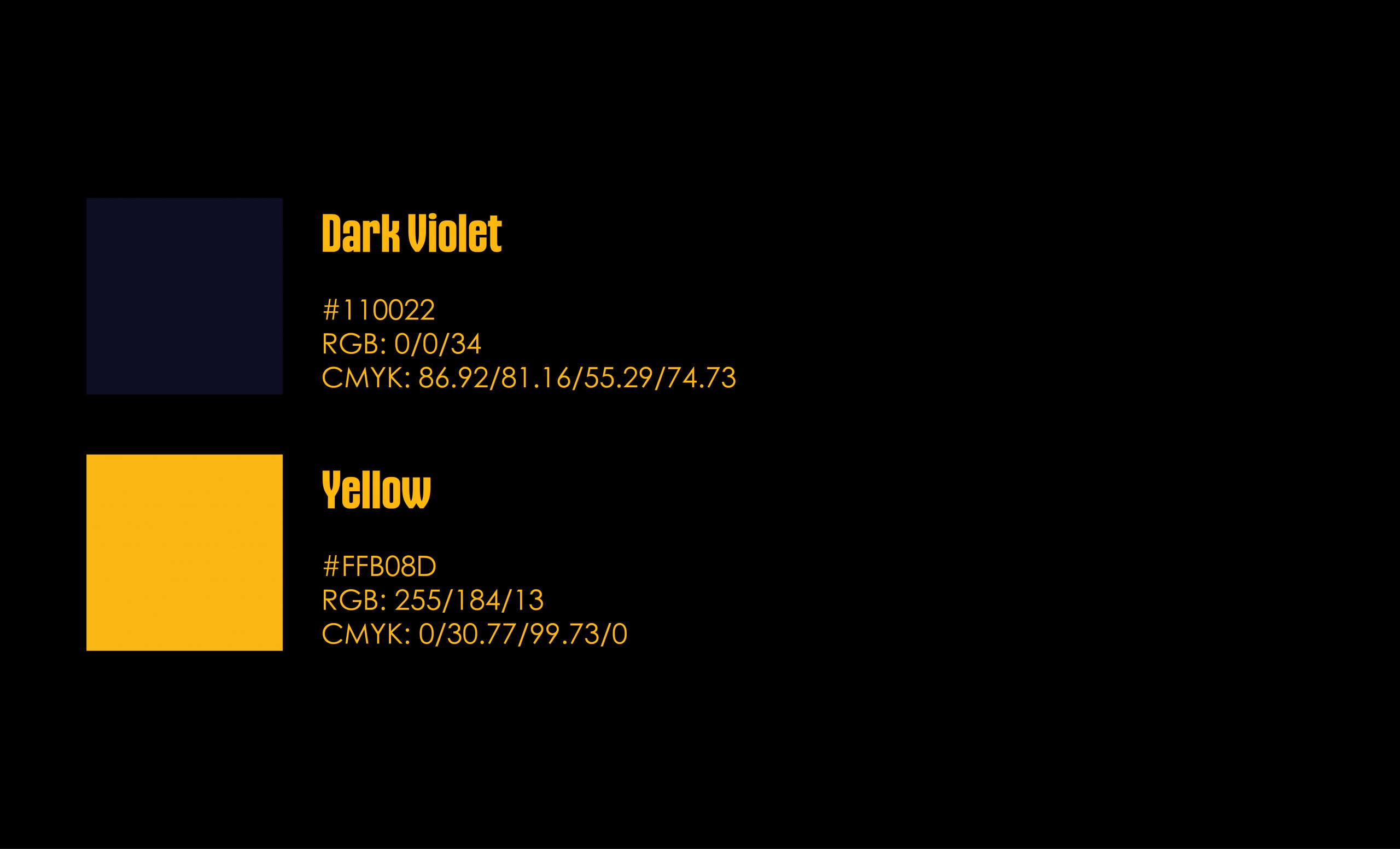
COLOUR
VIOLET is the colour of the sky before the dusk. Violet combines the stability of blue and the energy of red. Violet is associated with royalty, and symbolizes power, nobility, luxury, and ambition. It conveys wealth and extravagance.
YELLOW is the colour of the rising sun. It relates to food, and this golden shade is associated with the promise of better times. The yellow accent adds a sense of warmth and approachability to the design. It is also a nod to the rich cultural heritage of Japan, where yellow is associated with good luck and prosperity.
TYPEFACE
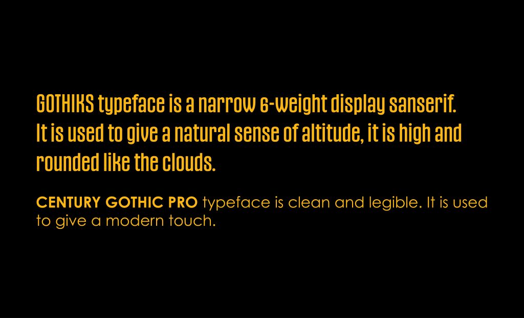
GOTHIKS typeface is a narrow 6-weight display sanserif. It is used to give a natural sense of altitude, it is high and rounded like the clouds.
CENTURY GOTHIC PRO typeface is clean and legible. It is used to give a modern touch.
The selection of Gothiks and Century Gothic Pro for the design creates consistency, legibility, modern aesthetics, versatility, and brand alignment. These typefaces work harmoniously to enhance the dining experience, making it easy for customers to navigate the menu and make informed choices. The resulting design is visually appealing, aligned with the restaurant’s brand, and ultimately, contributes to a positive and memorable dining experience.
These typefaces reflect the restaurant’s commitment to modernity, sophistication, and approachability. By utilizing these typefaces consistently throughout various branding materials, including the menu, we establish a visual connection between the restaurant and its customers, fostering brand recognition and loyalty.
LOGO
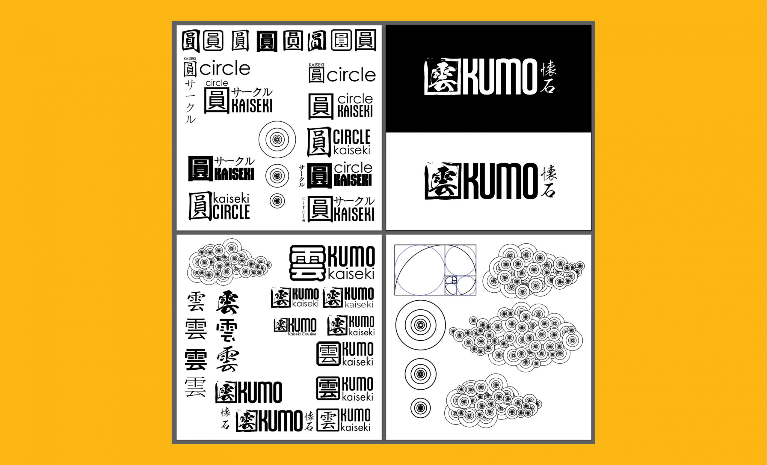
THE LOGO is the kanji for kumo written using the KsoKokuryuSou Regular typeface created by Japanese calligrapher Eisen Tsunanori.
THE CIRCLE is a universal symbol that depicts infinity. In Japan, the circle in the middle of the national flag represents a rising sun.
KUMO means cloud in Japanese, and it represents high quality.
THE SQUARE is used as a frame to give it a sense of stability by depicting a mathematical order with angles that form the square.
TYPEFACE, Gothiks Book used for the word kumo. It is a tall and rounded san-serif that communicates modern high quality.
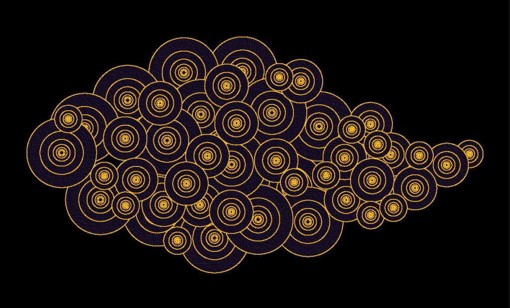
THE CLOUD was created using seven circles sized following the golden ratio. It symbolizes technology evolving through nature, and it works as an accent.
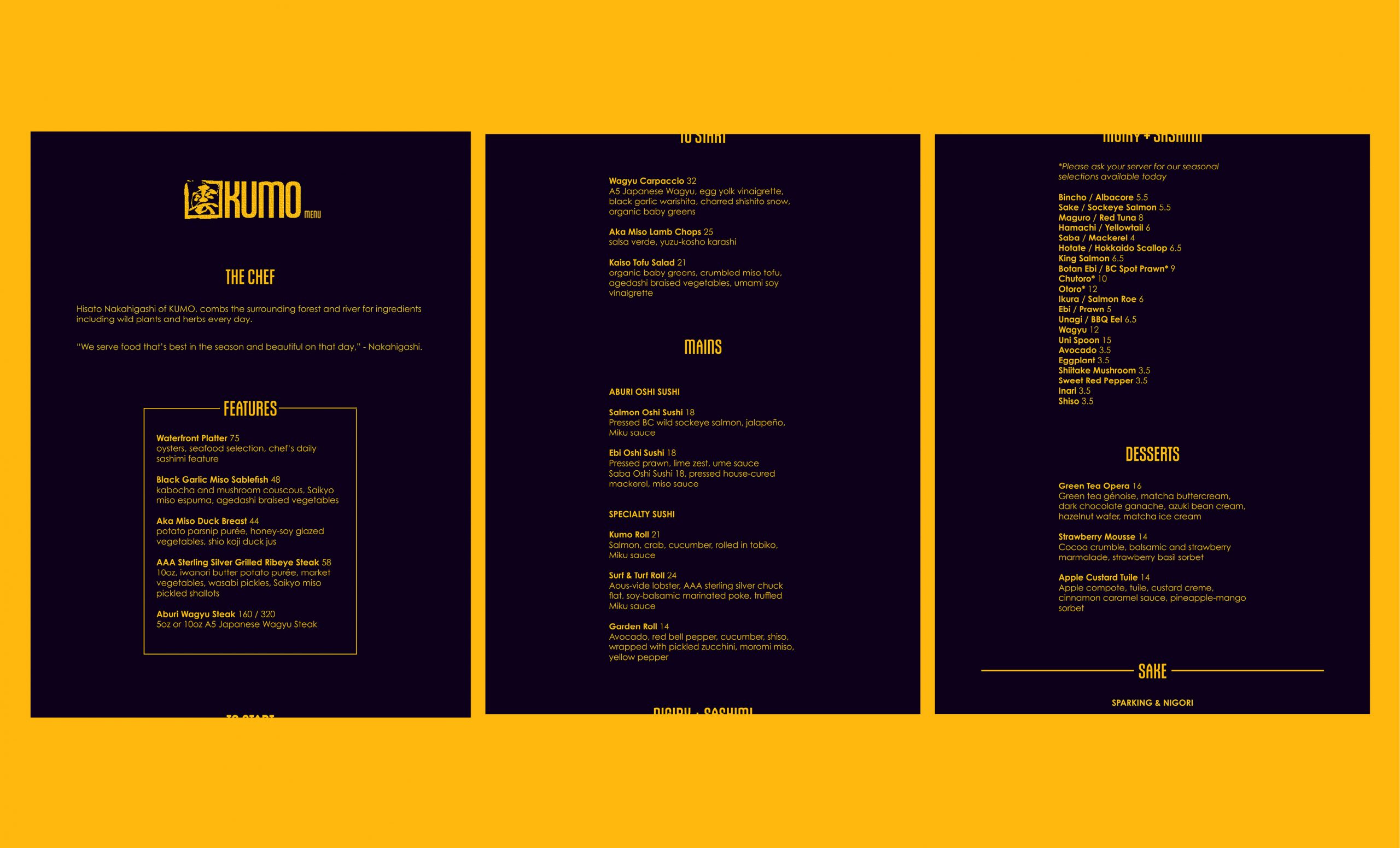
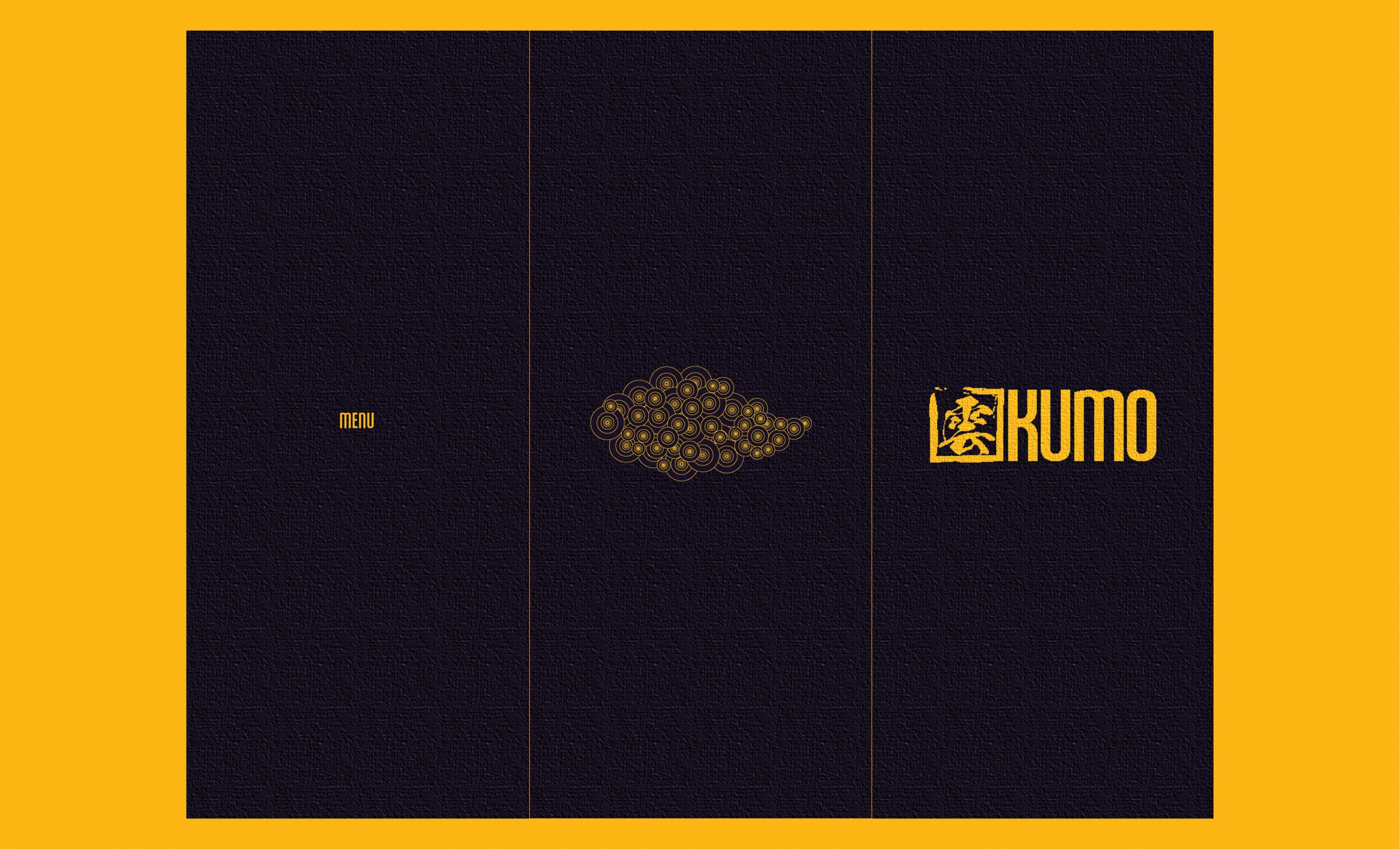
MAIN MENU
15" x 11.5"
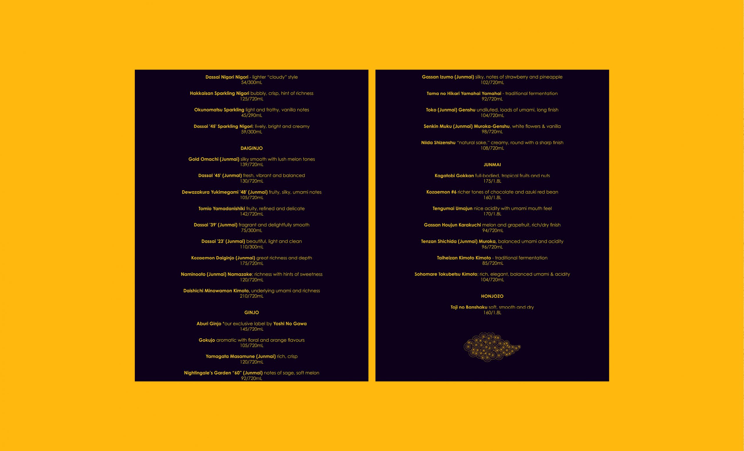
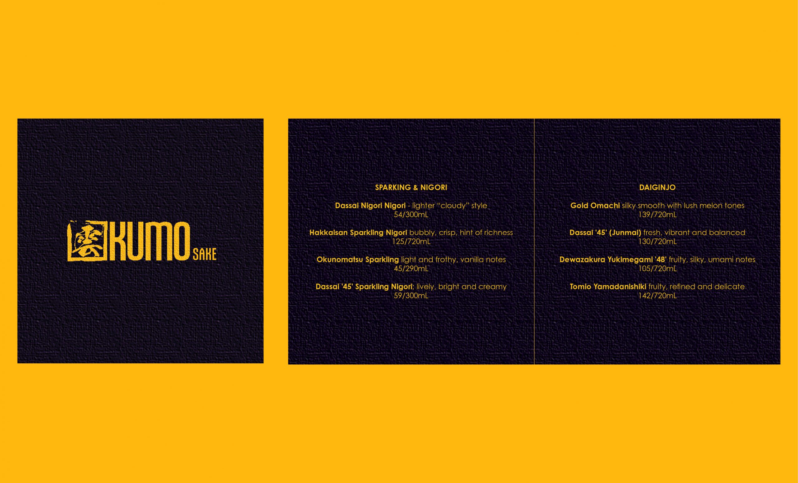
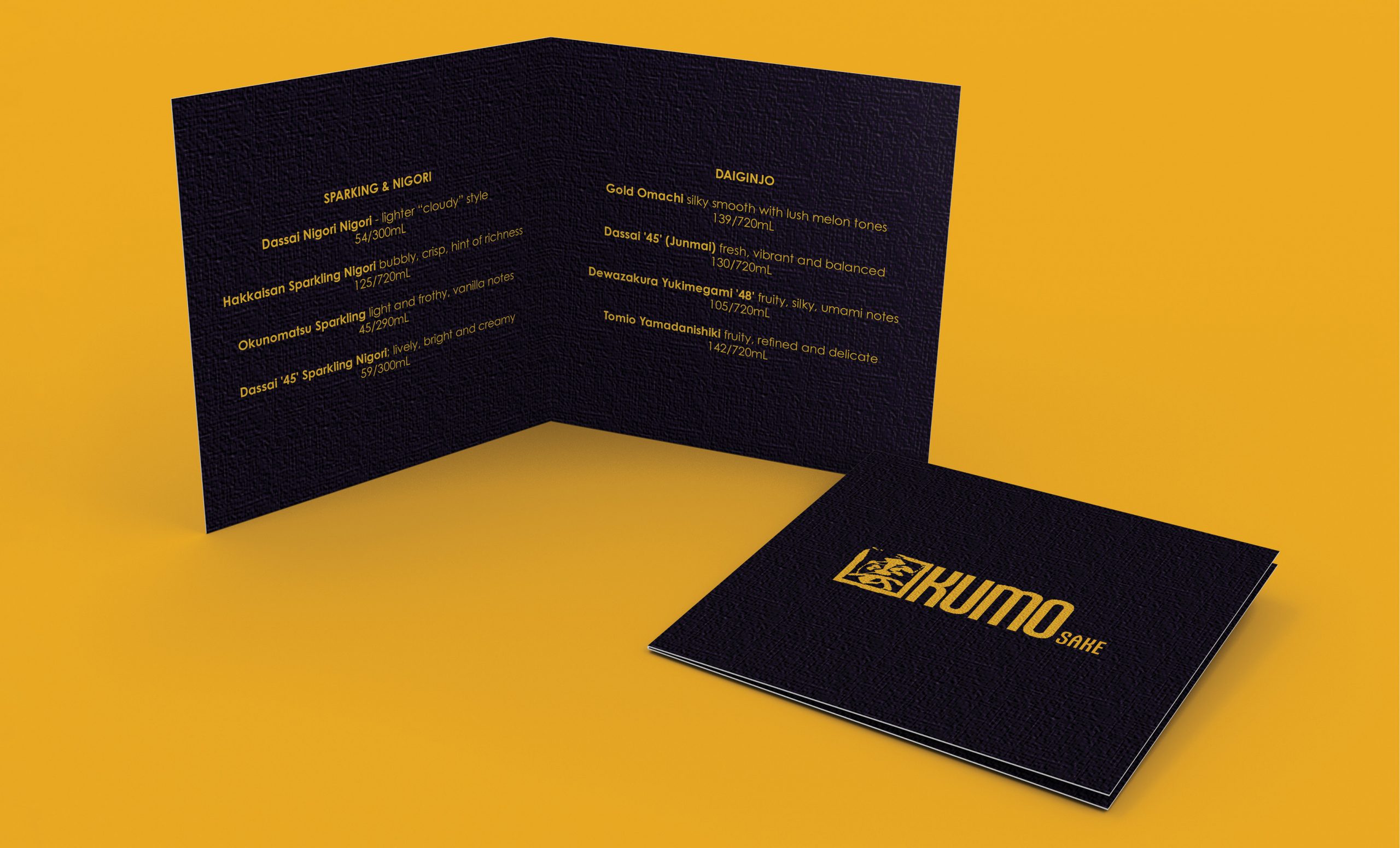
DRINKS MENU
5" x 5"
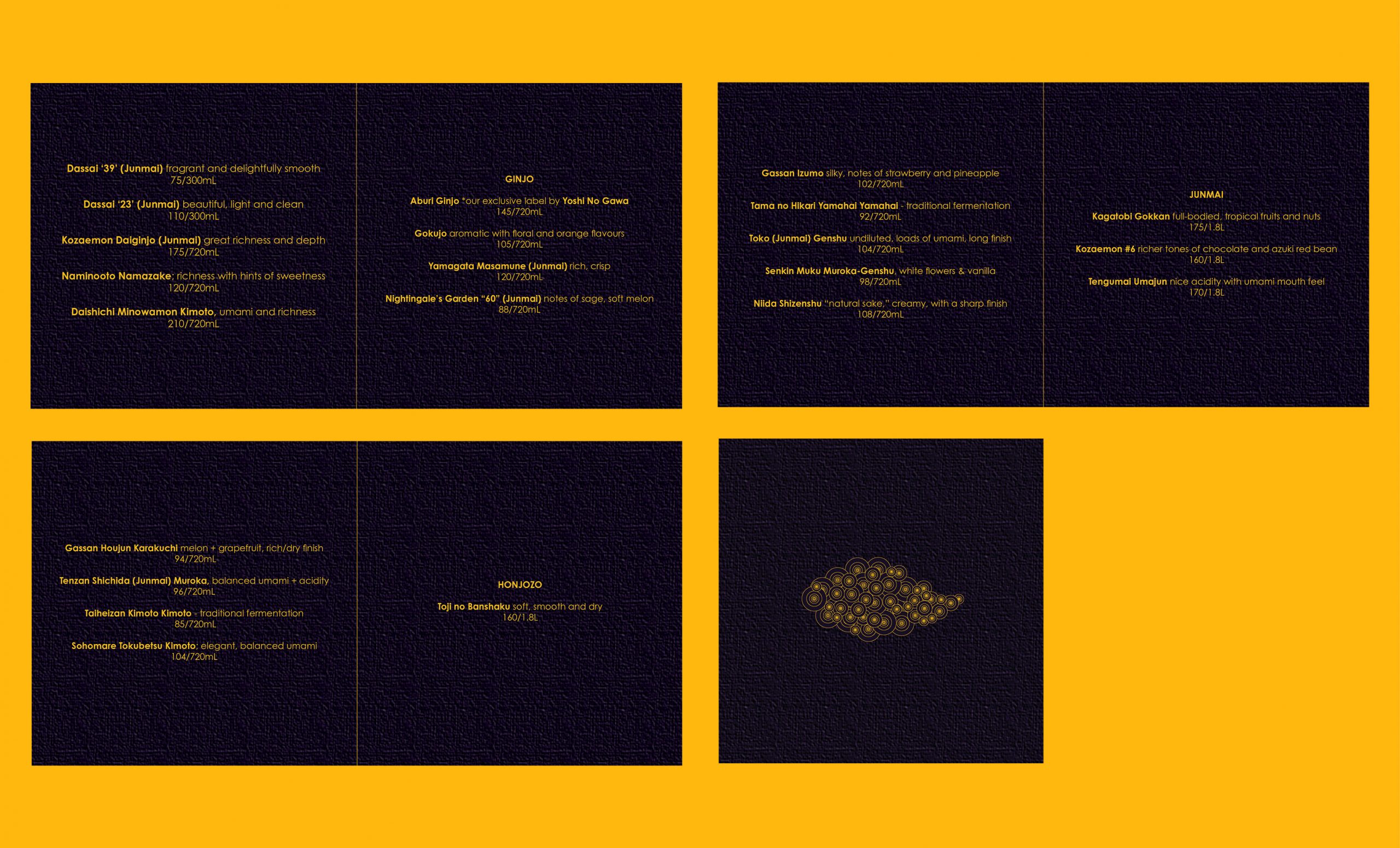
*Menu items were taken from Miku’s Restaurant in Vancouver BC, for reference.
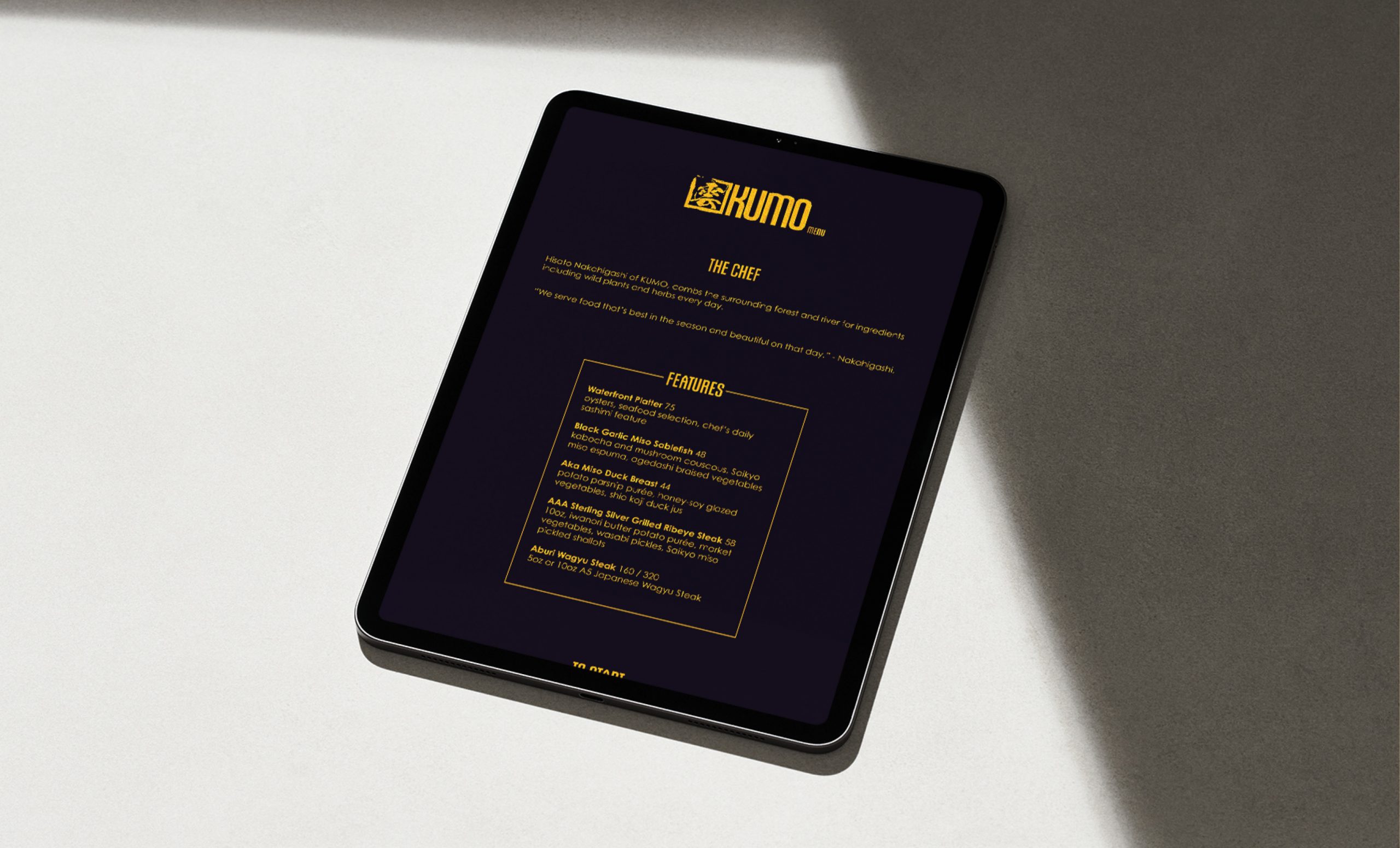
iPad MENU
CONTINUED SCROLLING
