Portfolio | Graphic Design / PR – Enjoitech Solutions Inc.
REIMAGINING TECHNOLOGY'S HUMAN SIDE.
Branding | January 2025
Client Overview
Enjoitech Solutions Inc. is a forward-thinking technology company that integrates innovative, human-centred solutions into everyday life. Specializing in industries like real estate, travel, and finance, Enjoitech’s mission is to create intuitive, user-friendly technology that simplifies workflows and enhances experiences.
By blending cutting-edge innovation with a human touch, Enjoitech combines the power of technology with the expertise of skilled engineers to deliver reliable, high-quality products. This commitment ensures that every solution not only meets user needs but also enriches their lives, making technology more accessible and impactful.
Project Overview
This project involved a comprehensive rebranding of Enjoitech, an innovative IT company dedicated to creating technology inspired by and designed for human nature. Starting with only the company name, I led the entire process—from research and strategy to design and execution—to develop a cohesive visual and strategic brand experience that effectively communicates Enjoitech’s mission, values, and unique approach to technology.
Key Contributions:
Conducted in-depth market research and target audience analysis to define the brand’s positioning and messaging.
Developed the brand strategy, including mission, vision, values, and unique selling proposition (USP).
Created the visual identity, including logo design, typography, and colour palette, ensuring alignment with the brand’s human-centred ethos.
Crafted brand messaging and guidelines to ensure consistency and clarity across all touchpoints.
Redesigned the company website to align with the new brand identity, enhancing user experience and ensuring a seamless digital presence.
Objective:
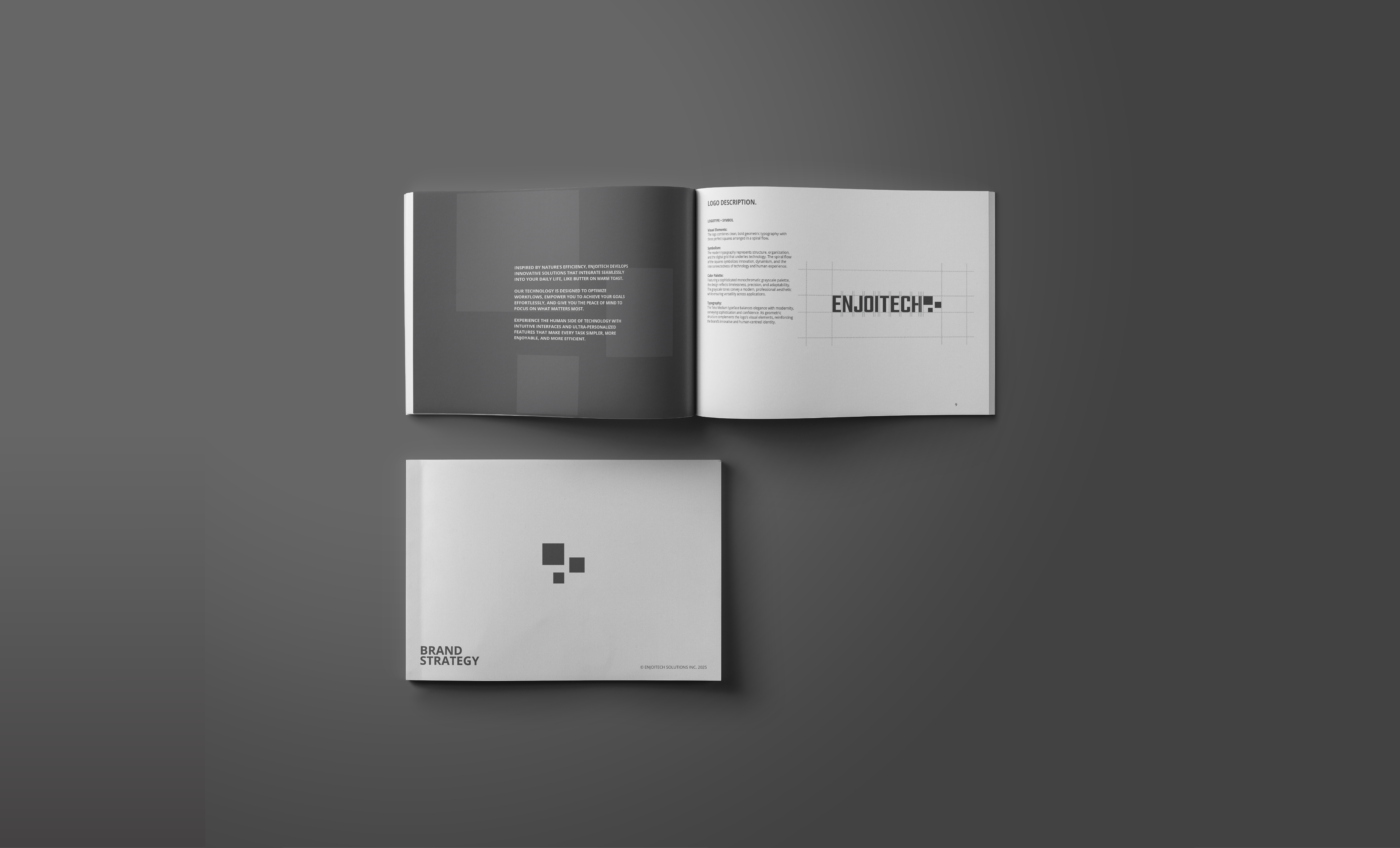
To establish a consistent and memorable brand experience that aligns with Enjoitech’s core values. The deliverables include a 17-page brand guideline covering logo design, typography, colour palette, and brand messaging, as well as a redesigned website, ensuring cohesion and professionalism across all applications.
BEFORE & AFTER
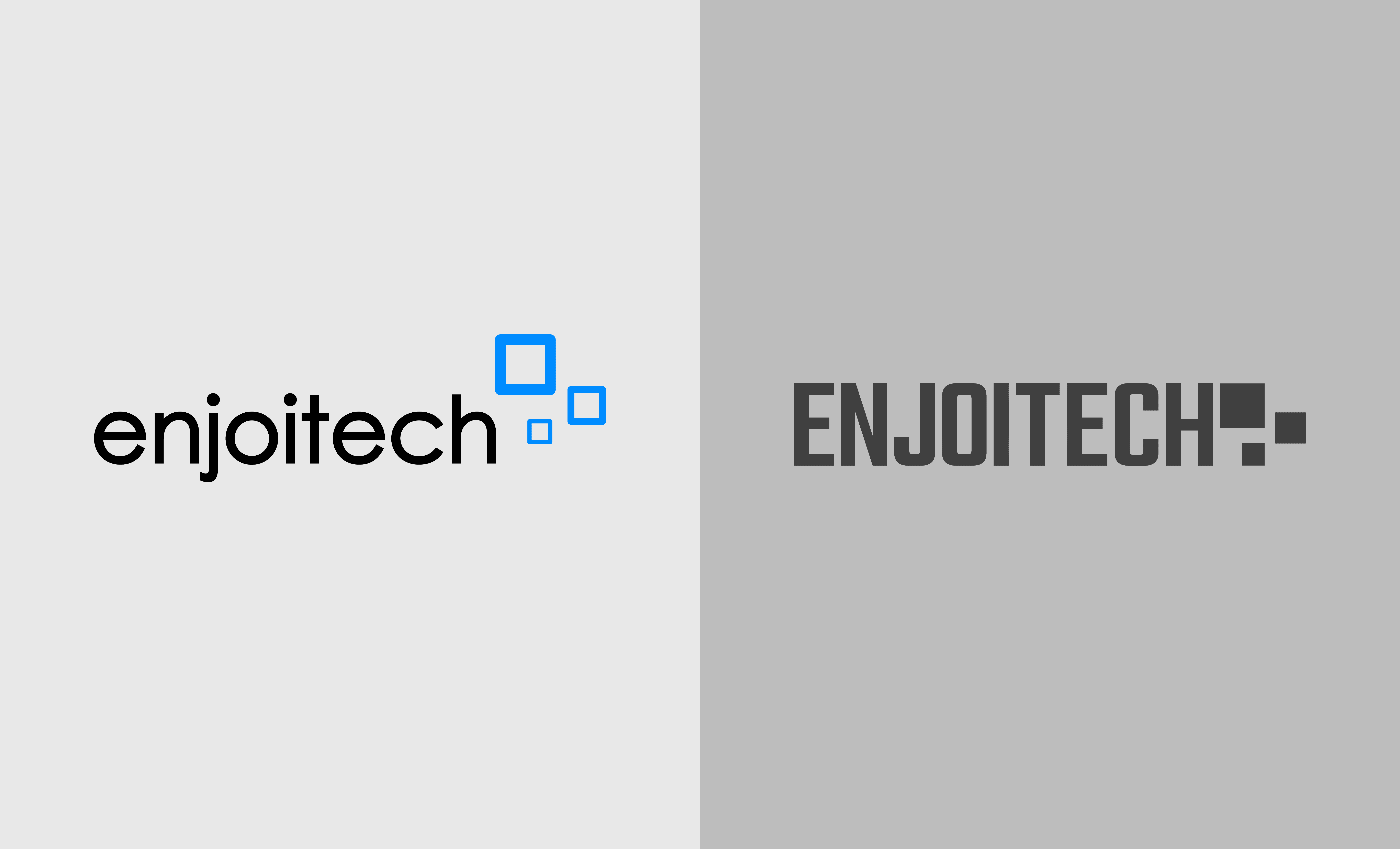
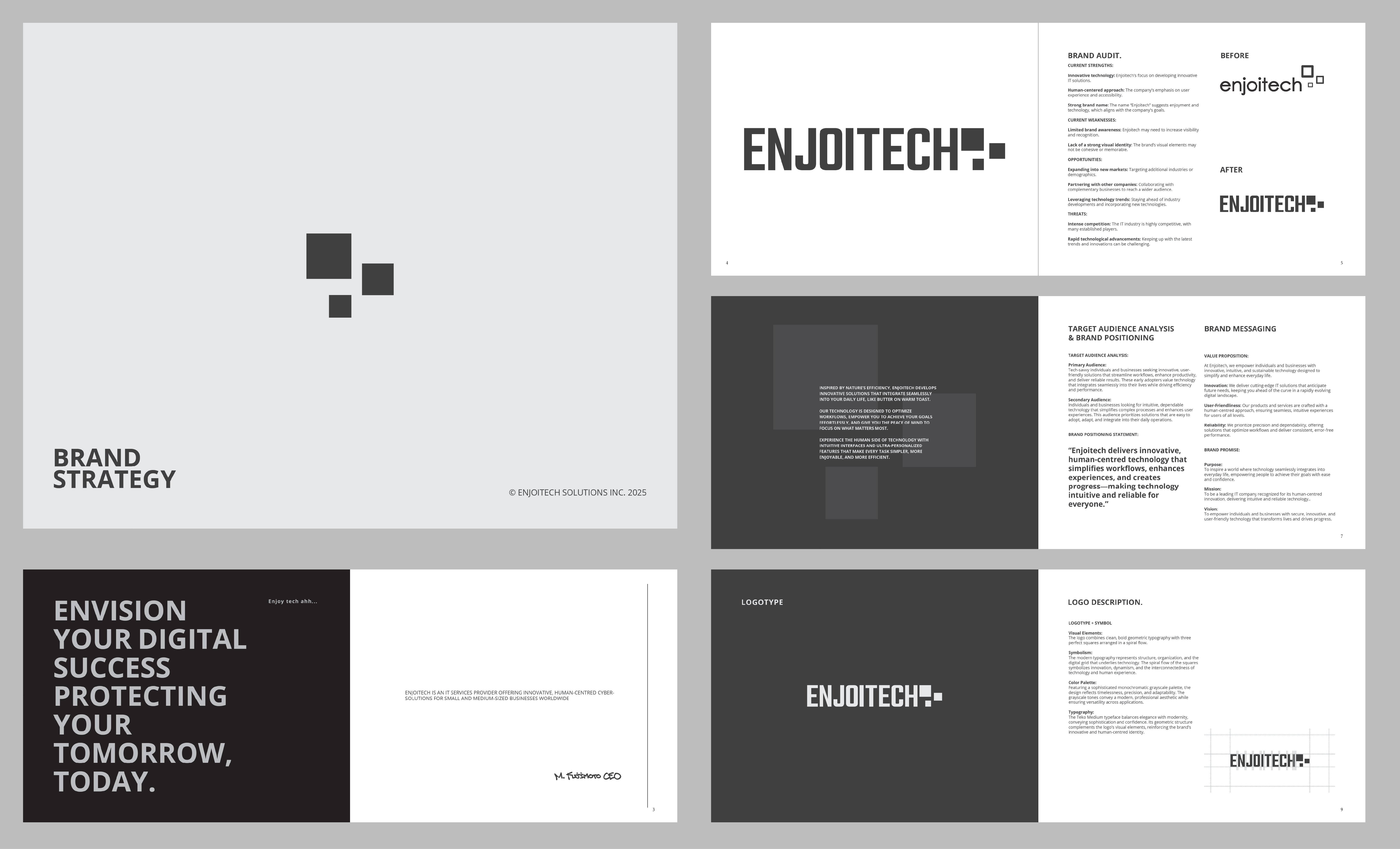
BEFORE:
The original logo for Enjoitech Solutions Inc. featured three blue squares arranged in a spiral pattern, adhering to the golden ratio. This design created a balanced, harmonious composition, reflecting the company’s innovative and forward-thinking nature. The blue colour scheme conveyed trust, intelligence, and dependability—key attributes in the IT industry. The vibrant blue added energy and excitement, while the squares symbolized the company’s focus areas: web, mobile, and security.
While the simple and modern sans-serif typography supported professionalism and clear communication, it lacked a human touch, giving the logo a more impersonal, corporate feel.
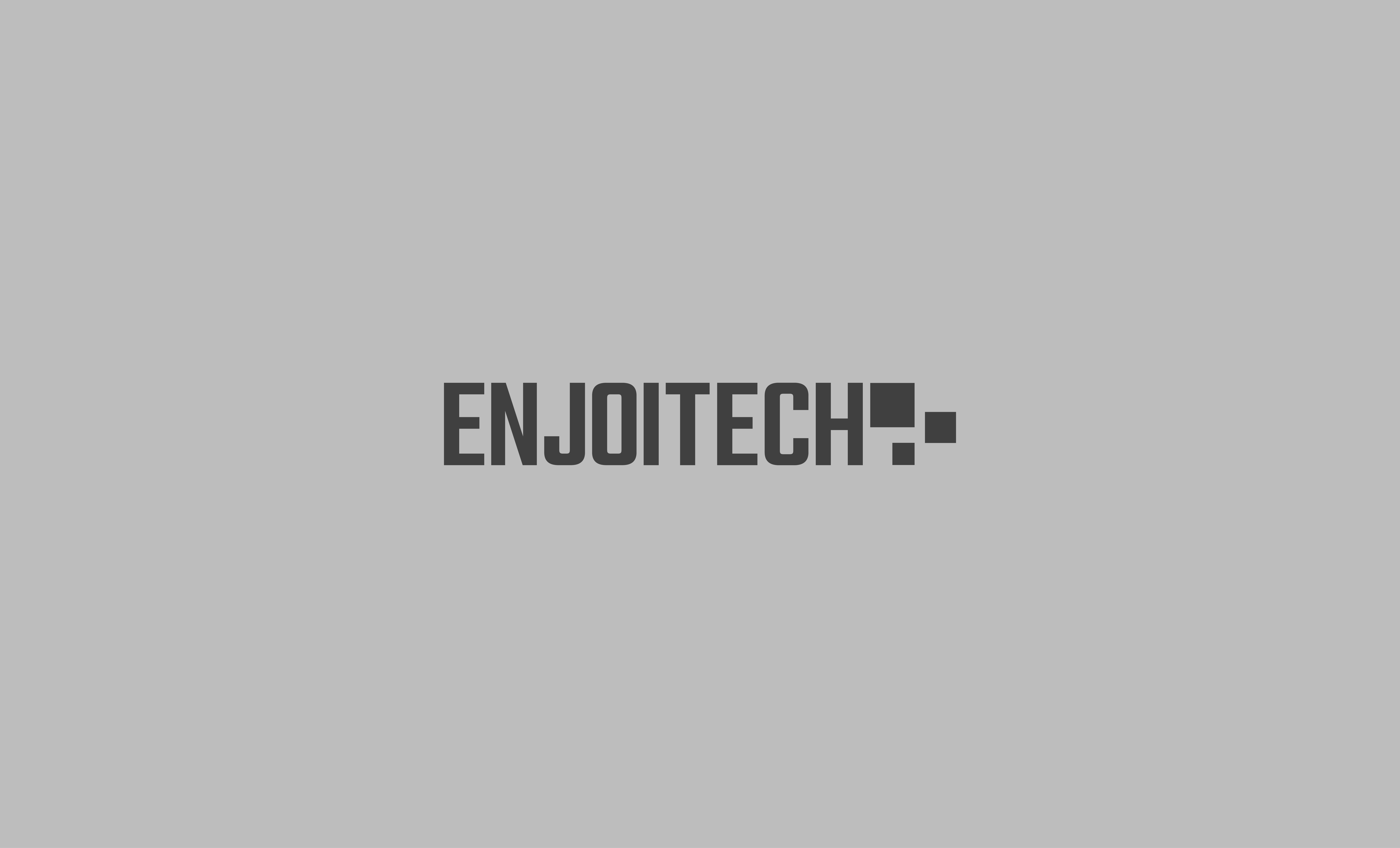
AFTER:
The new logo retains the concept of three squares arranged in a spiral flow but introduces clean, bold geometric lines to enhance structure and organization. The colour palette has shifted from blue to a sophisticated monochromatic grayscale scheme, symbolizing timelessness, precision, and adaptability. This change reflects Enjoitech’s commitment to human-centred design and its focus on creating technology that is both innovative and approachable.
The new logo features the Teko Medium typeface, chosen for its elegance and modernity, which conveys sophistication and confidence. The updated design is versatile, adapting seamlessly to both digital and physical applications, and maintains consistency across all brand materials. It better represents Enjoitech’s core values and its human-focused approach, ensuring the brand resonates with its audience on a deeper level.
KEY DELIVERABLES:
- Brand Strategy: Developed a comprehensive brand strategy, including target audience analysis, brand positioning, and messaging.
- Brand Identity: Created a new brand identity, including a logo, colour palette, typography, and brand guidelines.
- Visual Identity: Designed a suite of brand assets, such as business cards, stationery, and social media graphics.
- Website Design (under construction): Redesigned the Enjoitech website to align with the new brand identity and improve user experience.
AUDIT
CURRENT STRENGTHS:
Innovative Technology:
Enjoitech is dedicated to developing cutting-edge IT solutions that anticipate future needs, keeping clients ahead in a rapidly evolving digital landscape.
Human-Centred Approach:
The company prioritizes user experience and accessibility, ensuring its solutions are intuitive, easy to use, and designed to enhance everyday life.
Strong Brand Name:
The name “Enjoitech” combines enjoyment and technology, reflecting the brand’s mission to create solutions that are not only functional but also enjoyable to use.
CURRENT WEAKNESSES:
Limited Brand Awareness:
Enjoitech may need to increase its visibility and recognition in the market to better compete with established players in the IT industry.
Lack of a Strong Visual Identity:
The brand’s visual elements may not be memorable or impactful enough to effectively convey its values and messages, potentially hindering its ability to connect with its target audience.
OPPORTUNITIES:
Expanding into New Markets:
Enjoitech can explore opportunities to target additional industries or demographics, broadening its reach and diversifying its client base.
Partnering with Other Companies:
Collaborating with complementary businesses can help Enjoitech expand its offerings, reach a wider audience, and create mutually beneficial relationships.
Leveraging Technology Trends:
By staying ahead of industry developments and incorporating emerging technologies, Enjoitech can maintain its position as an innovative leader in the IT space.
Intense Competition:
The IT industry is highly competitive, with many established players vying for market share. Enjoitech must differentiate itself through innovation, user-centric design, and strong branding.
Rapid Technological Advancements:
The pace of technological change presents a challenge, as Enjoitech must continuously adapt and innovate to remain relevant and meet evolving customer needs.
PUBLIC RELATIONS
BRAND MESSAGING
Unique Selling Proposition (USP):
“Enjoitech combines advanced technology with a human touch, delivering intuitive, error-free solutions that optimize workflows and enhance everyday experiences.”
Value Proposition:
Enjoitech focuses on innovation, user-friendliness, and reliability, offering tech-savvy individuals and businesses solutions that simplify complexity and drive efficiency.
Brand Promise:
“Transform your world with secure, innovative, and intuitive technology designed to empower and inspire.”
STRATEGIC FRAMEWORK
Purpose:
To inspire a world where technology seamlessly integrates into everyday life, empowering people to achieve their goals with ease and confidence.
Mission:
To deliver secure, intuitive, and innovative IT solutions that optimize workflows, enhance user experiences, and simplify complexity.
Vision:
To provide innovative technology that transforms interactions enhances lives, and drives progress in a connected world.
“Enjoitech delivers innovative, human-centred technology that simplifies workflows, enhances experiences, and creates progress—making technology intuitive and reliable for everyone.”
THE MESSAGE
“Inspired by nature’s efficiency, Enjoitech develops innovative solutions that integrate seamlessly into your daily life, like butter on warm toast.
Our technology is designed to optimize workflows, empower you to achieve your goals effortlessly, and give you the peace of mind to focus on what matters most.
Experience the human side of technology with intuitive interfaces and ultra-personalized features that make every task simpler, more enjoyable, and more efficient.”
“ENVISION YOUR DIGITAL SUCCESS PROTECTING YOUR TOMORROW, TODAY.”
GRAPHIC DESIGN
LOGO DESIGN
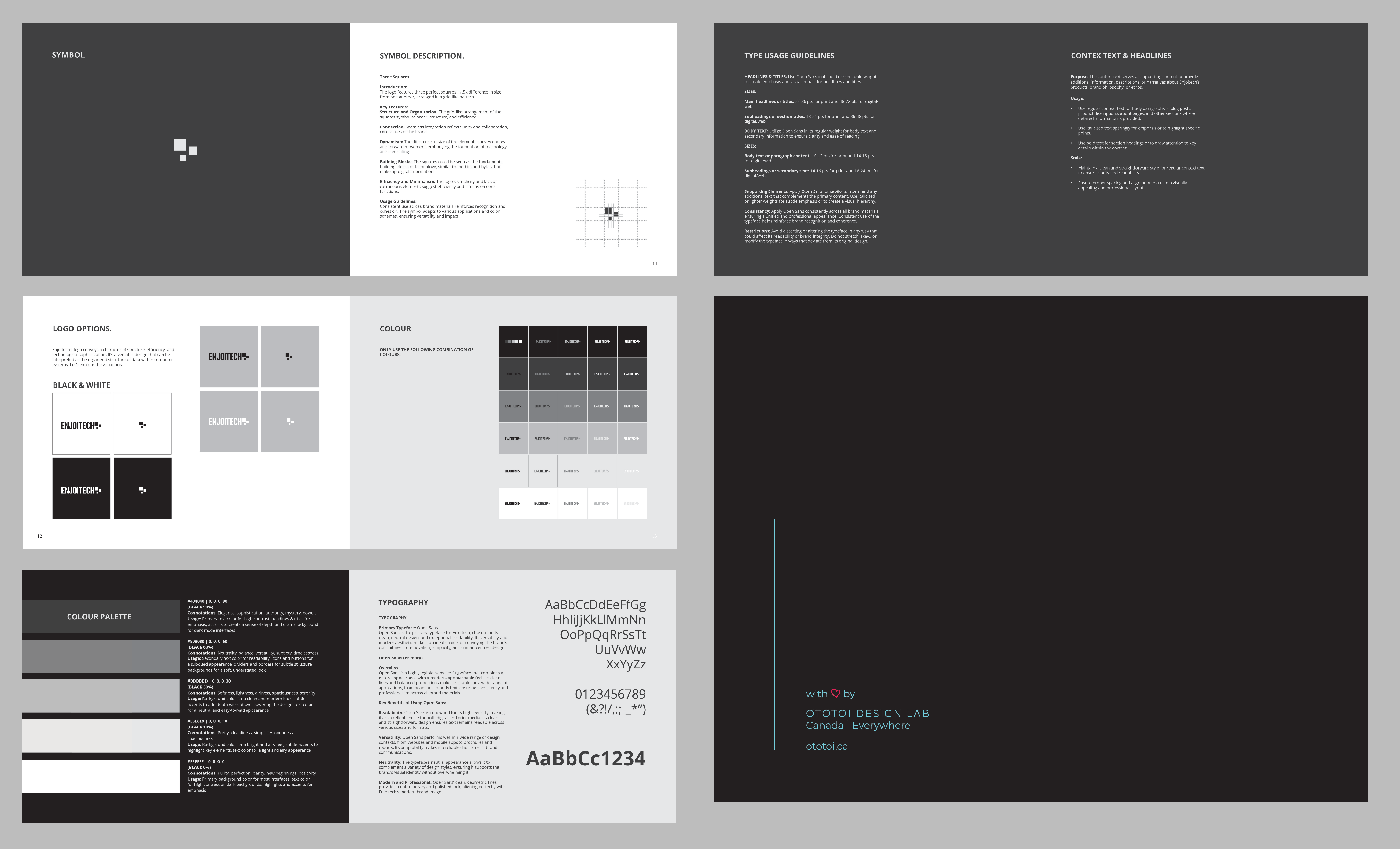
Visual Elements:
The logo features clean, bold geometric lines with three perfect squares arranged in a spiral flow, creating a sense of movement and balance.
Symbolism:
The geometric typography represents structure, organization, and the digital grid that underlies technology. The squares symbolize stability, dynamism, and the building blocks of innovation, reflecting Enjoitech’s commitment to creating reliable and forward-thinking solutions.
Color Palette:
A sophisticated monochromatic grayscale palette was used to reflect timelessness, precision, and adaptability. This choice ensures the logo remains modern, versatile, and aligned with Enjoitech’s professional yet human-centred identity.
Typography:
The Teko Medium typeface was chosen for its elegance and modernity, conveying sophistication and confidence. Its geometric structure complements the logo’s visual elements, reinforcing the brand’s innovative and approachable ethos.
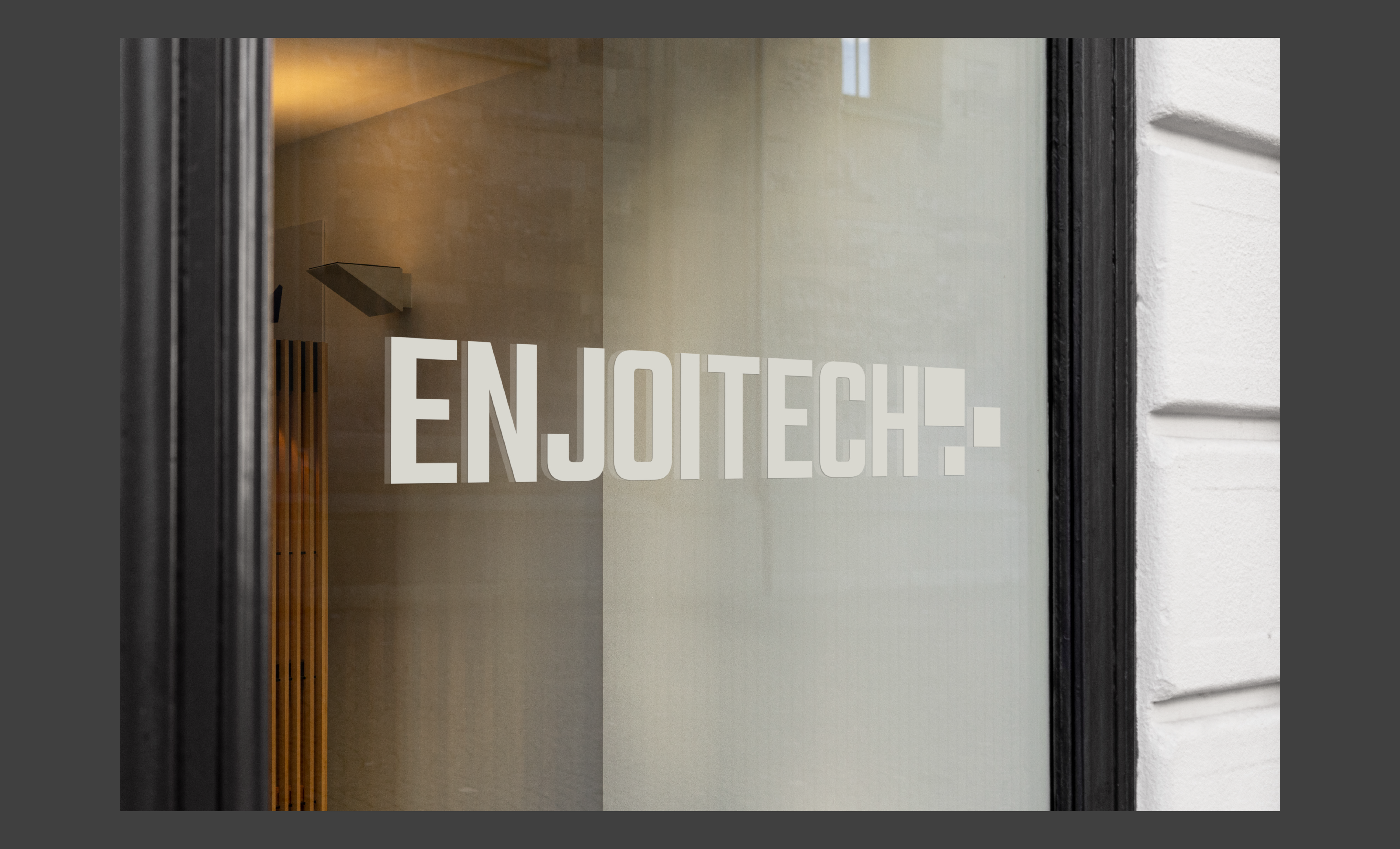
Versatility:
The logo adapts seamlessly to digital and physical applications, maintaining its impact and recognizability across all mediums.
Consistency:
Strict adherence to logo size, clear space, and colour schemes is required to ensure brand cohesion. Maintain a clear space of 1.5x the height of the logo around it to preserve visibility and impact.
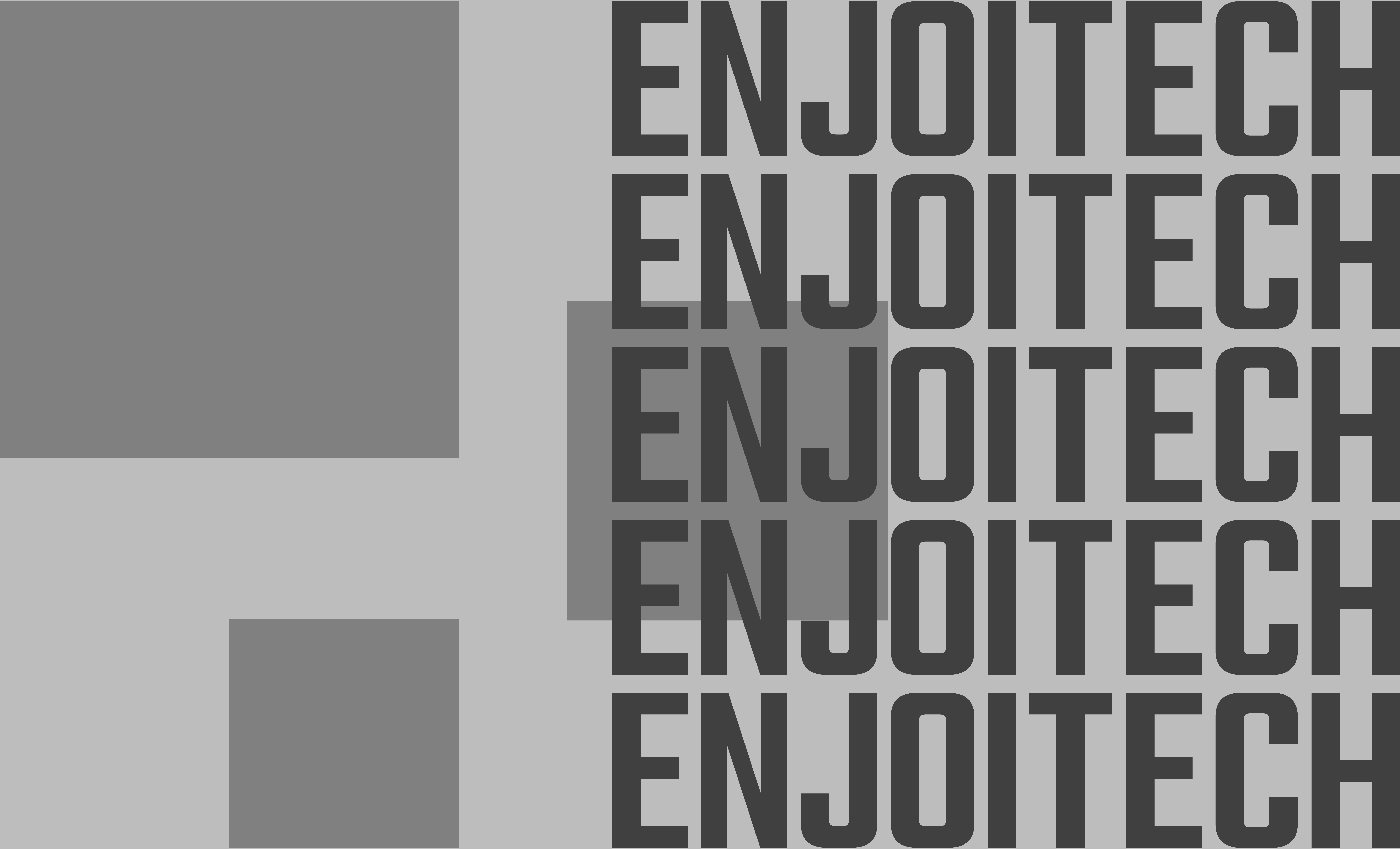
LOGOTYPE
LOGO | SYMBOL
COLOURS
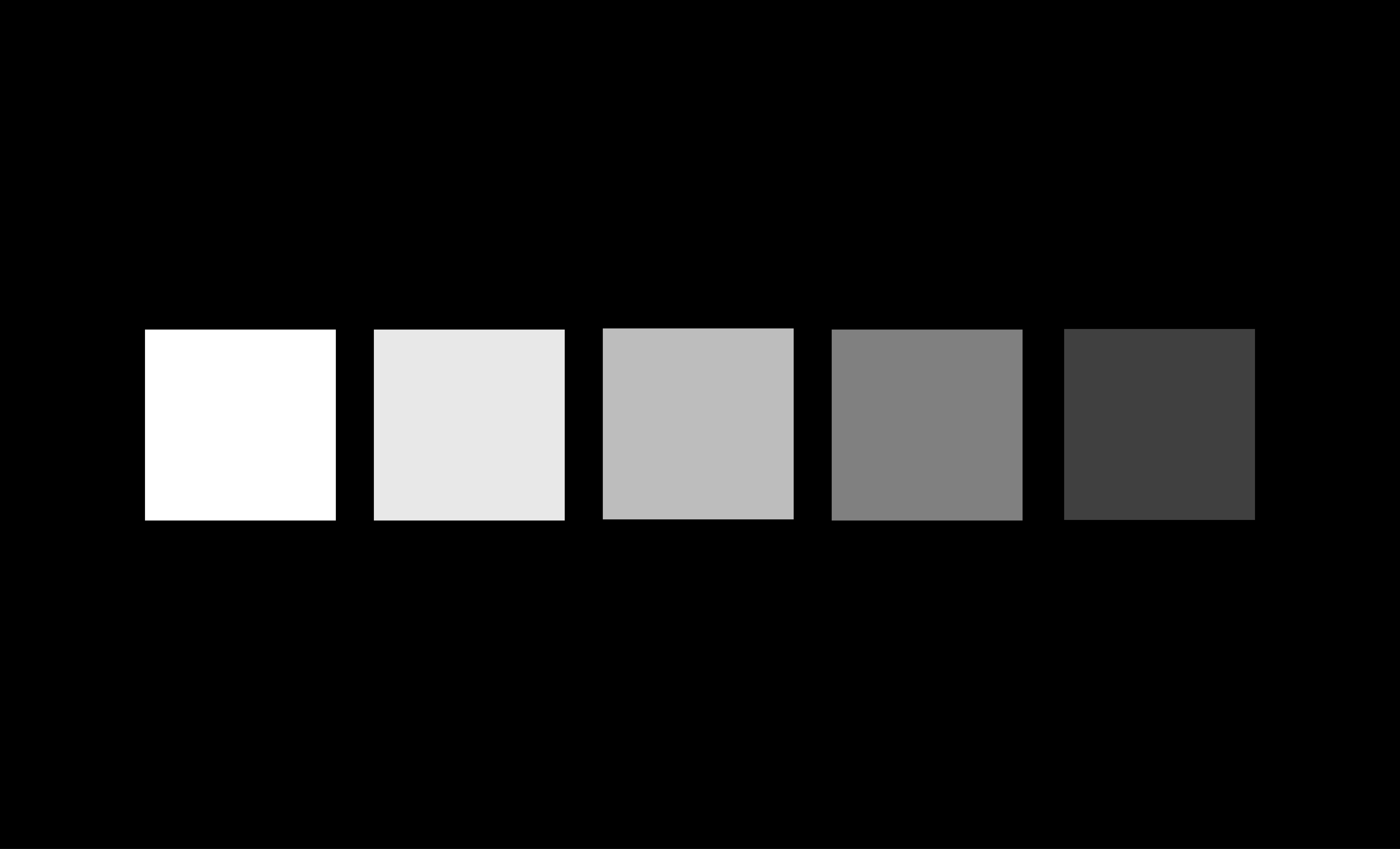
COLOUR PALETTE
#404040 | 0, 0, 0, 90 (Black 90%)
Connotations: Elegance, sophistication, authority, mystery, power.
Usage: Primary text colour for high contrast, headings & titles for emphasis, accents to create a sense of depth and drama, background for dark mode interfaces.
#FFFFFF | 0, 0, 0, 0 (Black 0%)
Connotations: Purity, perfection, clarity, new beginnings, positivity
Usage: Primary background colour for most interfaces, text colour for high contrast on dark backgrounds, highlights and accents for emphasis.
#E8E8E8 | 0, 0, 0, 10 (Black 10%)
Connotations: Purity, cleanliness, simplicity, openness, spaciousness
Usage: Background colour for a bright and airy feel, subtle accents to highlight key elements, and text colour for a light and airy appearance
#808080 | 0, 0, 0, 60 (Black 60%)
Connotations: Neutrality, balance, versatility, subtlety, timelessness.
Usage: Secondary text colour for readability, icons and buttons for a subdued appearance, dividers and borders for subtle structure backgrounds for a soft, understated look.
#BDBDBD | 0, 0, 0, 30 (Black 30%)
Connotations: Softness, lightness, airiness, spaciousness, serenity.
Usage: Background colour for a clean and modern look, subtle accents to add depth without overpowering the design, and text colour for a neutral and easy-to-read appearance.
A MONOCHROMATIC COLOUR SCHEME: A monochromatic colour scheme, which utilizes variations of a single colour, conveys several key qualities. It creates a harmonious and unified look, making designs feel cohesive and well-organized. This approach often appears clean and elegant, enhancing simplicity and reducing visual clutter. By using different shades, tints, and tones of one colour, it directs focus to specific elements while maintaining a consistent visual identity, reinforcing brand recognition and professionalism. The chosen colour can evoke specific emotions—such as calmness with blues or sophistication with grays—while adding refinement to the overall design.
Reasons Why the New Grayscale Monochromatic Scheme Aligns with Enjoitech’s Updated Brand Identity
Symbolism:
Grayscale represents timelessness, precision, and adaptability, reflecting Enjoitech’s commitment to creating reliable and forward-thinking technology. The neutral tones convey stability and professionalism, key attributes for a trusted IT solutions provider.
Human-Centred Design:
The grayscale palette emphasizes clarity and simplicity, making technology feel more approachable and user-friendly. It aligns with Enjoitech’s focus on creating intuitive, human-centred solutions.
Modern Sophistication:
Grayscale exudeselegance and modernity, reinforcing Enjoitech’s position as an innovative and forward-thinking brand. The minimalist aesthetic reflects a commitment to cutting-edge design and functionality.
Visual Consistency:
Using different shades of grayscale creates a unified and professional look, enhancing brand recognition and memorability. The cohesive palette ensures consistency across all brand materials.
Versatility:
The grayscale scheme is highly adaptable, seamlessly integrating into digital and physical applications. It ensures the brand remains impactful and recognizable across diverse platforms.
TYPOGRAPHY
TYPOGRAPHY
Primary Typeface: Open Sans
Open Sans is the primary typeface for Enjoitech, chosen for its clean, neutral design, and exceptional readability. Its versatility and modern aesthetic make it an ideal choice for conveying the brand’s commitment to innovation, simplicity, and human-centred design.
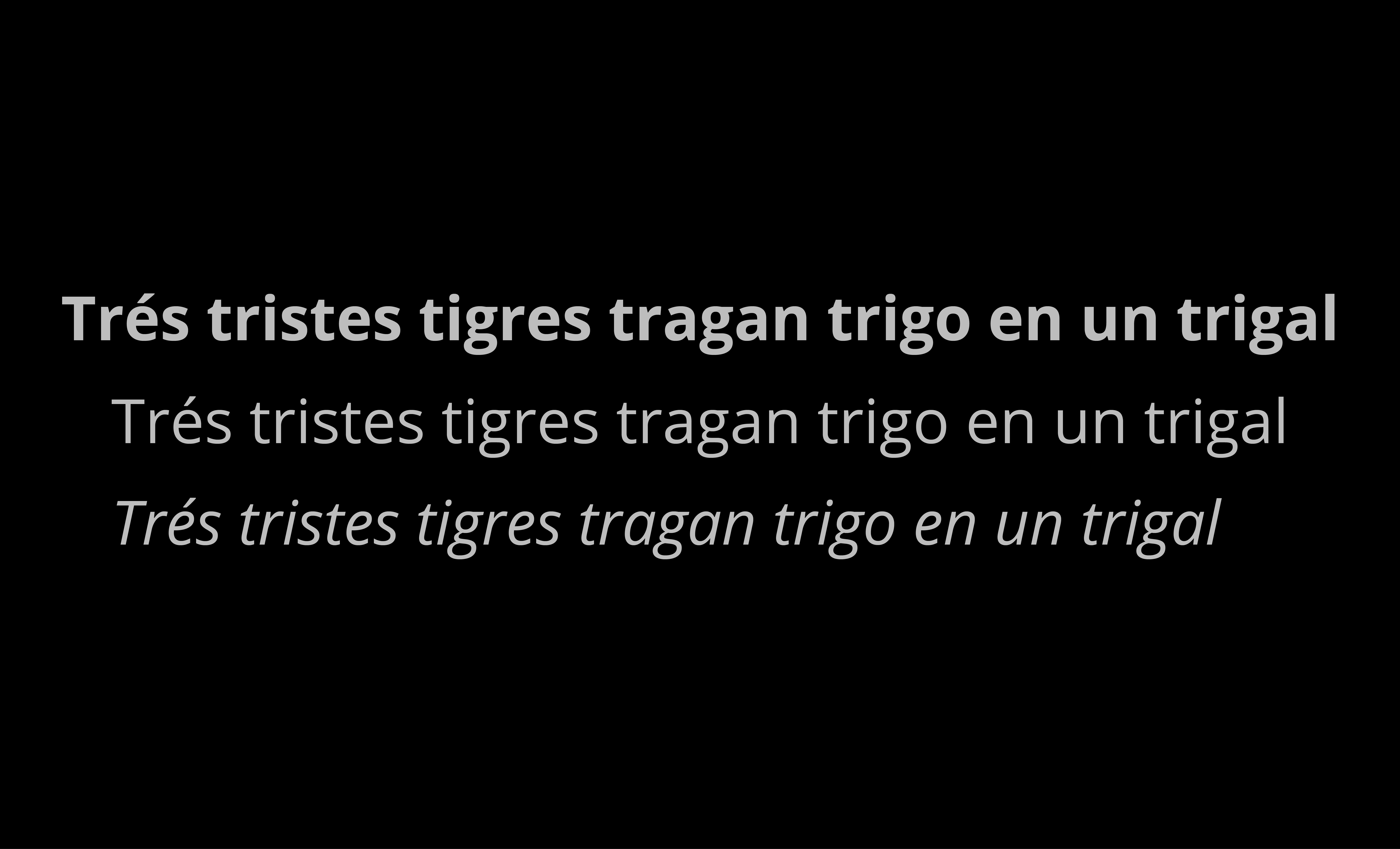
OPEN SANS (Primary)
Overview:
Open Sans is a highly legible, sans-serif typeface that combines a neutral appearance with a modern, approachable feel. Its clean lines and balanced proportions make it suitable for a wide range of applications, from headlines to body text, ensuring consistency and professionalism across all brand materials.
Key Benefits of Using Open Sans:
Readability: Open Sans is renowned for its high legibility, making it an excellent choice for both digital and print media. Its clear and straightforward design ensures text remains readable across various sizes and formats.
Versatility: Open Sans performs well in a wide range of design contexts, from websites and mobile apps to brochures and reports. Its adaptability makes it a reliable choice for all brand communications.
Neutrality: The typeface’s neutral appearance allows it to complement a variety of design styles, ensuring it supports the brand’s visual identity without overwhelming it.
Modern and Professional: Open Sans’ clean, geometric lines provide a contemporary and polished look, aligning perfectly with Enjoitech’s modern brand image.
USAGE GUIDELINES
Headlines and Titles: Use Open Sans in its bold or semi-bold weights to create emphasis and visual impact for headlines and titles.
Sizes:
Main headlines or titles: 24-36 pts for print and 48-72 pts for digital/web.
Subheadings or section titles: 18-24 pts for print and 36-48 pts for digital/web.
Body Text: Utilize Open Sans in its regular weight for body text and secondary information to ensure clarity and ease of reading.
Sizes:
Body text or paragraph content: 10-12 pts for print and 14-16 pts for digital/web.
Subheadings or secondary text: 14-16 pts for print and 18-24 pts for digital/web.
Supporting Elements: Apply Open Sans for captions, labels, and any additional text that complements the primary content. Use italicized or lighter weights for subtle emphasis or to create a visual hierarchy.
Consistency: Apply Open Sans consistently across all brand materials, ensuring a unified and professional appearance. Consistent use of the typeface helps reinforce brand recognition and coherence.
Restrictions: Avoid distorting or altering the typeface in any way that could affect its readability or brand integrity. Do not stretch, skew, or modify the typeface in ways that deviate from its original design.
CONTEXT
Purpose: The context text serves as supporting content to provide additional information, descriptions, or narratives about Enjoitech’s products, brand philosophy, or ethos.
Usage:
Use regular context text for body paragraphs in blog posts, product descriptions, about pages, and other sections where detailed information is provided.
Use italicized text sparingly for emphasis or to highlight specific points.
Use bold text for section headings or to draw attention to key details within the context.
Style:
Maintain a clean and straightforward style for regular context text to ensure clarity and readability.
Ensure proper spacing and alignment to create a visually appealing and professional layout.
THE BOOKLET
LOGO SAMPLE
GRAPHIC DESIGN + PR FUSION
The graphic design and PR elements of this project were closely linked to creating a cohesive brand experience for Enjoitech. The visual elements, such as the logo, typography, and colour palette, were carefully selected to align with the brand messaging and strategic framework developed through PR efforts. Together, these components ensure that Enjoitech’s brand identity is visually appealing and resonates with the company’s target audience.
- Visual Identity Reinforcement: The design choices supported the brand’s messaging by visually communicating the company’s values of innovation, human nature, and user-friendliness.
- Consistent Brand Voice: The PR strategies ensured that all communication channels echoed the same core values and promises, making the visual identity more impactful and memorable.