Portfolio | Graphic Design – Veritas Magazine (Concept)
MAGAZINE DESIGN
Adobe InDesign | March 2023

INTRO
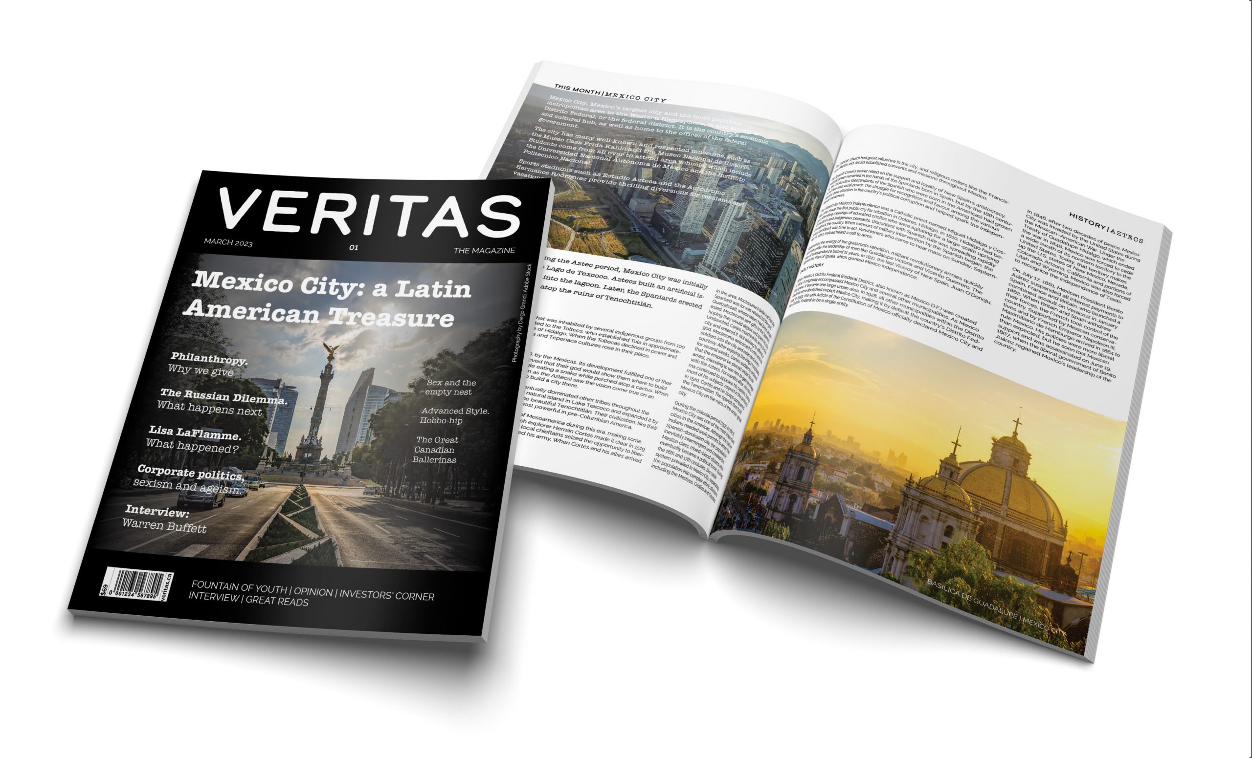
The concept behind this magazine’s graphic design is to create a striking and elegant visual identity that reflects the sophistication and modernity of the content.
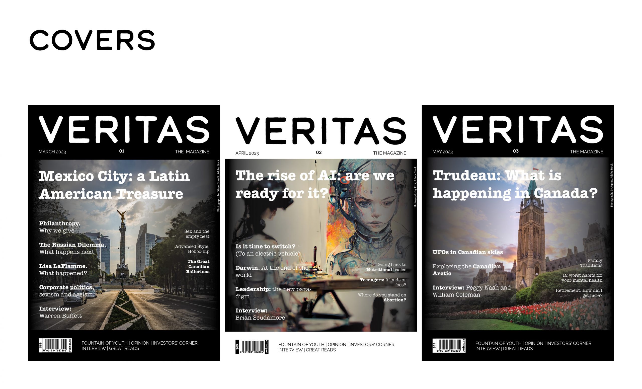
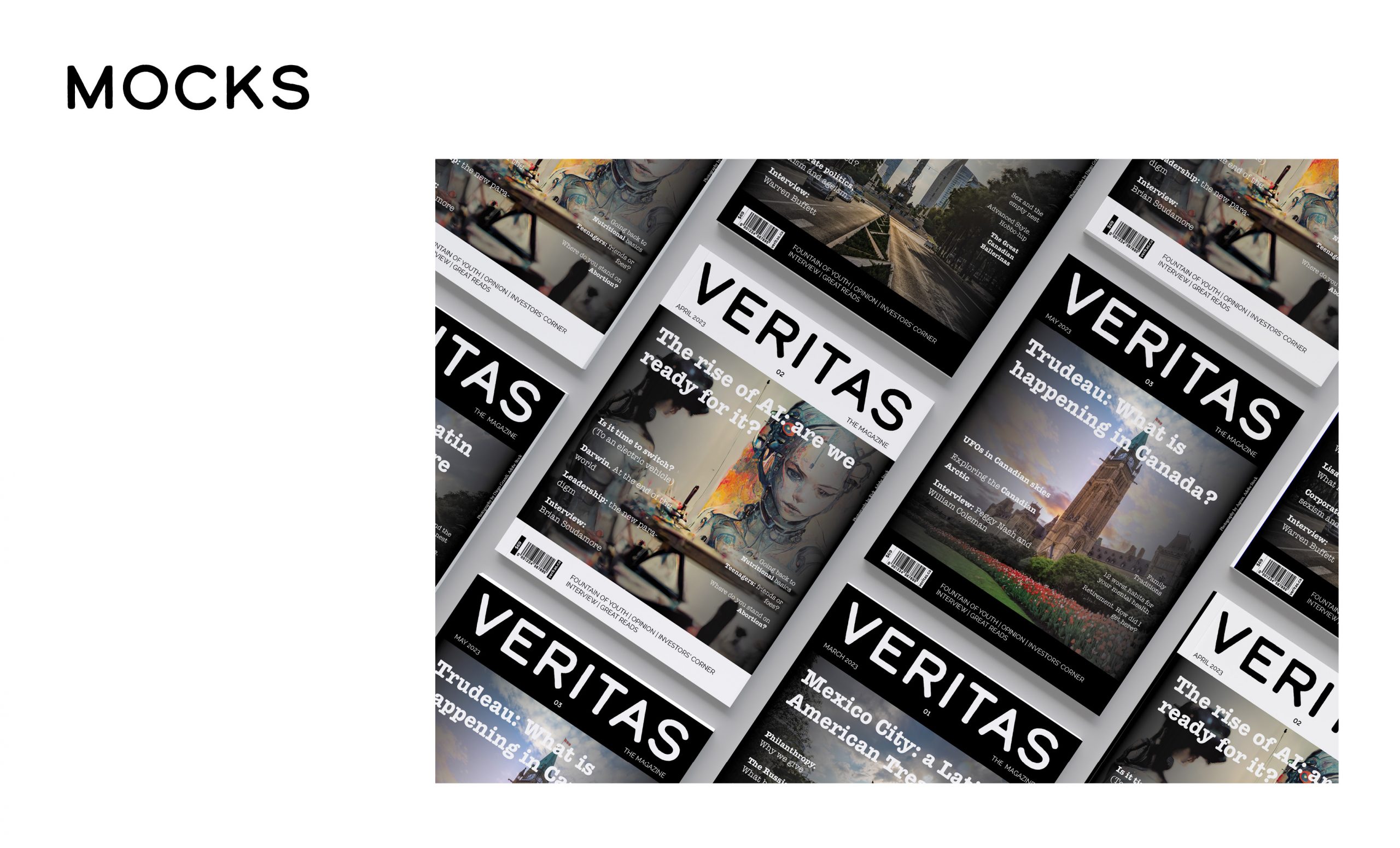
The alternating white and black covers provide a bold and impactful contrast while evoking a sense of balance and harmony.
The cover images are carefully curated to capture the essence of each issue’s theme and content, focusing on high-quality visuals to grab the reader’s attention.
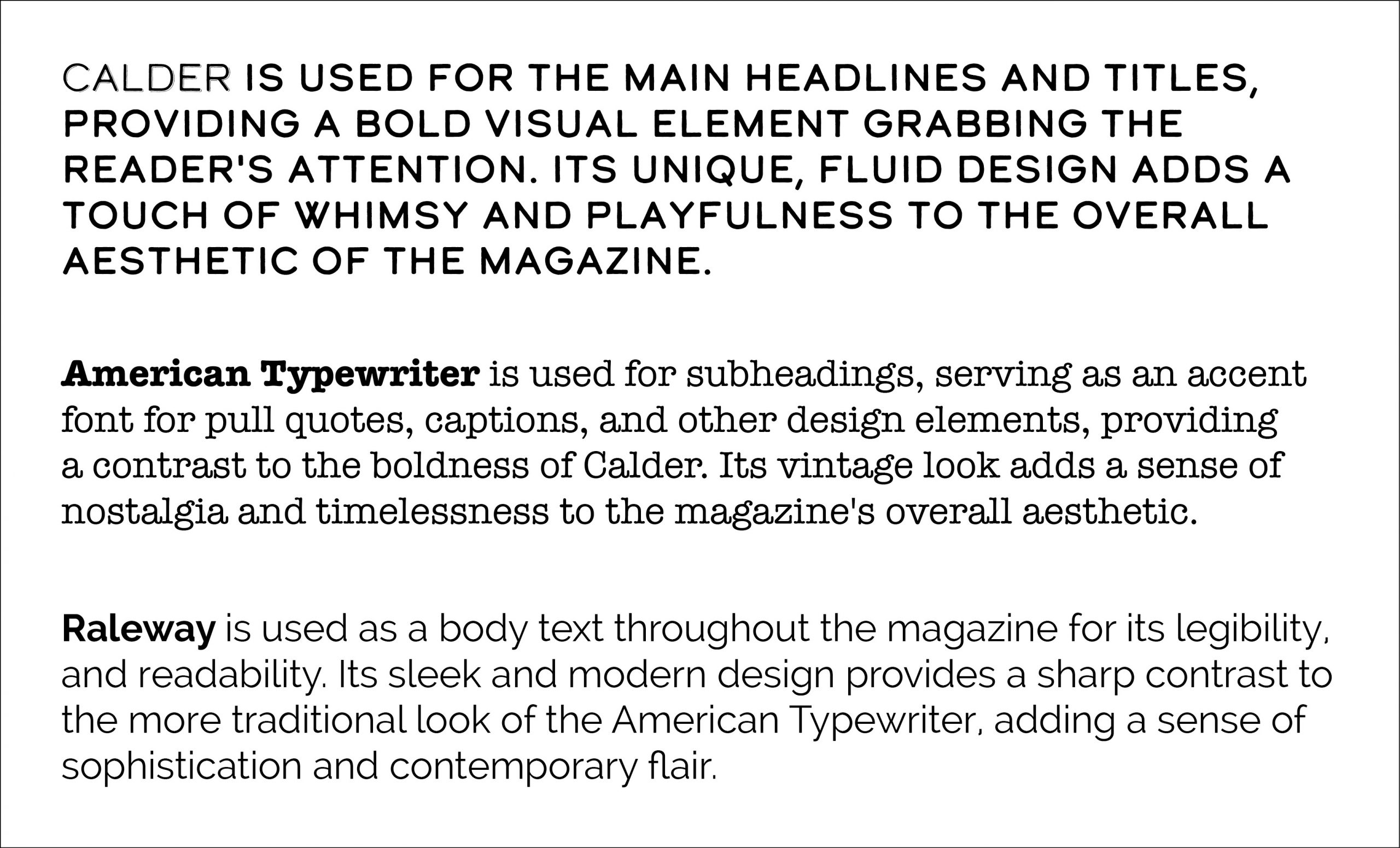
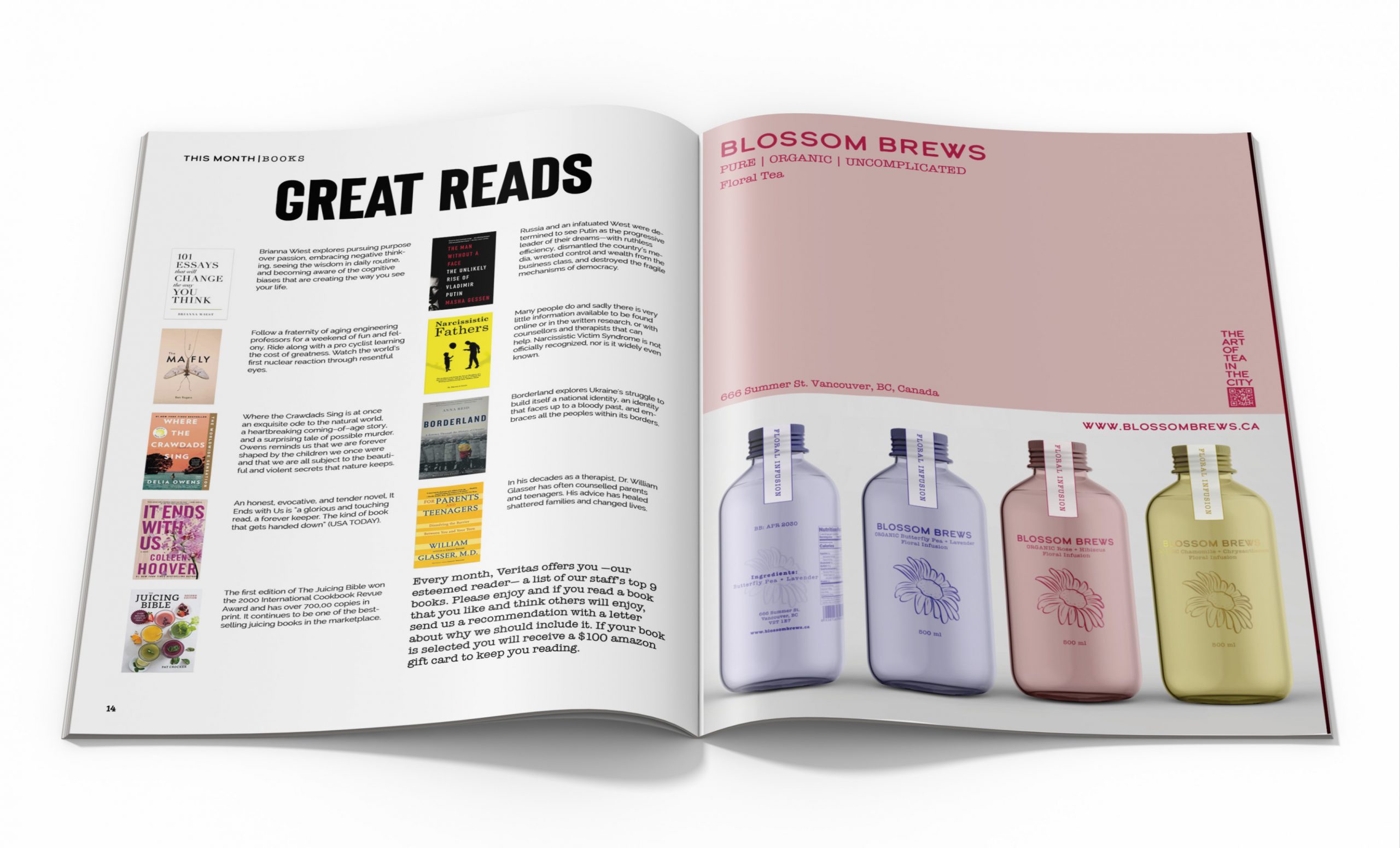
The typography is clean and modern, with a mix of serif and sans-serif fonts that provide a sense of hierarchy and organization to the page.
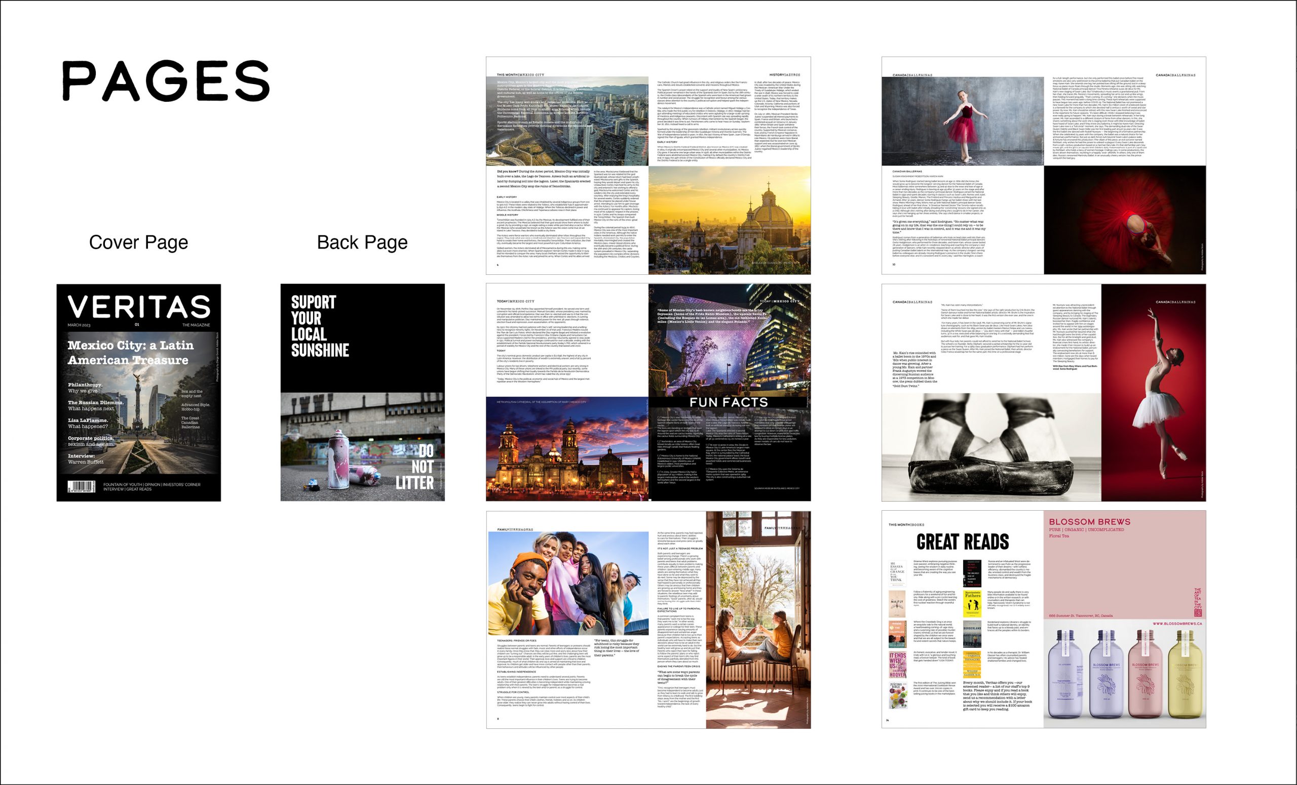
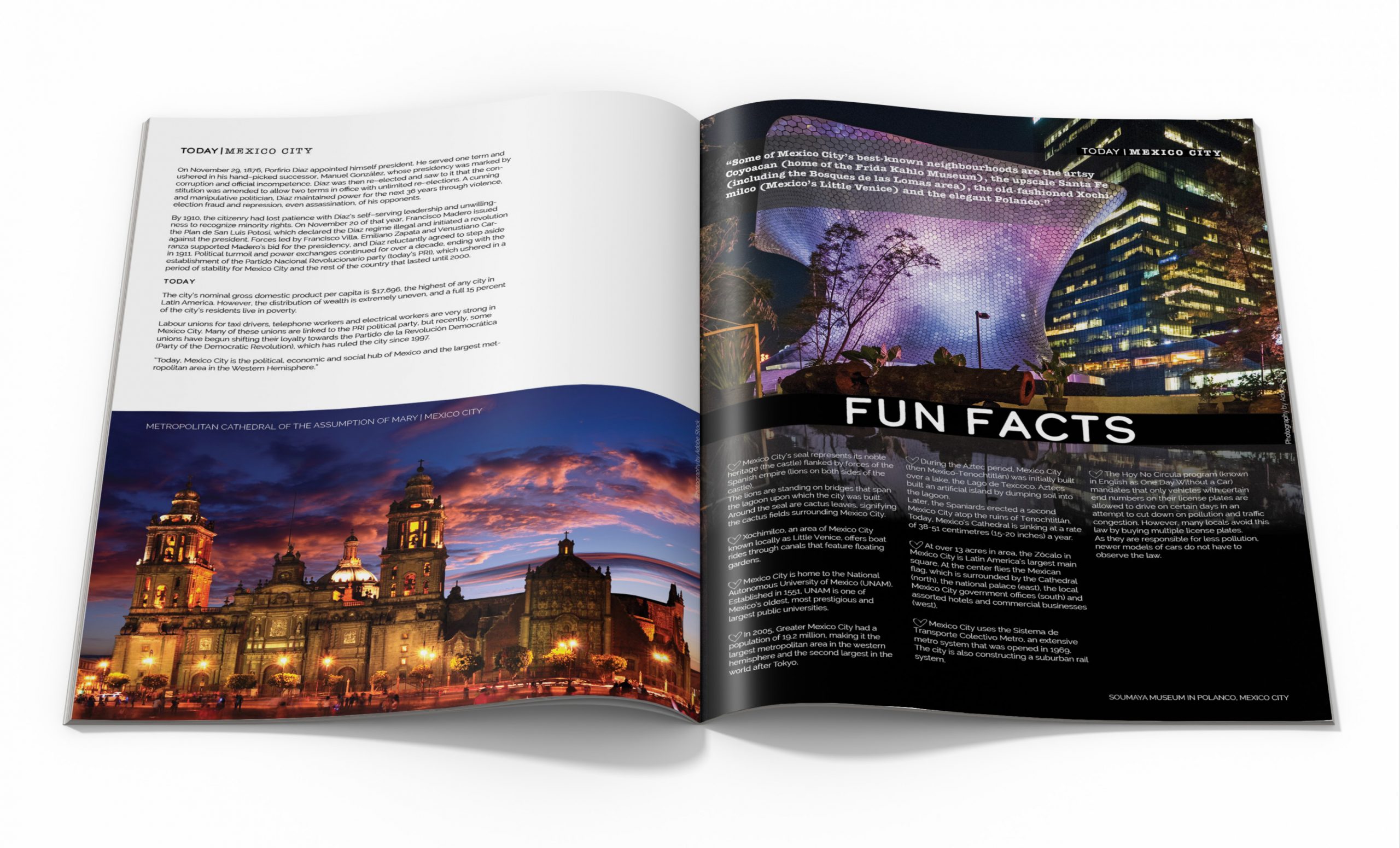
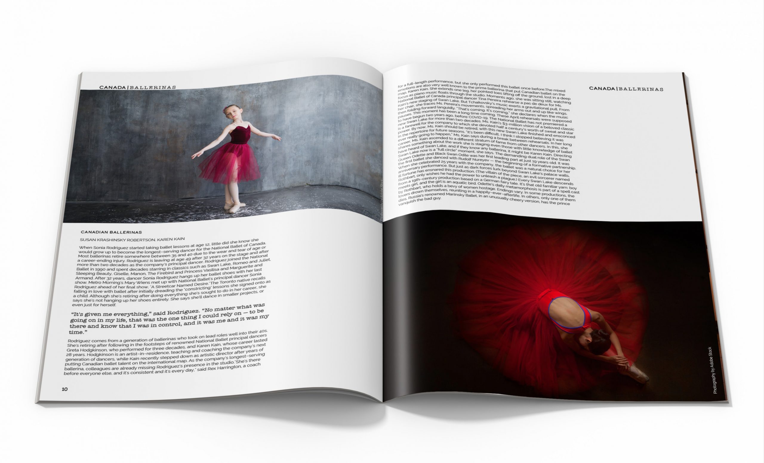
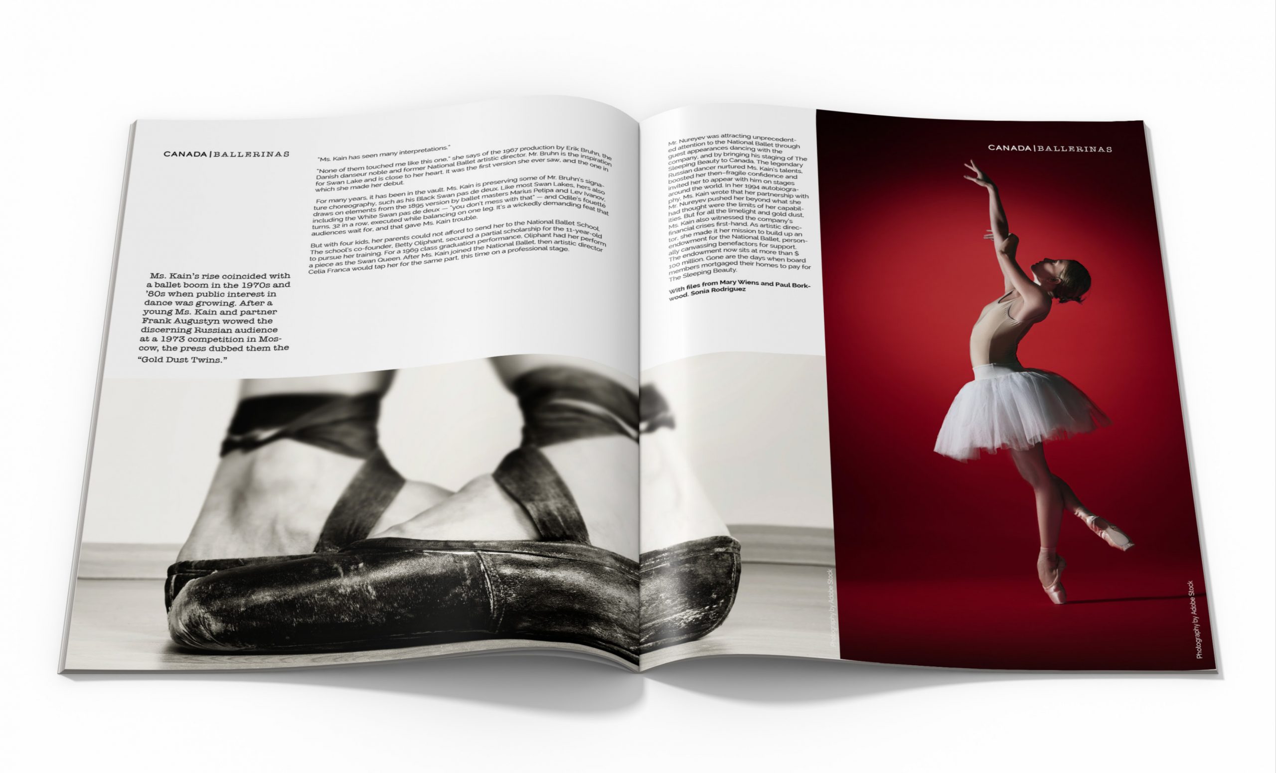
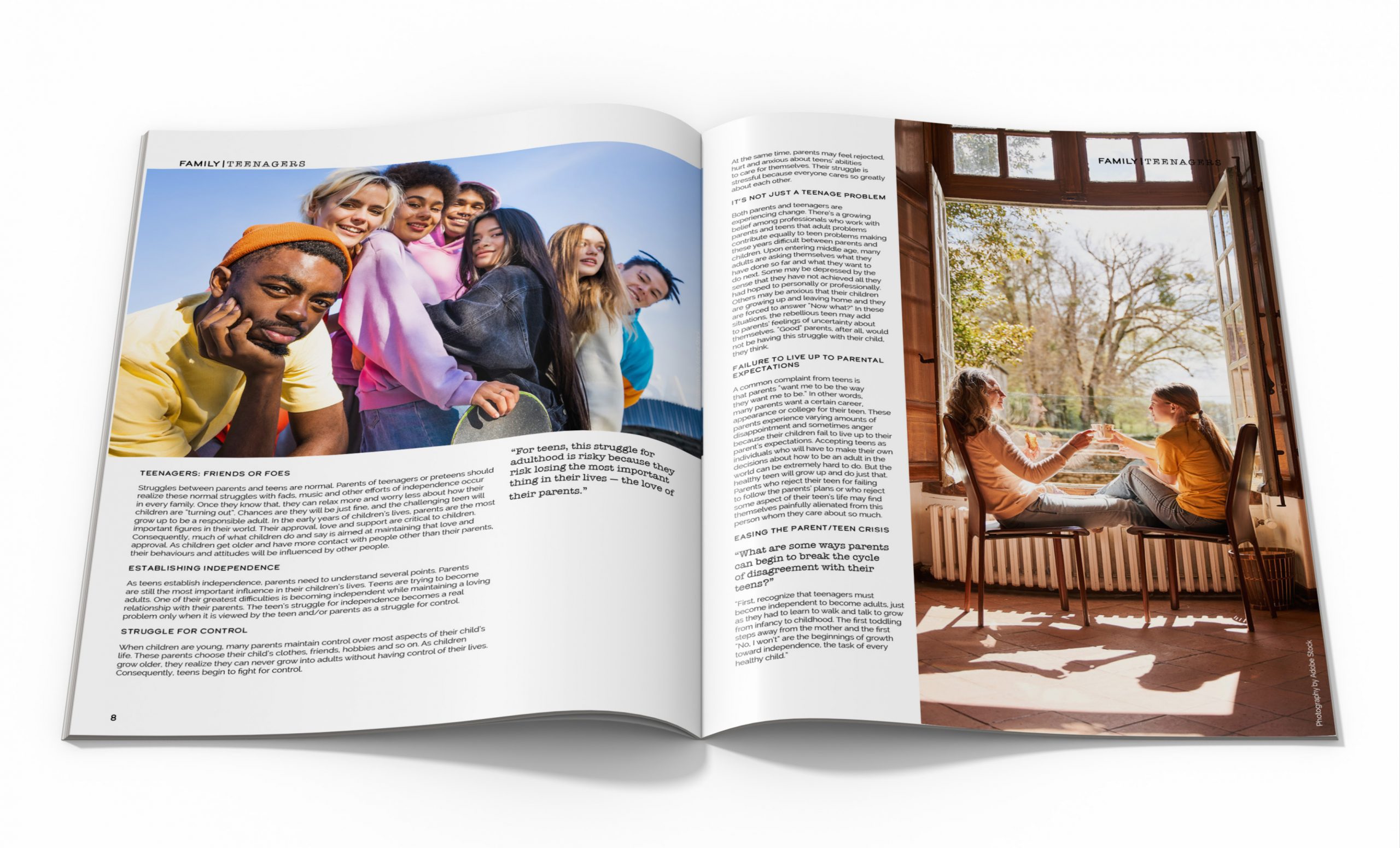
Inside the magazine, the layout is designed to be visually engaging and easy to navigate, with a mix of full-page images and text that break up the page and provide a dynamic reading experience. The use of white space is deliberate, allowing the content to breathe providing a sense of clarity and simplicity.
Throughout the magazine, a consistent colour palette is used to tie together the design elements and create a cohesive visual identity. The use of bold accent colours adds a pop of excitement and energy, while also helping to draw attention to key elements of the content.
Overall, this magazine is designed to be visually impactful, and engaging, reflecting the high-quality content within its pages. The alternating white and black covers serve as a bold and memorable branding element, while the clean and modern layout and typography ensure that the content is easy to read and navigate.
TYPEFACE
