Portfolio | Graphic Design – Vancouver Digital Arts Festival (Concept)
INSPIRED BY VIDEO GAMES.
Ad Design / Vector Illustration | February 2023
INTRO
VDAF is a made–up digital arts festival event in Vancouver BC. It brings together a community of artists to showcase their most uncanny creations, inviting people to explore the fusion of technology and art.
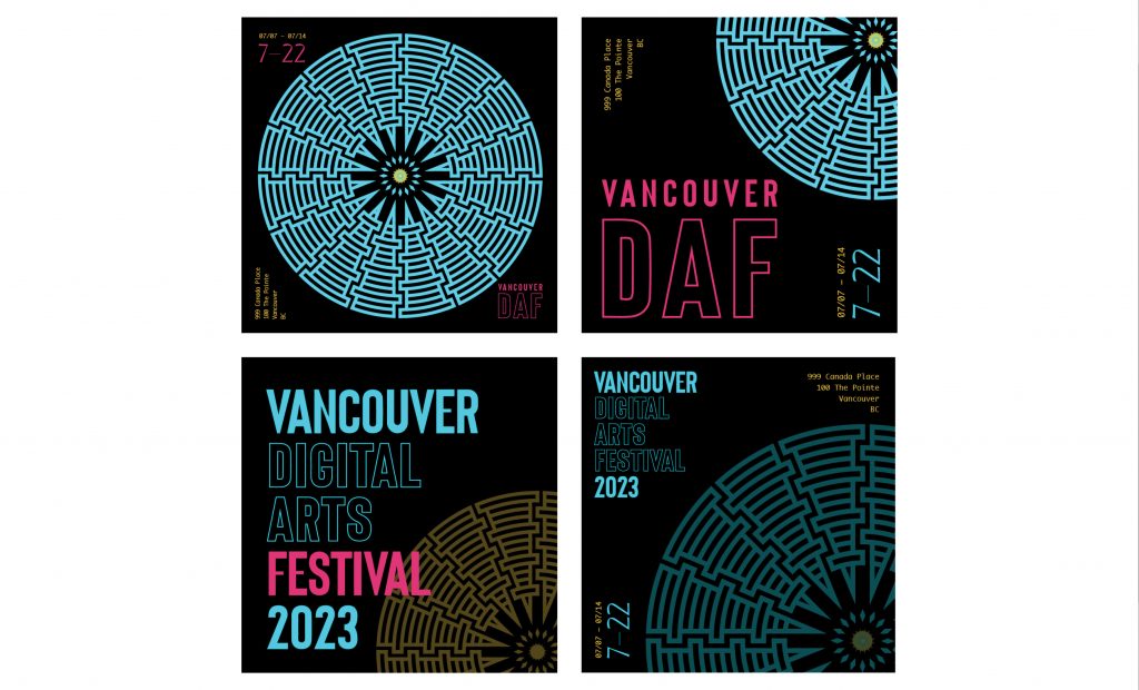
To reflect the festival’s theme of innovation, and creativity, the concept incorporates vibrant colours, bold typography and a balance of white space.
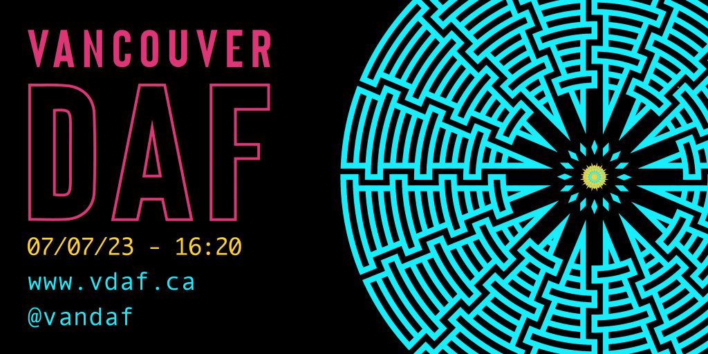
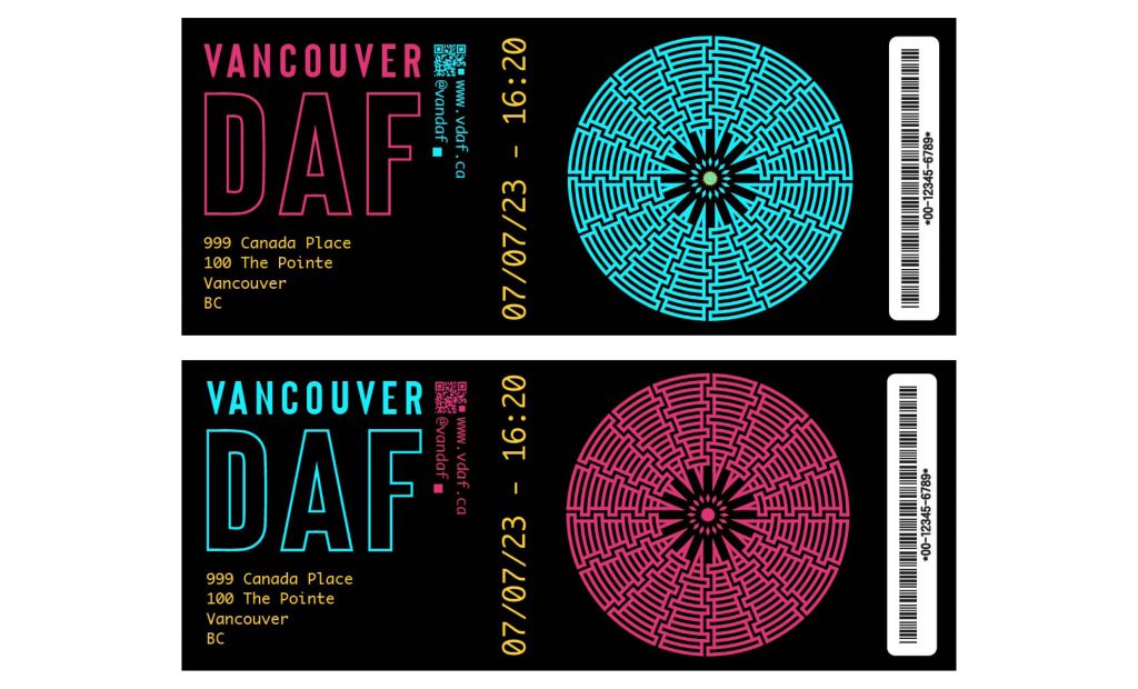
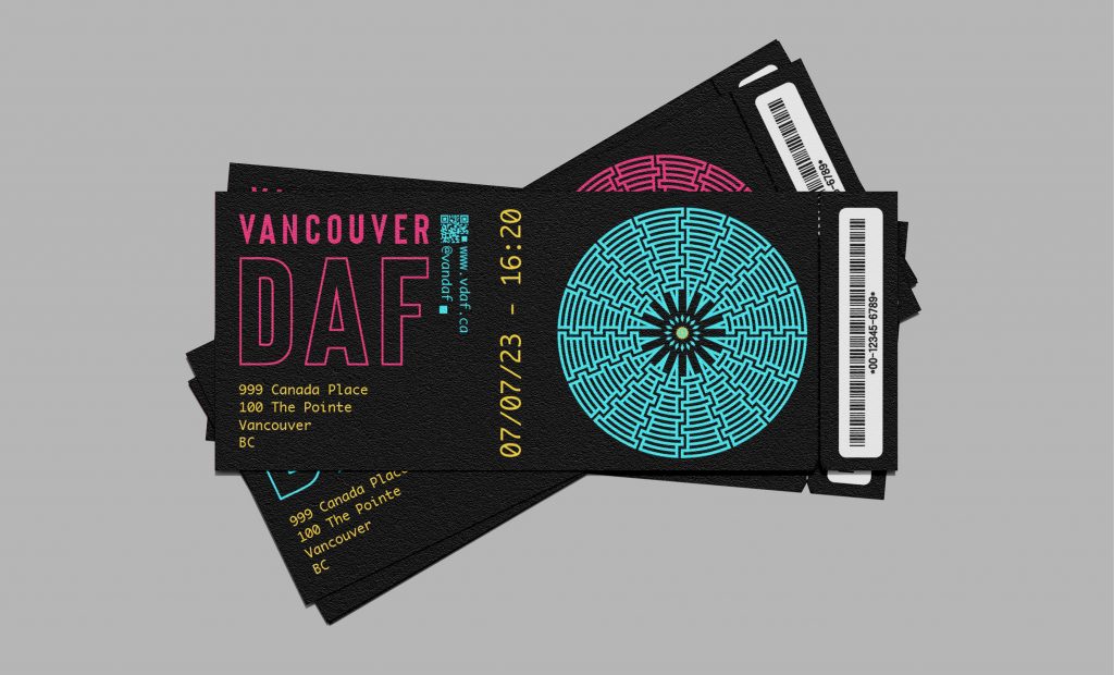
The design displays vibrant colours against a dark background. The black background adds a sense of drama and sophistication to the design, while also allowing the colours to pop, emphasizing important information. The festival name and other key information are presented in a bold sans-serif font to catch attention and a monospaced sans–serif typeface for legibility and readability.
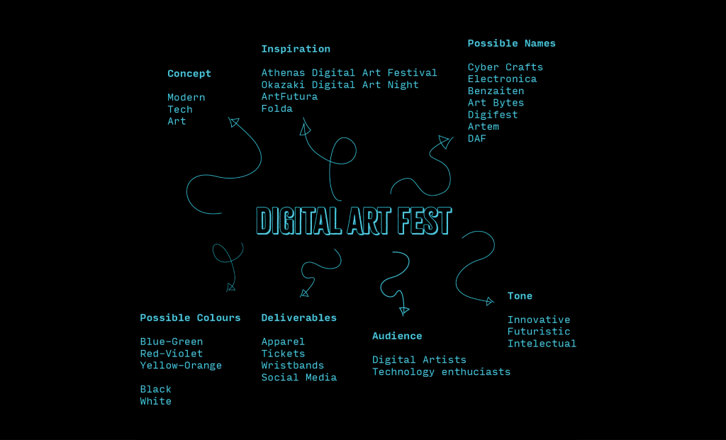
BRAIN MAP
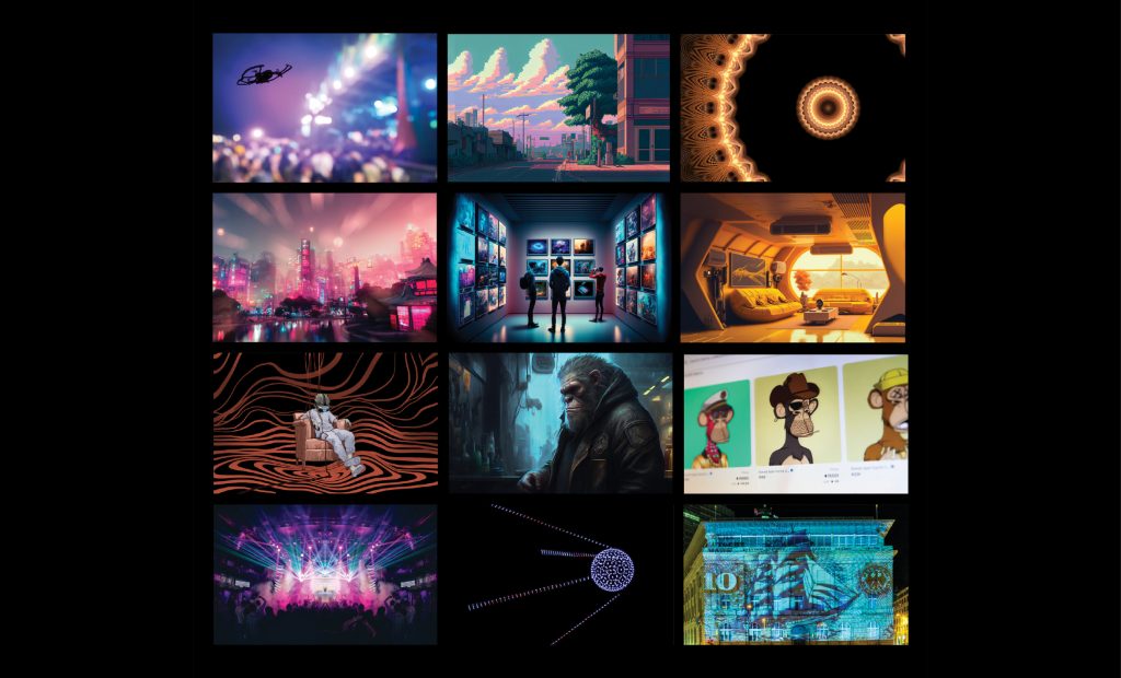
MOOD BOARD
TYPEFACE
ORIGIN SANS This bold sans serif type is modern and used for its versatility and to catch attention. It adapts to represent the different versions of the same information and creates relations.
ANDALE MONO adds a sense of structure and organization to the design I chose a monospace typeface.
Monospace fonts occupy the same amount of space, creating balance and order. This typeface is associated with technology and coding, which reinforces the festival’s focus on digital art and innovation.
COLOUR
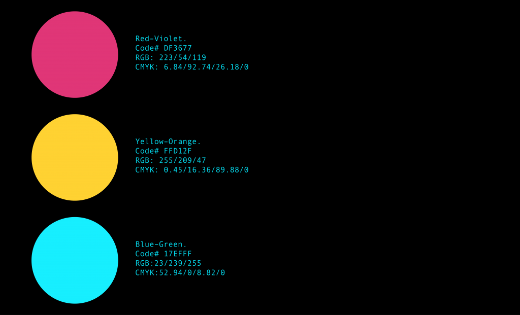
The colour palette is chosen inspired by the natural world and represents the diverse range of artistic expression featured at the festival.
Red-violet is a bold, vibrant colour representing passion, intensity, and celebration, associating it with the word “festival.”
Yellow-orange is a vibrant and energetic colour that symbolizes enthusiasm, optimism, and warmth, associating it with the community.
Blue-green is a calming and refreshing colour representing the digital side of creativity, innovation, and exploration.
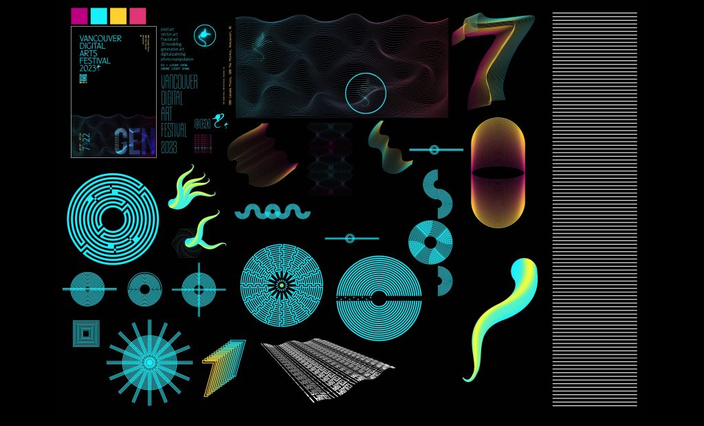
DIGITAL THUMBS
LOGO
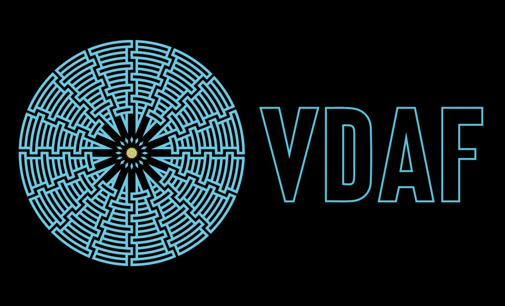
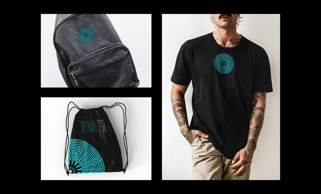
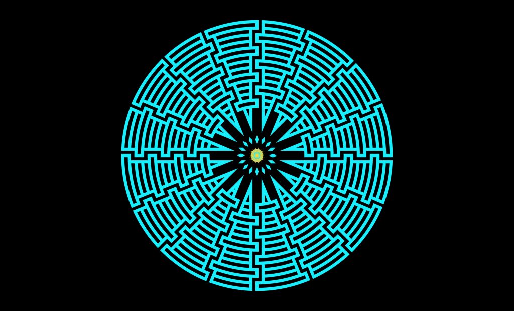
The logo is a circular design inspired by tribal art (and The Legend of Zelda). The circular shape represents unity, community, and continuity, while the tribal-inspired design alludes to the roots of art. The logo incorporates the festival name in bold, sans–serif typeface communicating the festival’s modern and innovative approach to art.
POSTERS
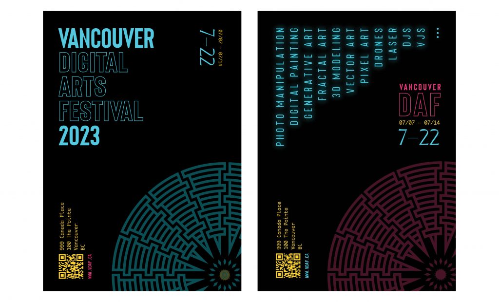
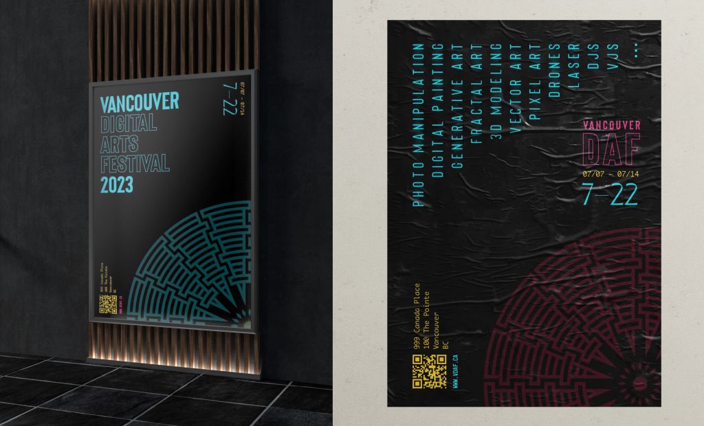
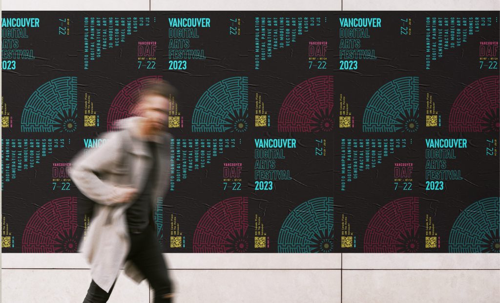
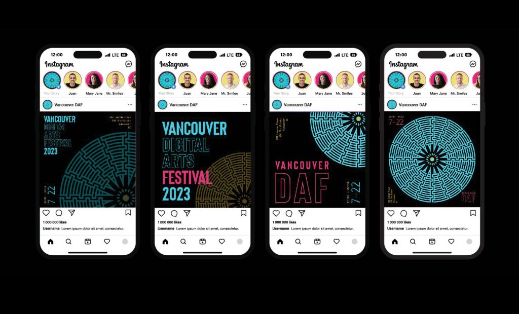
MOBILE AD
MALL AD

TICKETS
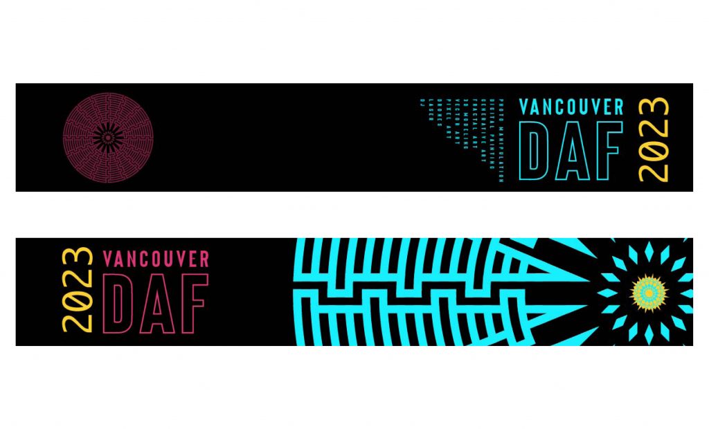
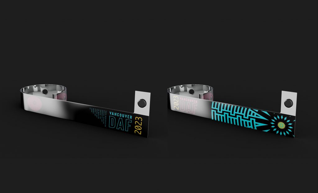
WRISTBANDS
