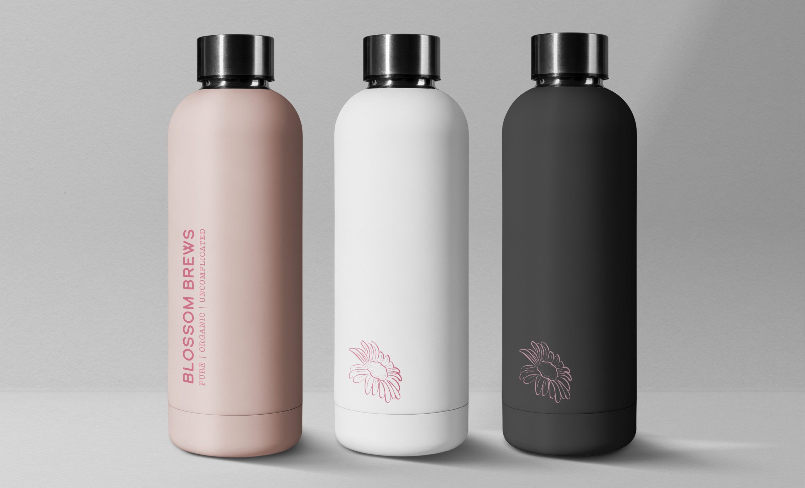
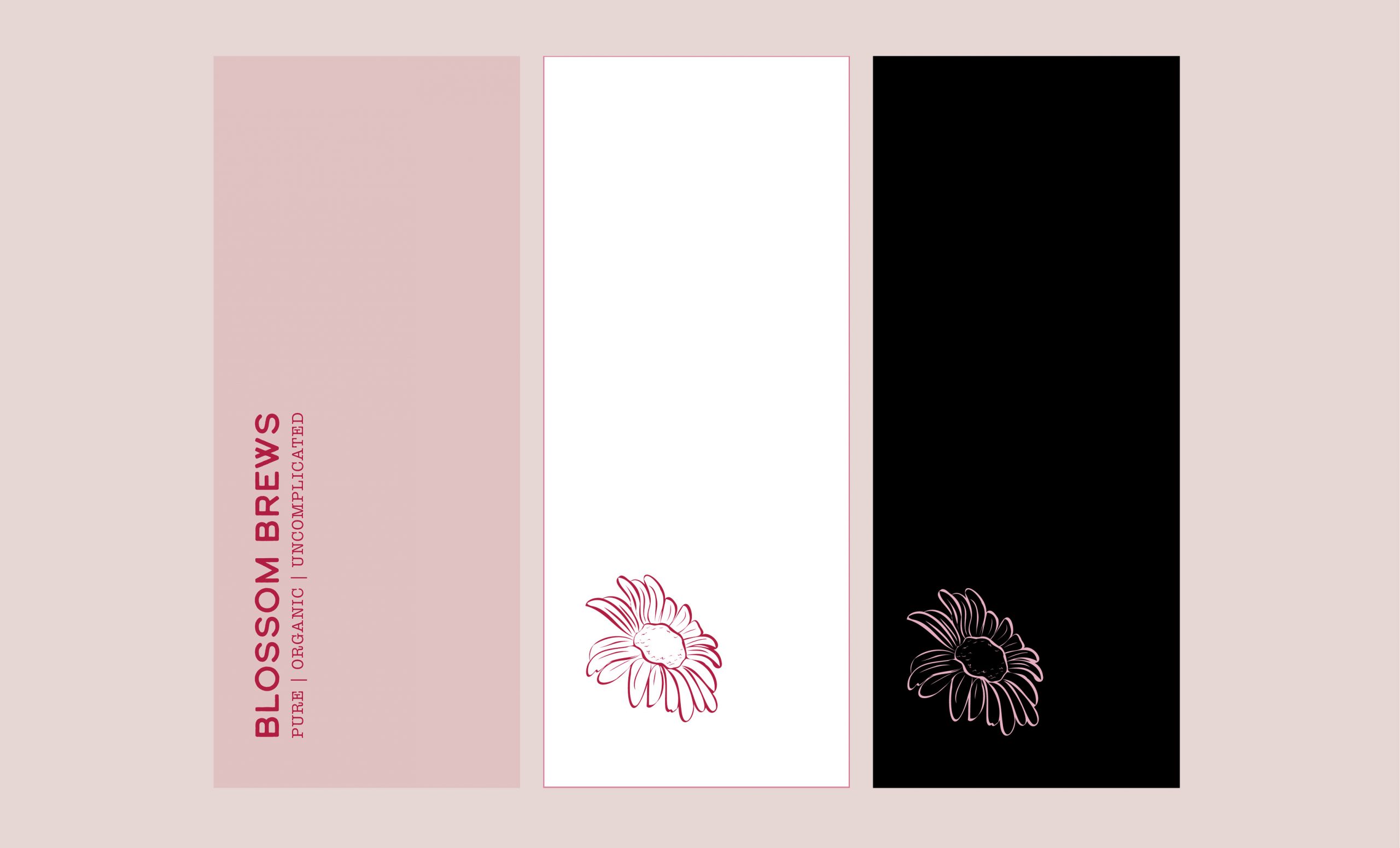
Portfolio | Graphic Design / Blossom Brews (Concept)
INSPIRED BY NATURE.
Branding / Package Design | April 2023
Target Audience: Tea Lovers
Mark: Flower | Tone: Muted | Style: Urban, + Natural + Uncomplicated
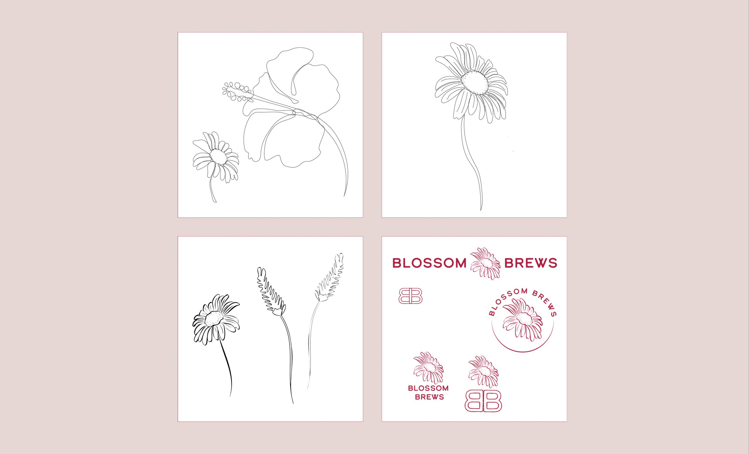
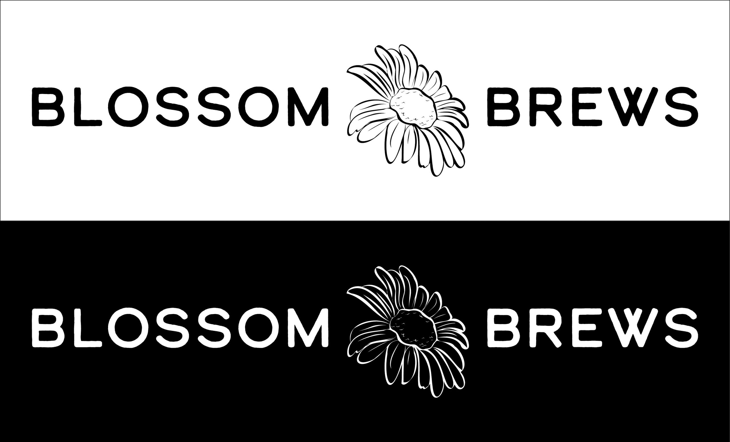
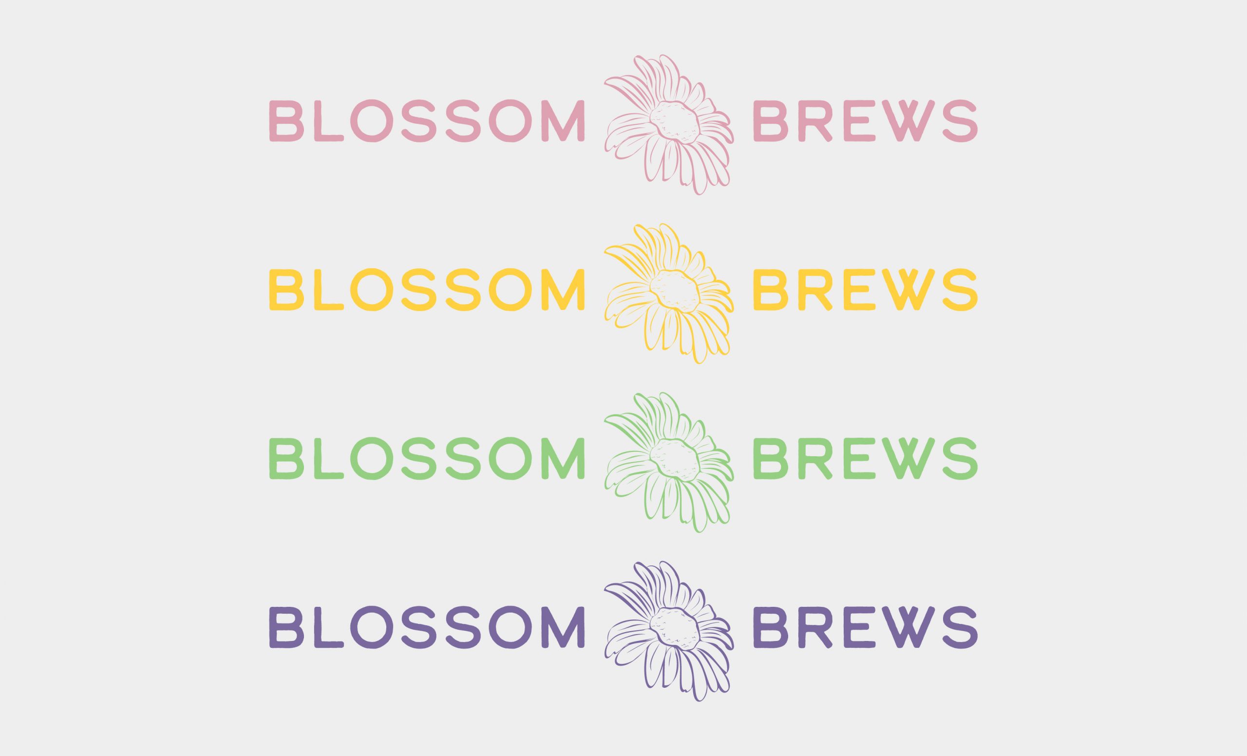
BLOSSOM BREWS It’s a floral tea brand concept with an organic-clean style and an urban-nature balance that aligns with the brand’s ethos of natural, healthy, and mindful living.
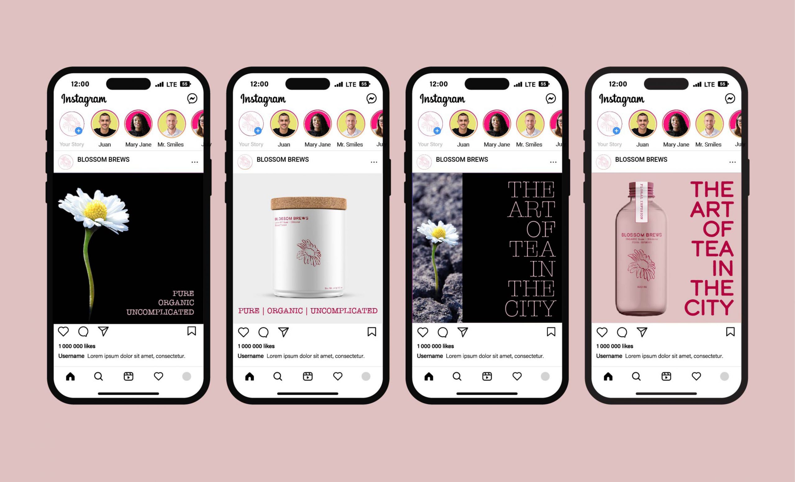
Deliverables: Logo | Business Card | 2 Package Designs | 2 Single Page Ads | 4 Mobile Ads | Merch
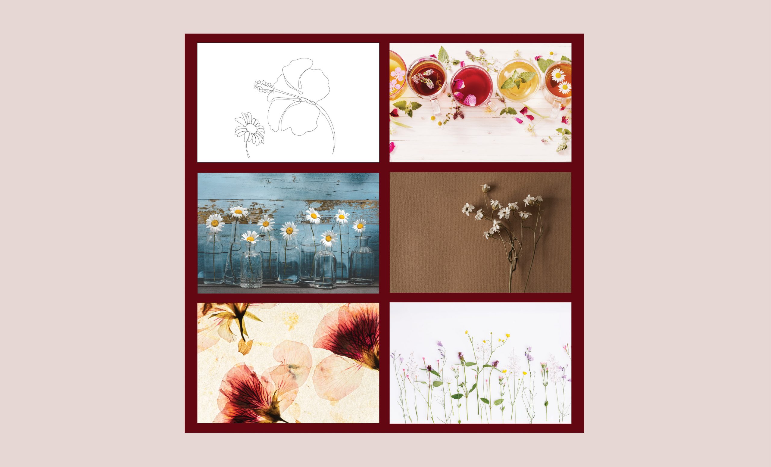
MOODBOARD
TYPEFACE
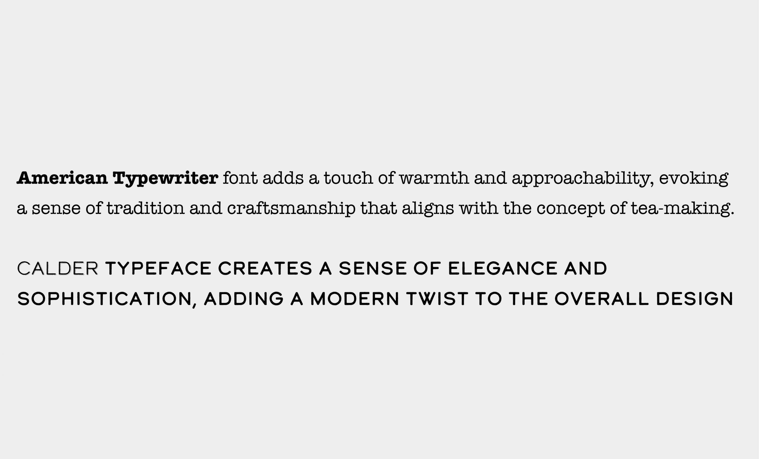
Typeface: pairing American Typewriter and Calder typefaces conveys a modern, minimalistic feel. Combining the vintage and handcrafted feel of American Typewriter with the clean and modern look of Calder creates a design that feels classic and contemporary.
American Typewriter font adds a touch of warmth and approachability, evoking a sense of tradition and craftsmanship that aligns with the concept of tea-making.
Calder typeface creates a sense of elegance and sophistication, adding a modern twist to the overall design. The typography is complemented by a muted background, allowing the floral illustrations to shine without overwhelming the design. Whitespace is incorporated to emphasize the minimalistic feel of the design.
COLOUR
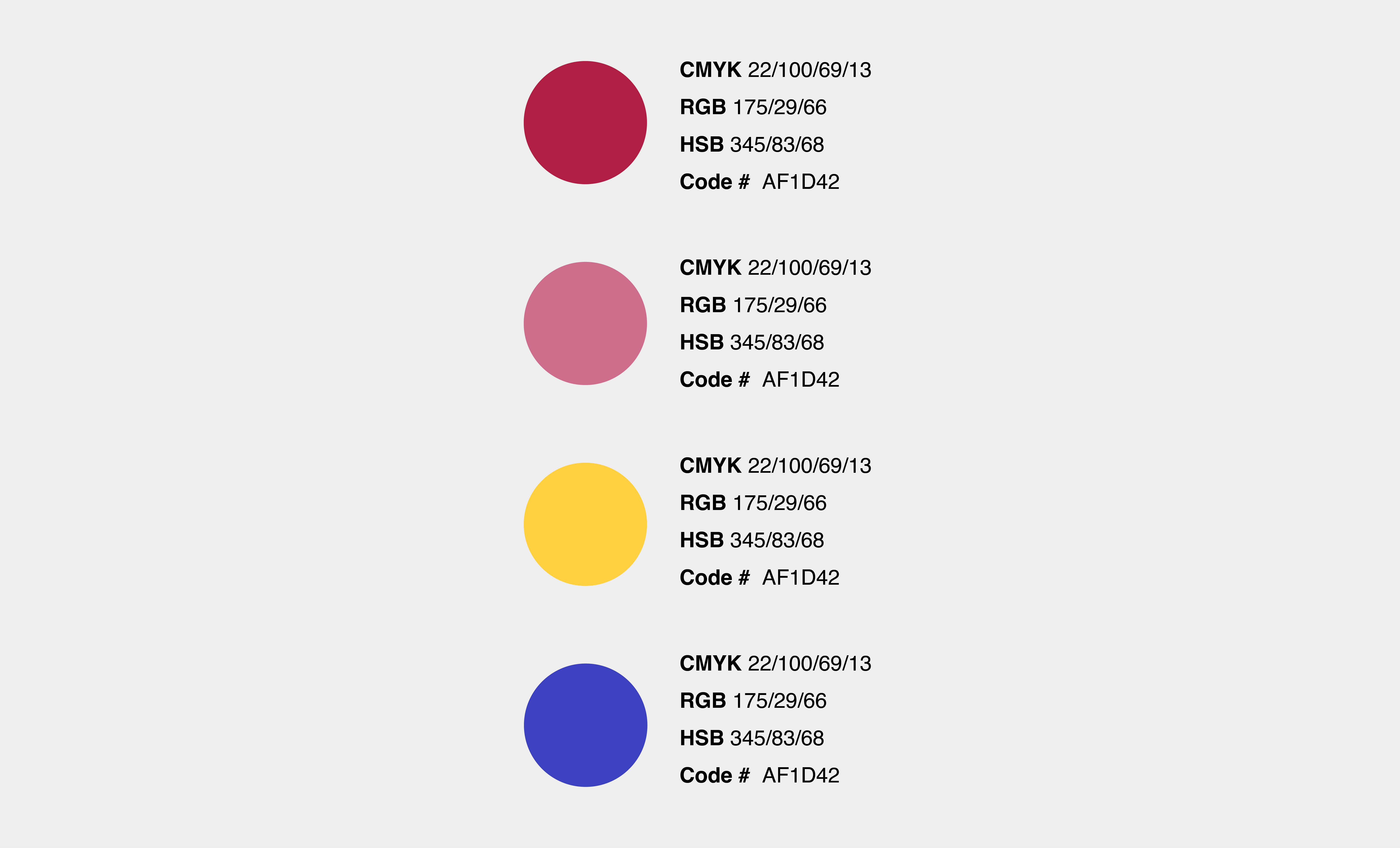
Red/Pink is used as the dominant colour to represent the bold, vibrant, and refreshing nature of floral tea.
Yellow symbolizes happiness, warmth, and joy, which complements the natural and organic aspects of the tea.
Blue represents tranquility, trust, and stability, which reflects the brand’s commitment to producing high-quality tea products.
Triad colour schemes are based on three evenly spaced colours around the colour wheel, forming an equilateral triangle. The primary advantage of triad colour schemes is their ability to provide a high level of contrast while maintaining balance.
SKETCHES
LOGO
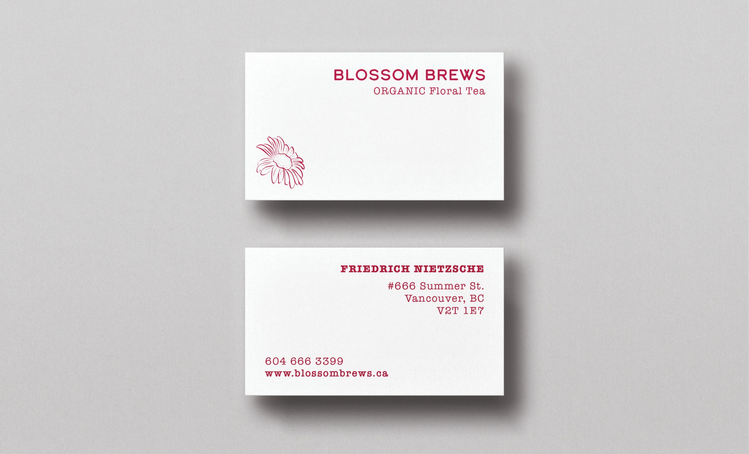
BUSINESS CARDS
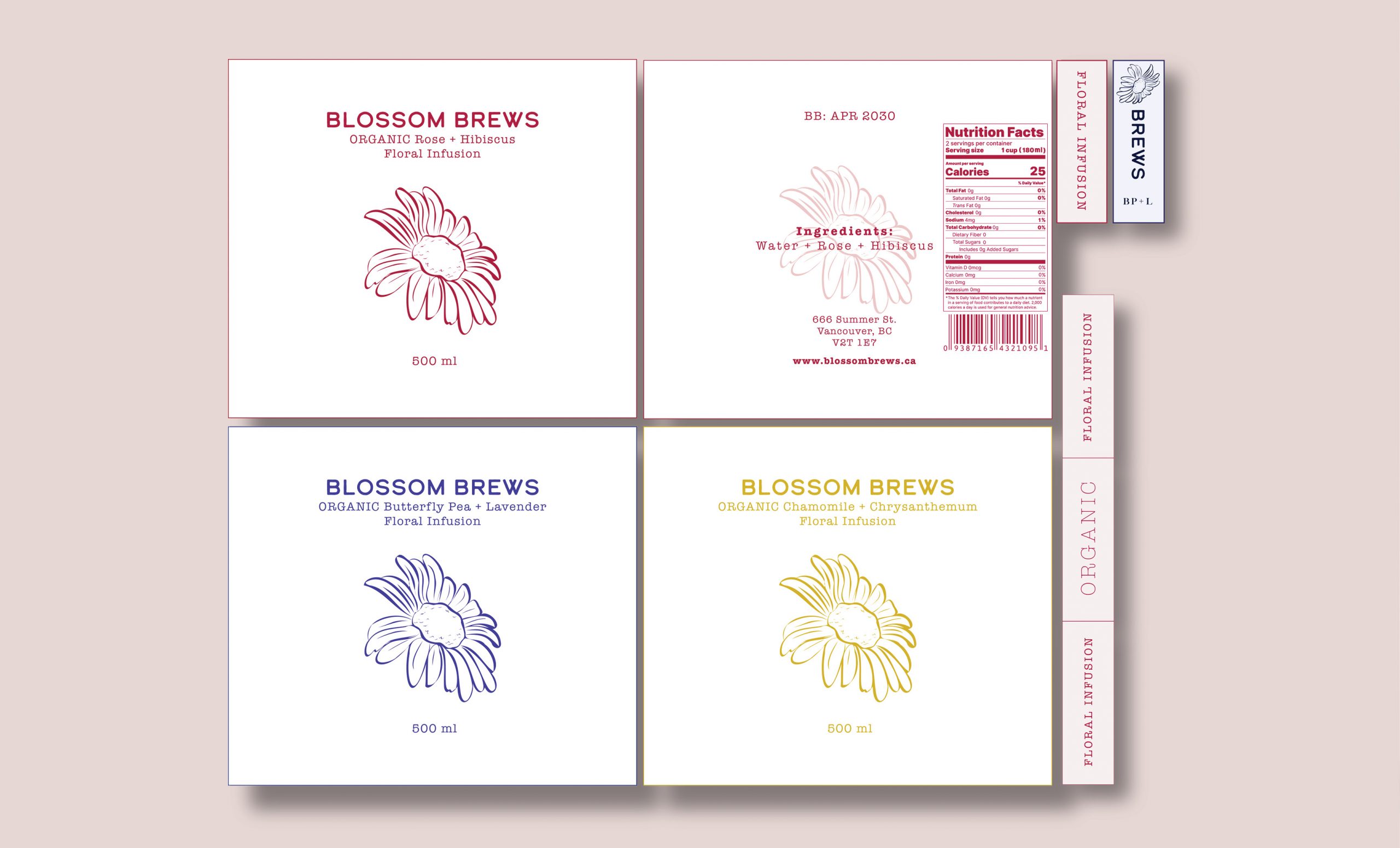
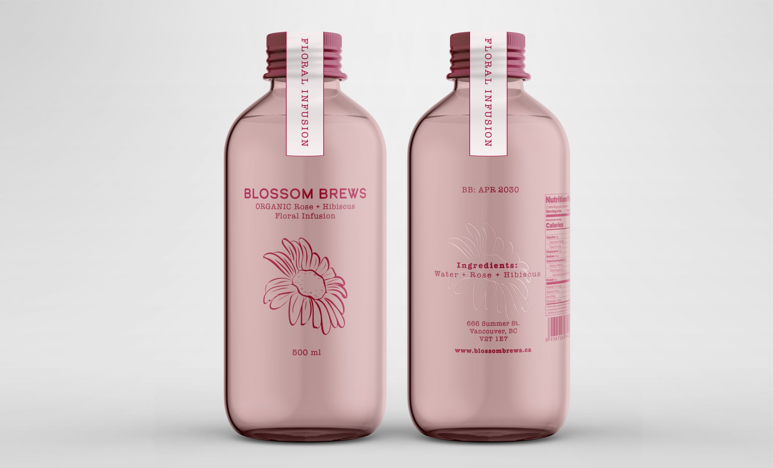
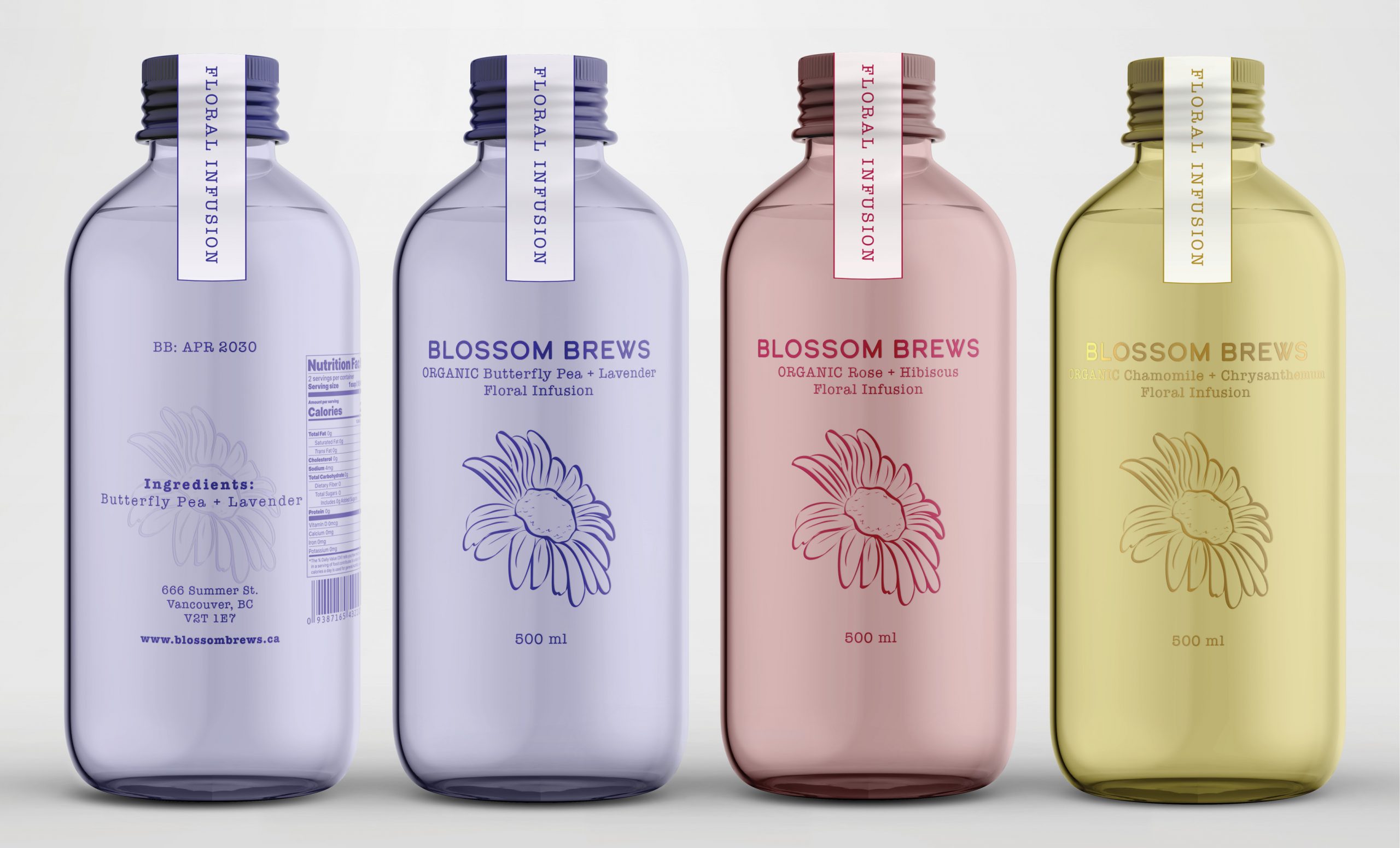
BOTTLE PACKAGE DESIGN
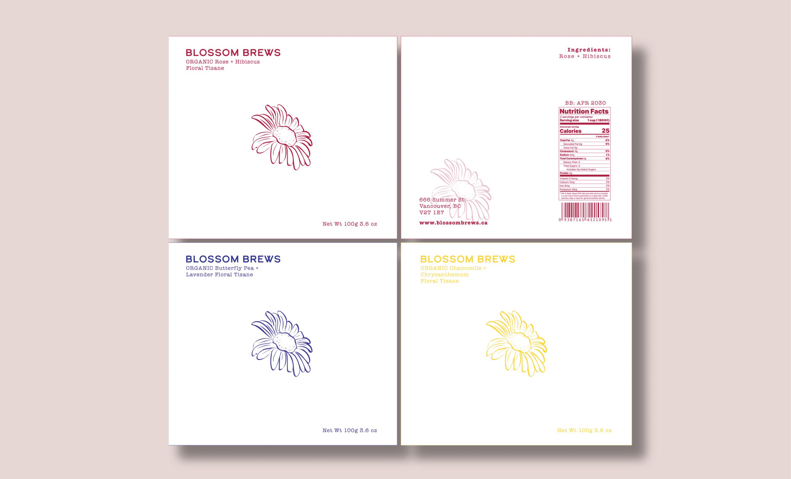
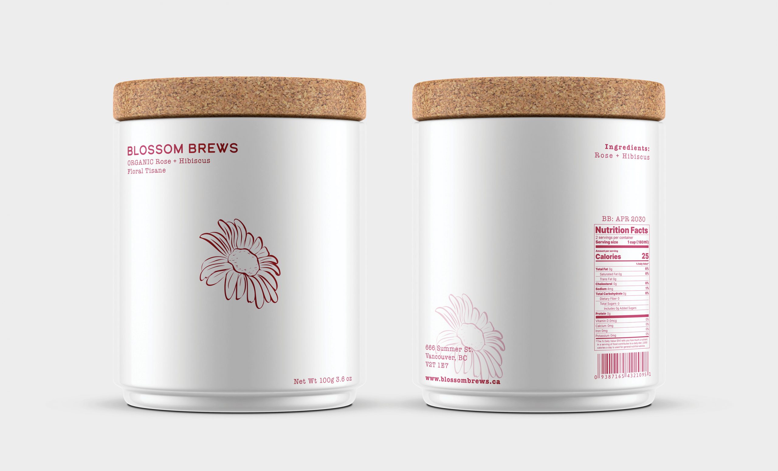
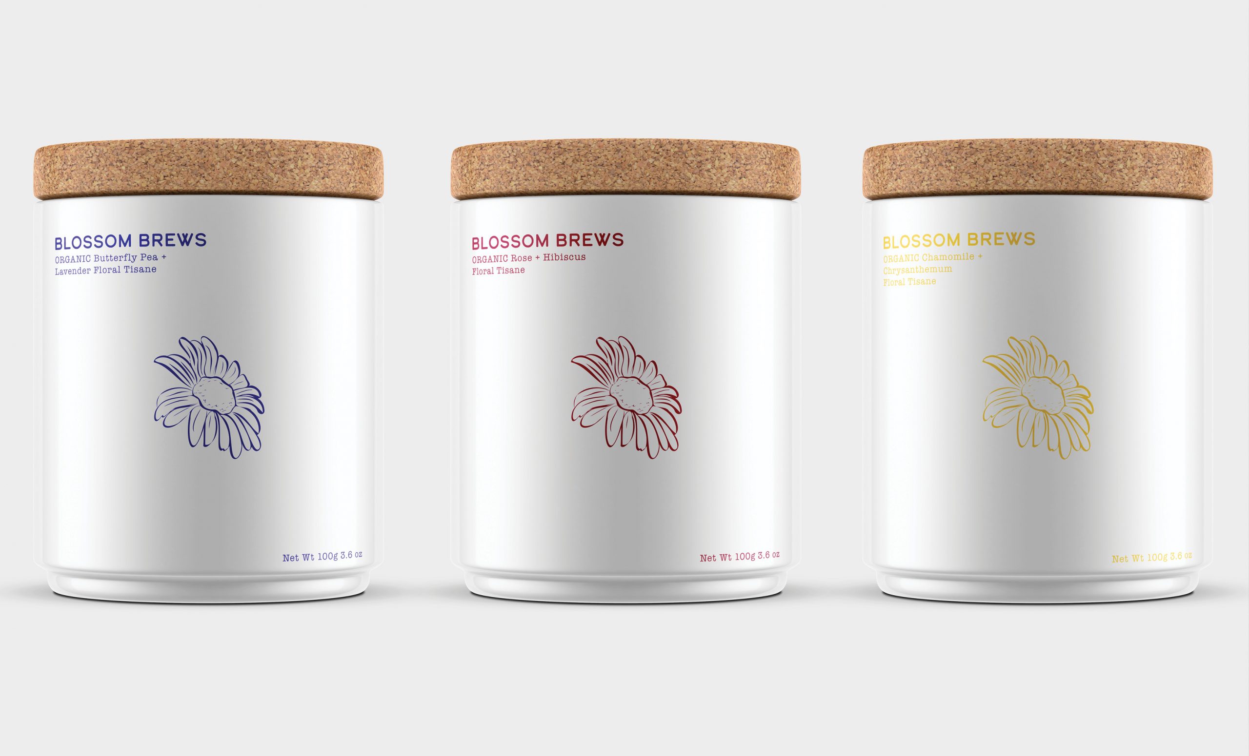
TIN CAN PACKAGE DESIGN
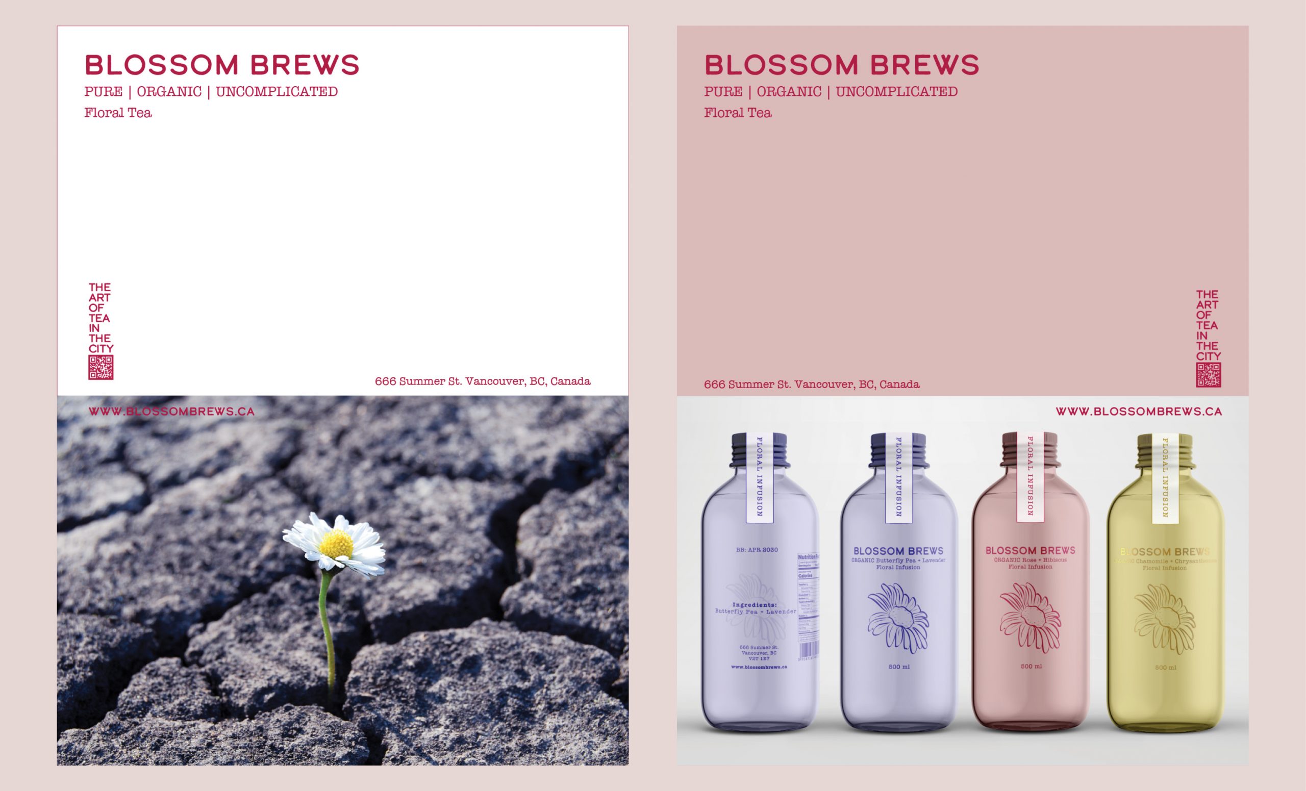
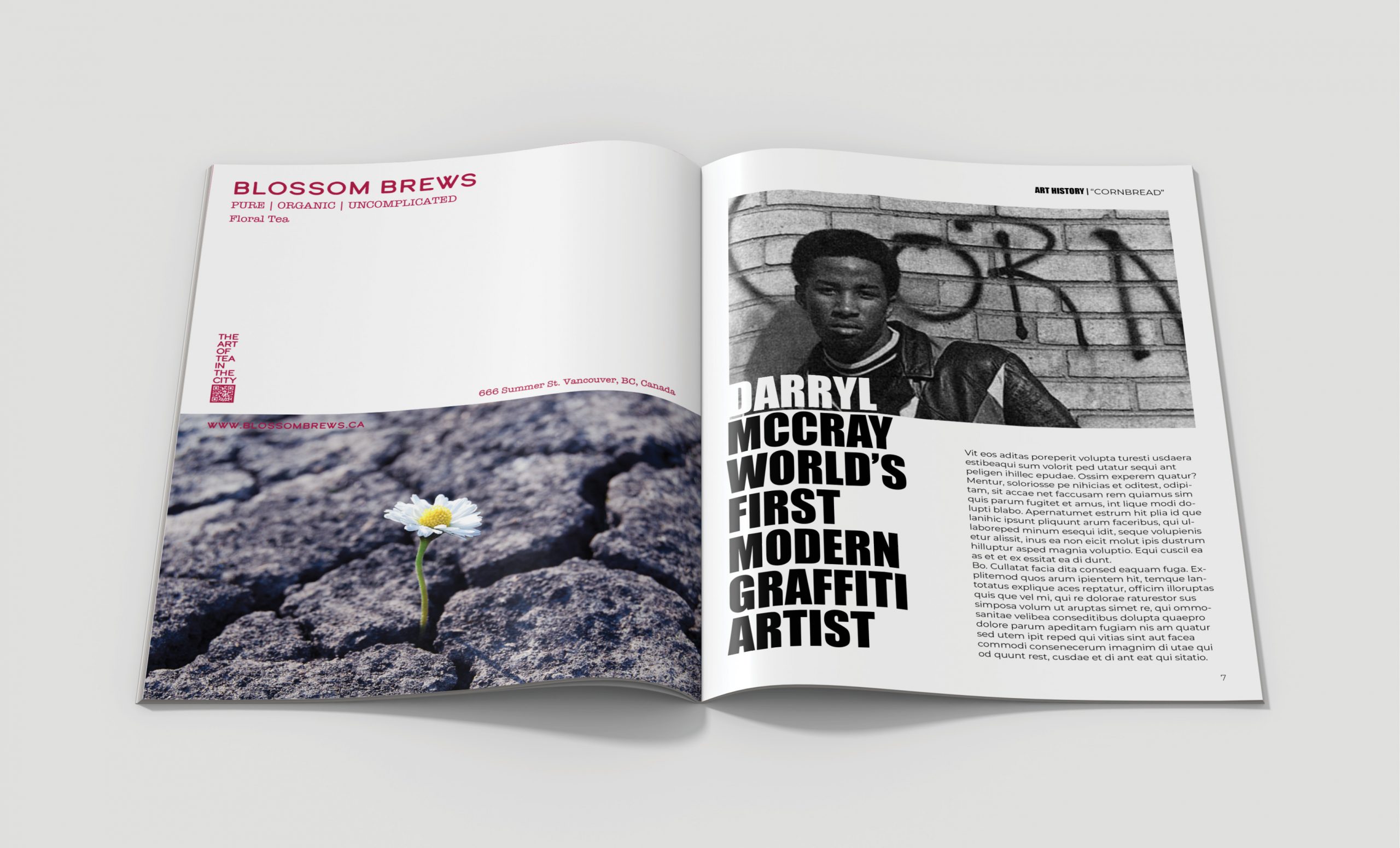
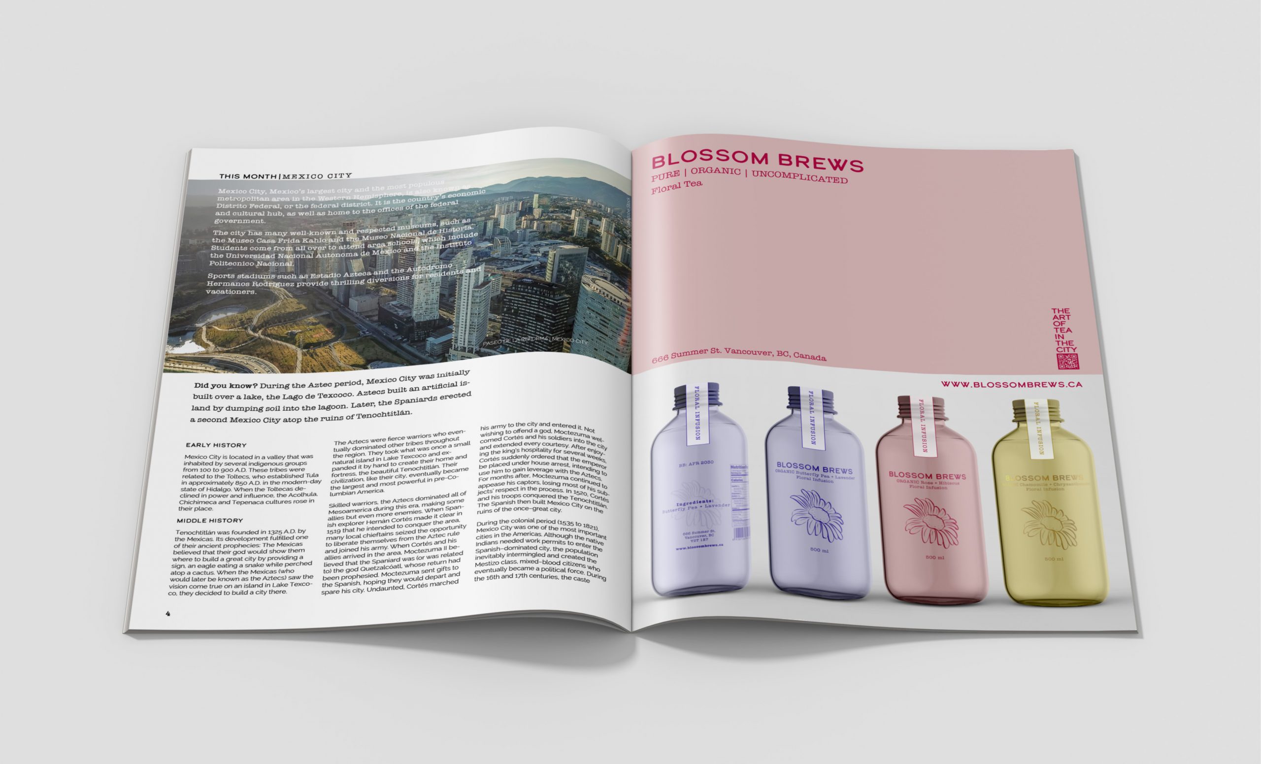
MAGAZINE ADS
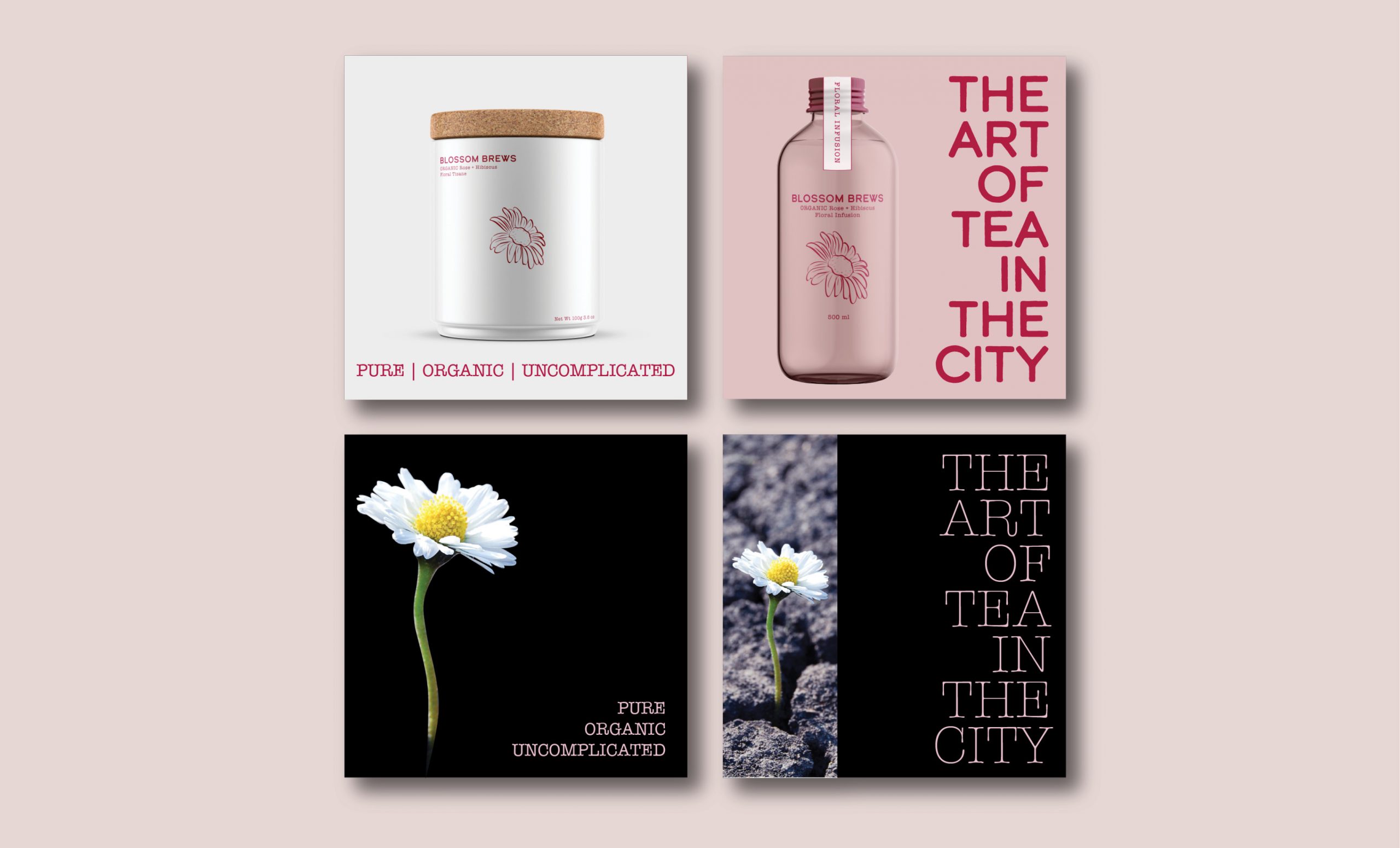
MOBILE SOCIAL MEDIA ADS
MERCH
