Portfolio | Graphic Design – Café (Concept)
IMAGINING A PLACE OF BALANCE.
Branding / Ad Design | January 2023
Café.
This is a branding design concept project. It is a modern local coffee shop thriving in simplicity. What is it? The Café intends to attract technology-driven millennials and Gen Zs who are busy with college and work. Café keeps things simple and fun, with simple menus and minimalist design to create a relaxed atmosphere that helps people focus on their projects while relaxing. It offers ultra-fast speed internet to help customers keep performing and video games for those who need a brain break.
Keywords
Simple + Fun + To the Point
Target Audience
– Age: 18-35
– Gender: All
– Location: Lower Mainland
– Personality: Busy students and workers.
– Likes: Technology-driven spaces, high-speed Internet, sharing photos on social media, and the 90s – 00s
– Education: Completed High Education
– Income: Middle to Upper Class
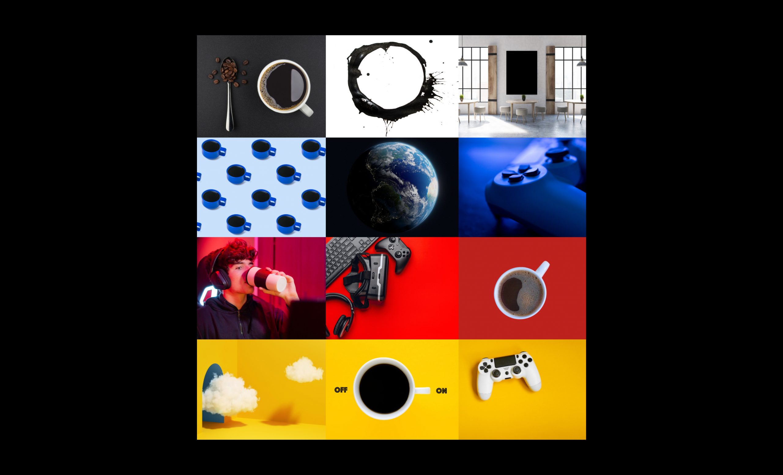
mood board.
name.
Café.
I wanted something simple and easy to remember, something to the point. All coffee shops have a meaningful name, café means coffee in Spanish, and that’s it.
Services.
– To the point! Simply Coffee
– Ultra-fast speed Internet
– Video Games
logotype.
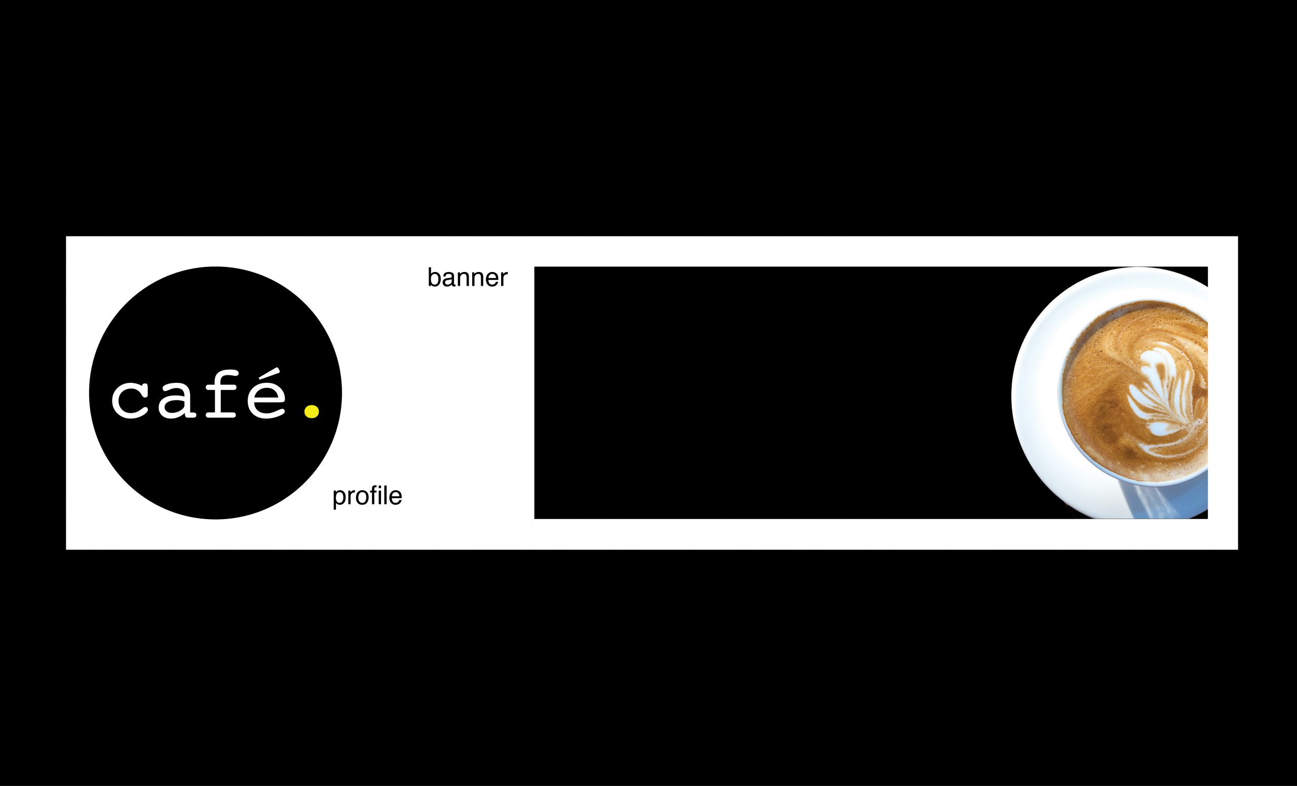
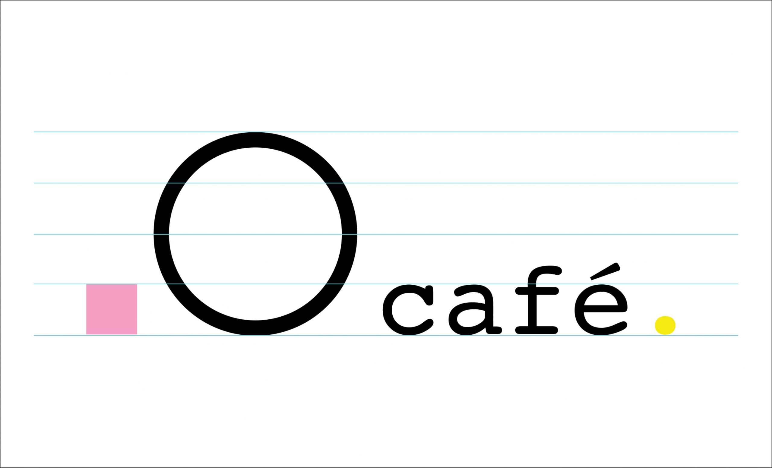
The circle represents the infinite imagination, a dot, and a video game controller’s button.
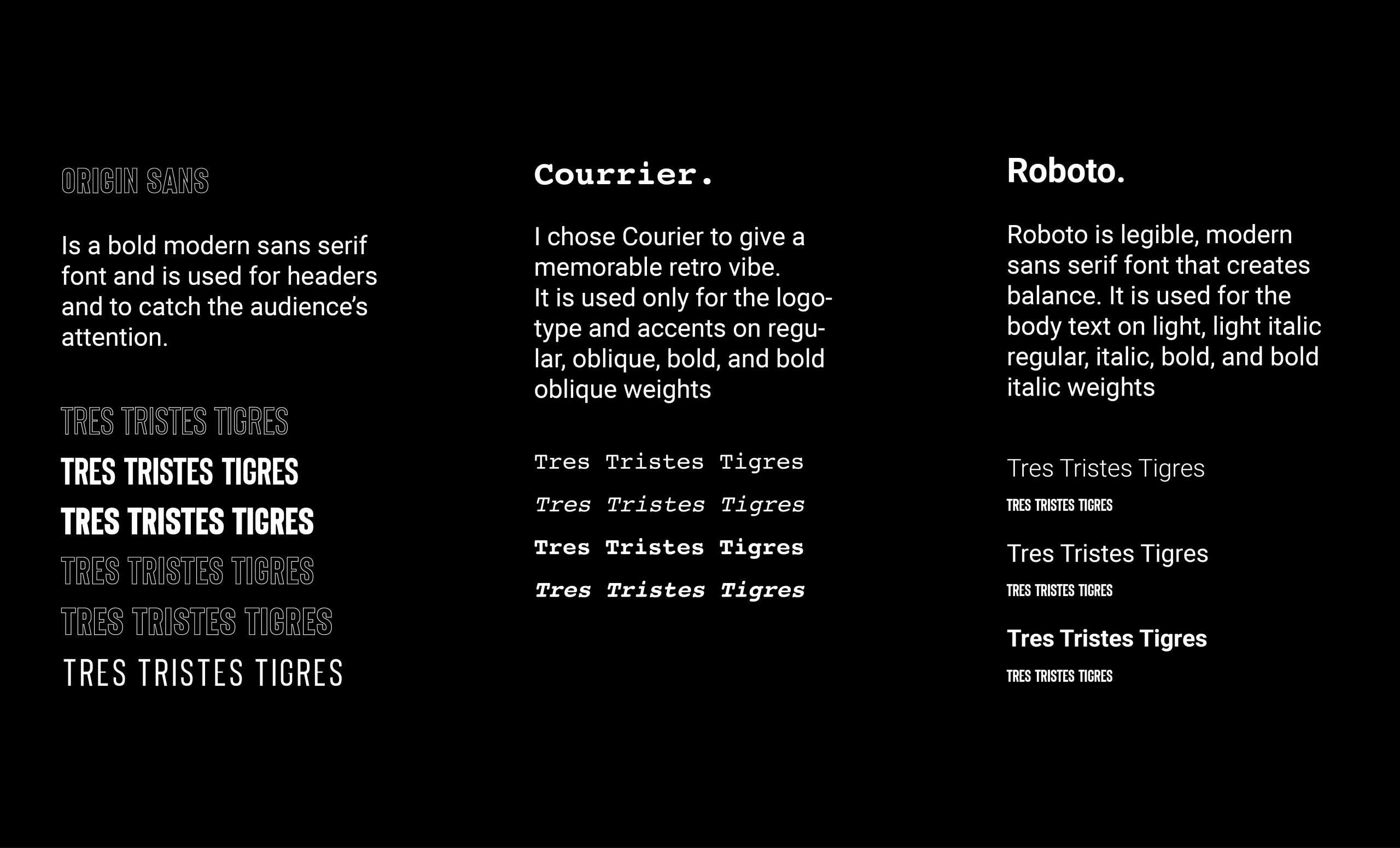
Courier, regular. 1/4 size of the logo (circle) for better legibility.
Once named “Messenger,” Courier was the starting point for coding fonts.
logo exploration.
logo variations.
colour.
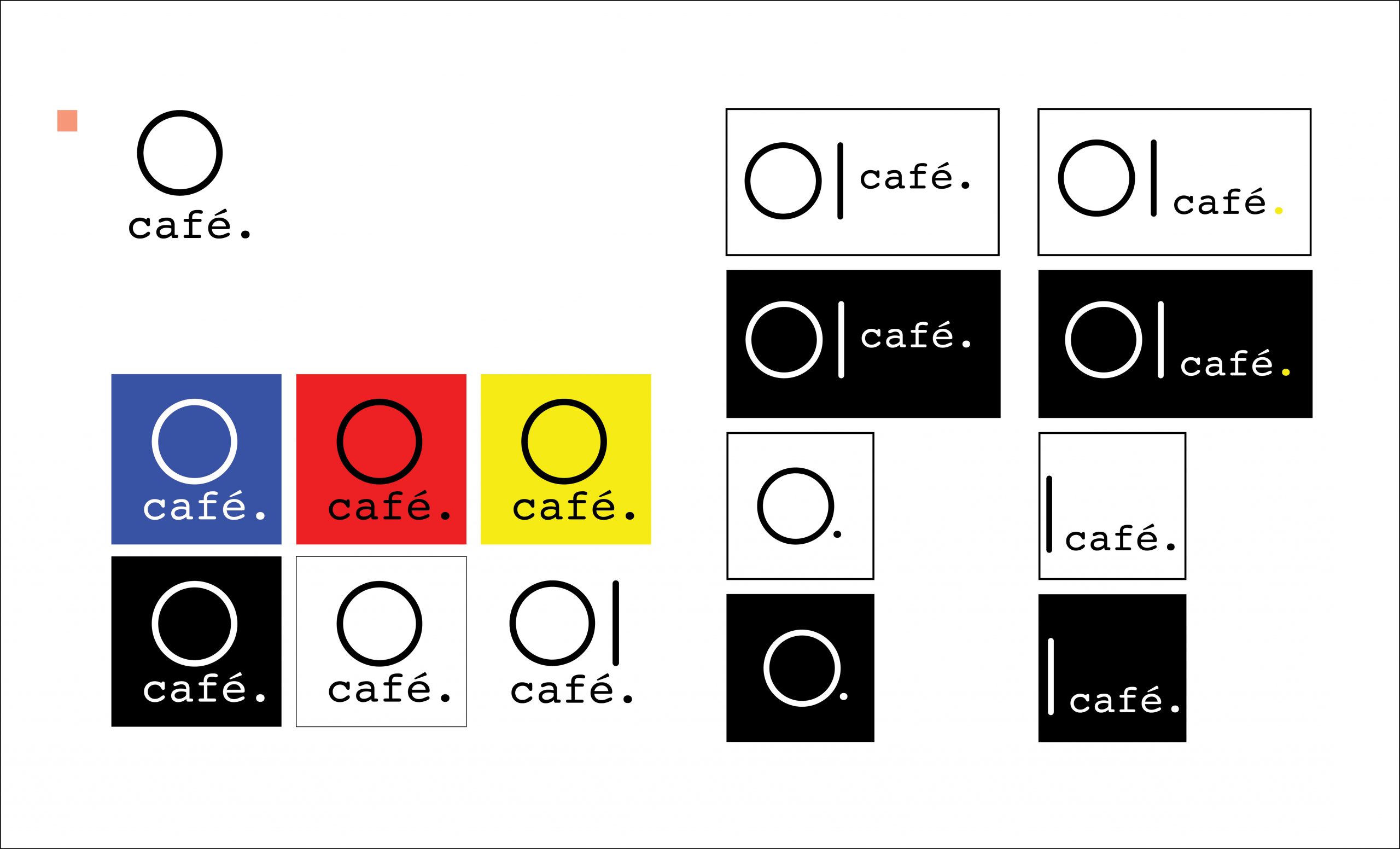
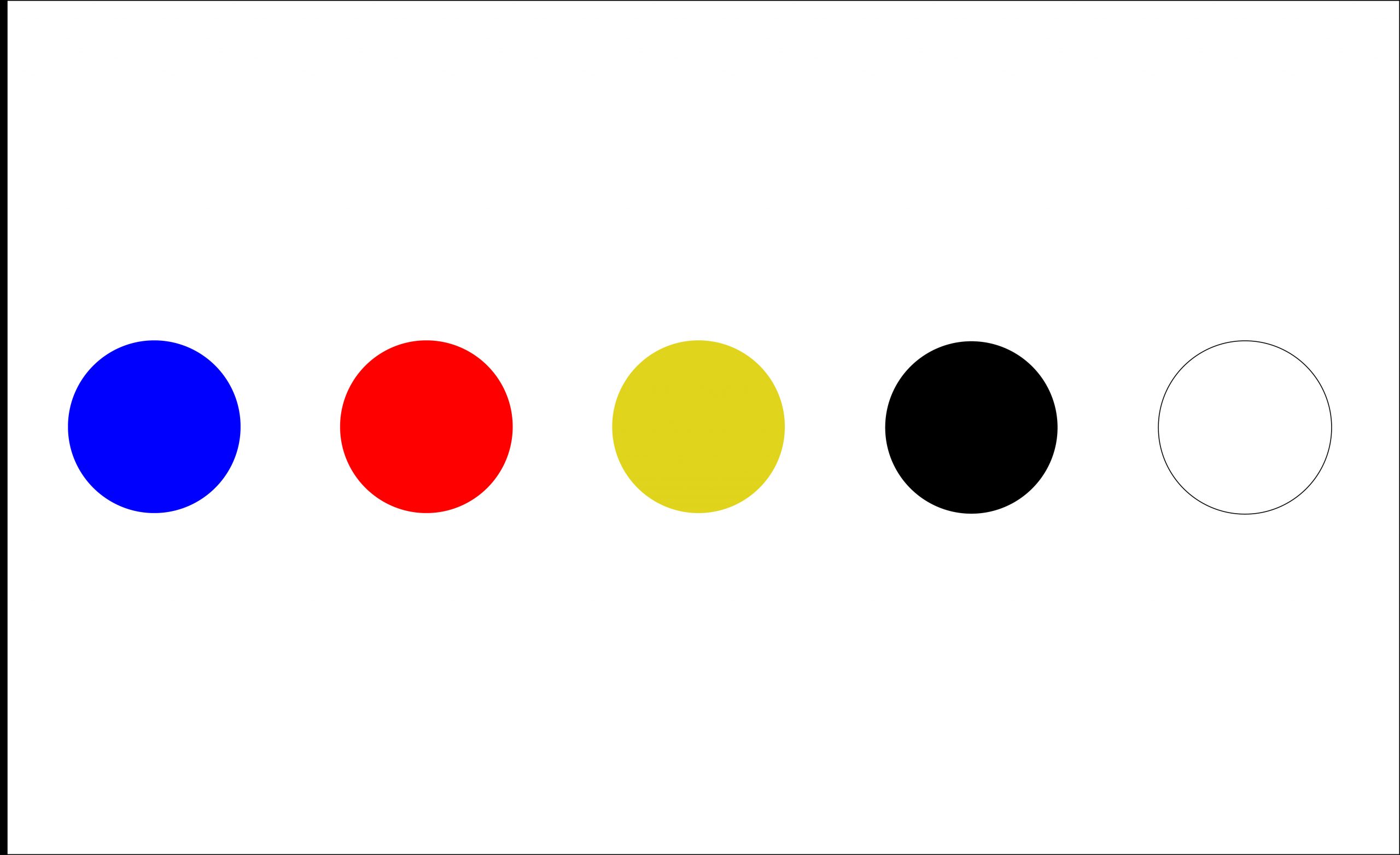
Blue + Red + Yellow | Black + White
Inspired by Piet Mondrian, I chose theese bold hues for their youthful energy, they represent simplicity and the beginning of creativity. These colors add contrast to the brand and clarity to their customer’s minds. The logo must be black or white, only the dot at the end can be colored when only using the wordmark.
typeface.
split-page ad.
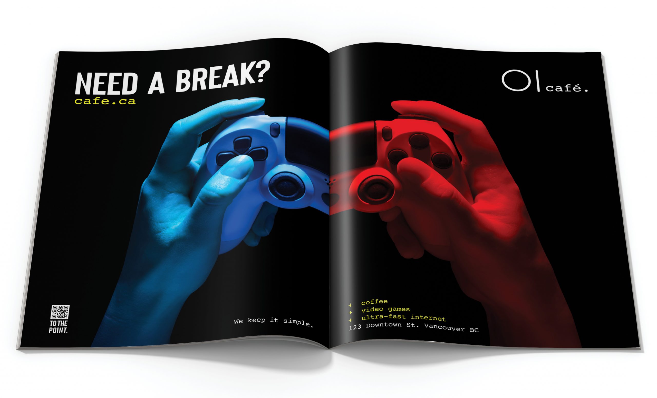
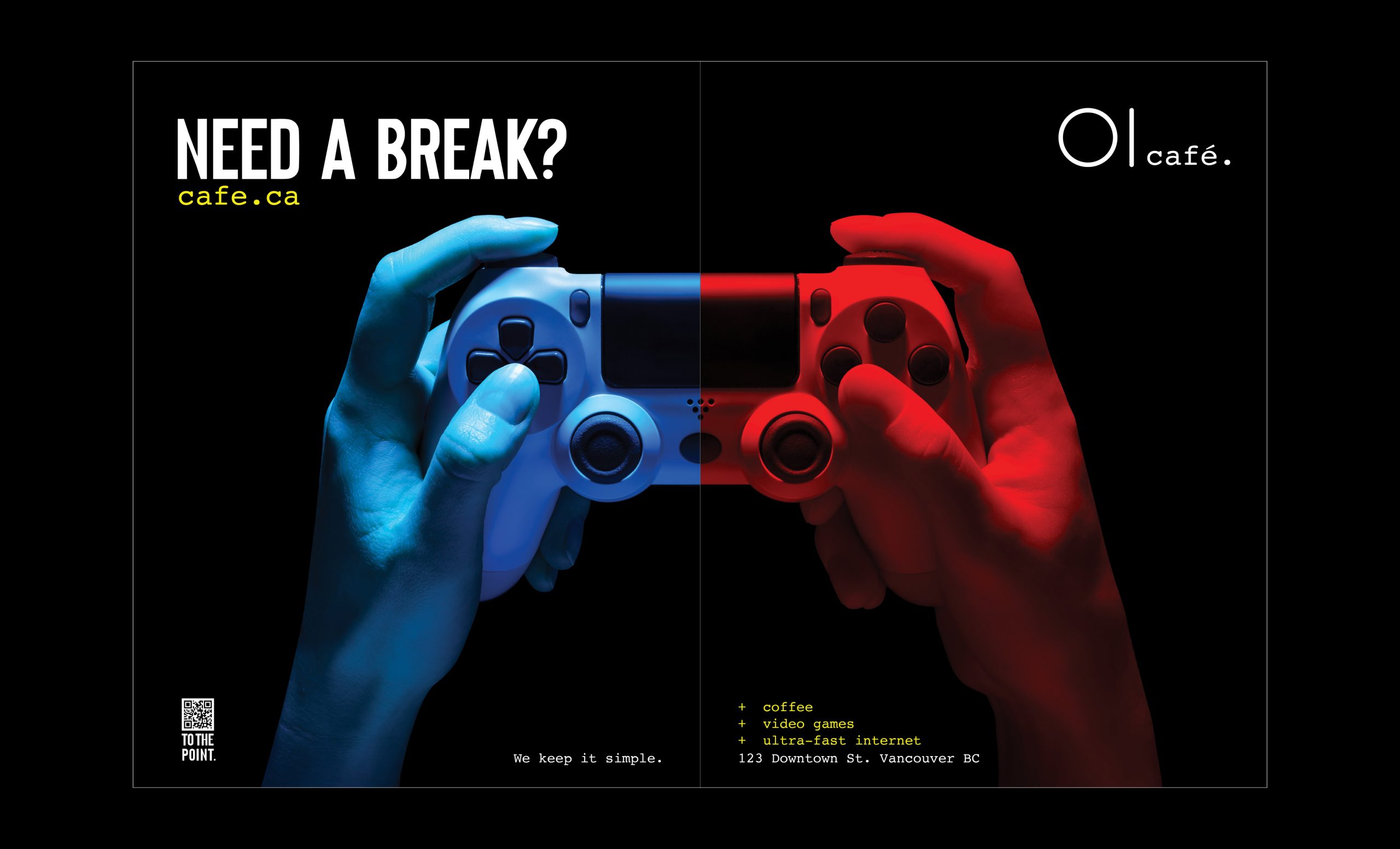
Design Concept: To capture attention and evoke curiosity, we’ve crafted a split-page advertisement that seamlessly blends the coffee shop experience with modern entertainment, creating a unique visual narrative that appeals to coffee lovers and gaming enthusiasts alike.
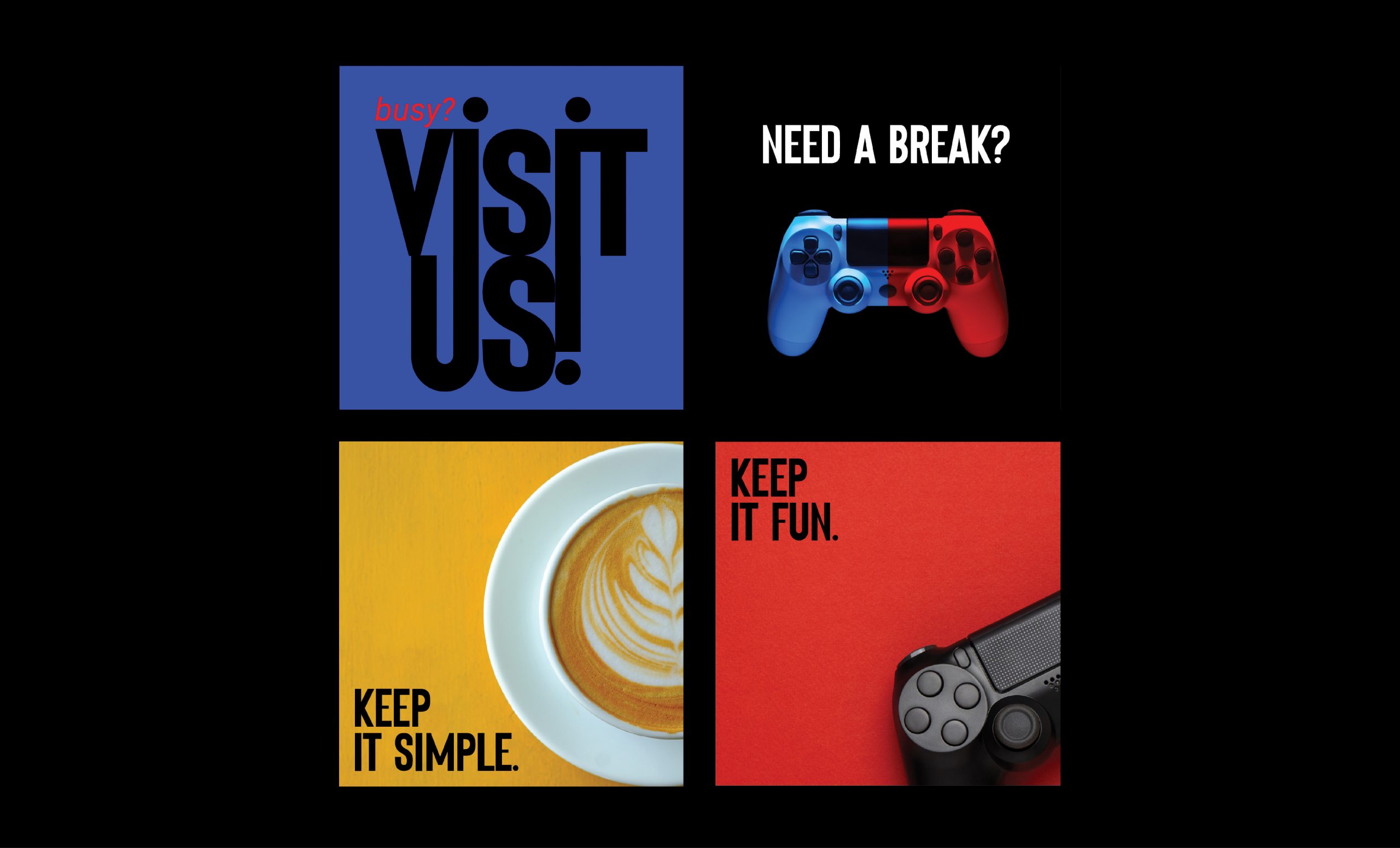
The advertisement for Cafe. combines coffee and gaming in a visually striking way. The black background creates a dramatic contrast, while the split-page design featuring a half-blue and half-red video game controller highlights the unique experience the coffee shop offers.
The calm blue side represents the peaceful atmosphere for enjoying coffee, while the vibrant red side symbolizes the excitement of gaming. The QR code in the corner allows customers to quickly access more information, and the text “Need a break?” invites them to visit the coffee shop.
Overall, the design is eye-catching, informative, and encourages customers to explore what Cafe. has to offer.
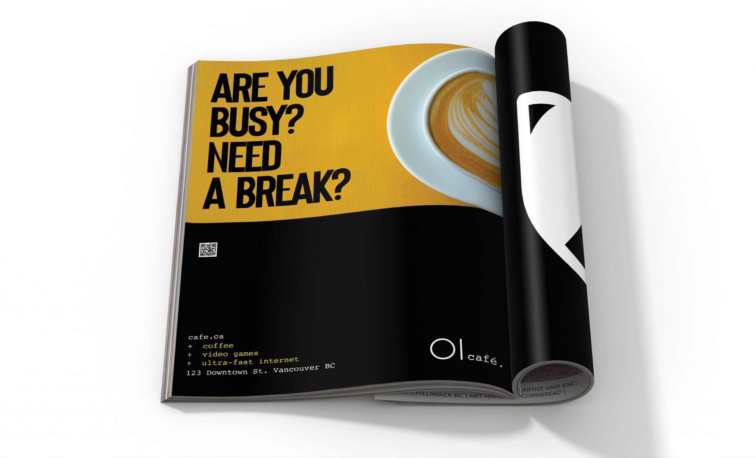
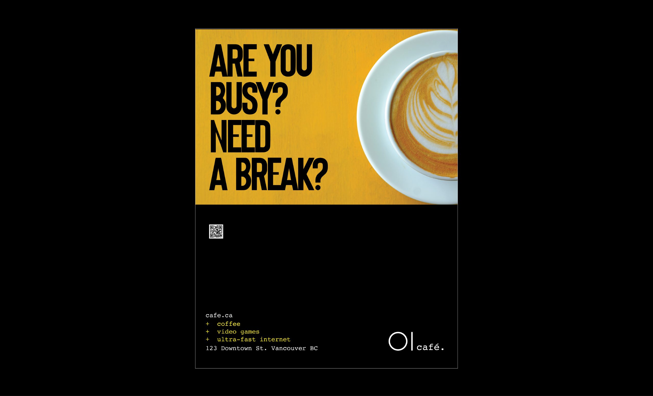
full-page ad.
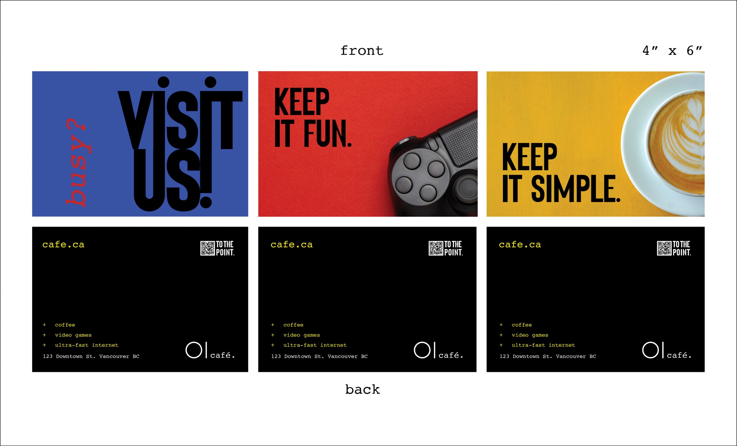
hand out.
social media.
